Lab 13-1 - Environmental inequalities

Author
Affiliations

Esteban Moro

Network Science Institute, Northeastern University

NETS 7983 Computational Urban Science

Published

March 31, 2025

Objective

In this lab, we will study environmental inequalities in the Boston Metropolitan Statistical Area (MSA). We are going to

  • Investigate exposure to pollution in different demographic groups using the PM2.5 data from the Atmospheric Composition Analysis Group at WashU, tree coverage from the US States Department of Agriculture’s Forest Service, and census data.

  • Study the unequal Urban Heat Island effect in Boston using data from the NIHHIS institute.

Setting up the environment

library(tidyverse)
library(arrow)
options(arrow.unsafe_metadata = TRUE)
library(DT) # for interactive tables
library(knitr) # for tables
library(ggthemes) # for ggplot themes
library(sf) # for spatial data
library(spdep) # for spatial econometrics
library(caret) # for machine learning
library(stargazer) # for regression tables
sf_use_s2(FALSE) # switch off geometry. Speed up calculations
theme_set(theme_hc() + theme(axis.title.y = element_text(angle = 90))) 

Loading the data

Research has found a significant inequity in the exposure to pollution in our cities [1] [2]. Some groups (low-income, minority groups) are more exposed to pollution than affluent communities.

Average exposure to PM25 by different demographic groups in most populous cities in the US. From Let’s reproduce those results in the Boston MSA. As in Lab 1-1 we can use the PM\(_{2.5}\) levels that the Atmospheric Composition Analysis Group at WashU publishes (see [3]). This time we are going to use the annual averages in 2022:

require(terra)
pm25 <- rast("/data/CUS/labs/6/V5NA04.02.HybridPM25.NorthAmerica.2022001-2022364.nc")

Let’s have a look to it:

require(tidyverse)
require(tidyterra)
ggplot() +
  geom_spatraster(data=pm25) +
  scale_fill_whitebox_c(
    palette = "muted",
    breaks = c(0,0.01,0.1,1,10,100),
    guide = guide_legend(reverse = TRUE)
    ) +
  labs(fill="PM25") 

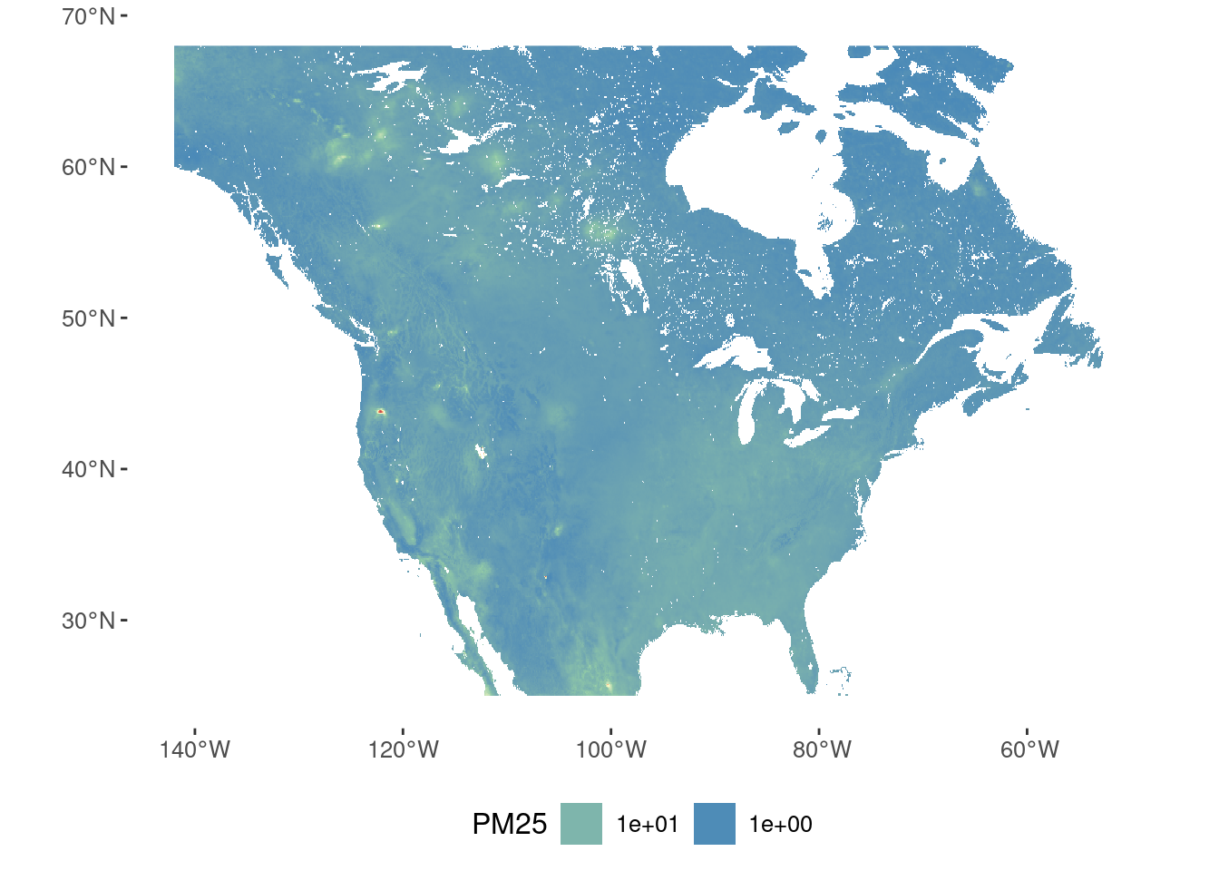
Modeling who is exposed to pollution

To model exposure to pollution (PM2.5), we are going to consider two different groups of variables

  • The first group is composed of demographic variables to study what groups are more exposed to pollution.

  • The second group is variables that could mediate the effect, like the extent of greenery in those areas.

Demographics

We use the American Community Survey 2021 data to get the demographics of the Boston MSA by CBG.

census <- st_read("/data/CUS/labs/6/14460_acs_2021_boston.geojson") |> 
  st_transform(4326)
Reading layer `14460_acs_2021_boston' from data source 
  `/data/CUS/labs/6/14460_acs_2021_boston.geojson' using driver `GeoJSON'
Simple feature collection with 3418 features and 66 fields
Geometry type: MULTIPOLYGON
Dimension:     XY
Bounding box:  xmin: -71.89877 ymin: 41.56585 xmax: -70.32252 ymax: 43.57279
Geodetic CRS:  NAD83

We are going to consider the following variables:

census_model <- census |>
  mutate(median_income = log(median_income), 
         prop_bachelor = education.bachelor/total.education,
         prop_black = race.black / race.total,
         prop_employed = employment.civilian_employed / employment.civilian_labor_force,
         prop_car = trans.car/trans.total) |>
  select(GEOID, median_income, prop_bachelor, prop_black, prop_employed, prop_car) |>
  drop_na()

Canopy

The US States Department of Agriculture’s Forest Service maintains a tree canopy covers datasets for the US

canopy <- read_csv("/data/CUS/labs/13/tree_coverage_Boston.csv",
                   col_types = cols(GEOID = col_character(), tree_coverage = col_double()))

This dataset contains the proportion of canopy in each CBG. Let’s merge it with the census data:

census_model <- left_join(census_model, canopy, by="GEOID")

Here is it:

require(leaflet)
pal <- colorNumeric("YlGn", domain = census_model$tree_coverage)
leaflet(census_model) %>%
  addProviderTiles("CartoDB.Positron") %>%
  addPolygons(stroke = FALSE, smoothFactor = 0.2, 
              fillOpacity = 0.8, color = ~pal(tree_coverage)) |>
  addLegend(pal = pal, values = ~tree_coverage, 
            opacity = 0.7, title = "tree_coverage %")

Pollution

To get the average PM2.5 by CBG using the WashU raster, we will use the fantastic exactextractr package:

require(exactextractr)
census_model <- census_model |>
  mutate(PM25 = exact_extract(pm25,geometry,"mean",progress=F))

Here is the map of pollution:

require(leaflet)
pal <- colorNumeric("YlOrRd", domain = census_model$PM25)
leaflet(census_model) %>%
  addProviderTiles("CartoDB.Positron") %>%
  addPolygons(stroke = FALSE, smoothFactor = 0.2, 
              fillOpacity = 0.8, color = ~pal(PM25)) |>
  addLegend(pal = pal, values = ~PM25, 
            opacity = 0.7, title = "PM2.5")

Note that the pollution has a strong spatial structure. As we did in past labs we can calculate it:

nb <- poly2nb(census_model)
no_neighbors <- which(card(nb) == 0)
census_filtered <- census_model[which(!c(1:nrow(census_model) %in% no_neighbors)), ]
nb <- poly2nb(census_filtered)
lw <- nb2listw(nb, style="W")
moran.test(census_filtered$PM25, lw)

    Moran I test under randomisation

data:  census_filtered$PM25  
weights: lw    

Moran I statistic standard deviate = 93.898, p-value < 2.2e-16
alternative hypothesis: greater
sample estimates:
Moran I statistic       Expectation          Variance 
     0.9788049599     -0.0003051572      0.0001087295 

As we can see there is a large spatial autocorrelation in the pollution levels.

Modeling

Variable inspection

Let’s build simple models to explain the association between PM2.5, canopy, and some demographic variables. Let’s see first how are the variables correlated:

require(corrplot)
cc <- cor(census_filtered |> st_drop_geometry() |> select(-GEOID),use="na")
corrplot(cc, method="number")

As we can see, there is a strong correlation between levels of PM2.5 and the proportion of black people, median income, employment, the use of cars, and canopy.

OLS model

Let’s start with a simple OLS model to understand these multidimensional associations. First, we scale all regressors (to compare them later)

census_scaled <- census_filtered |> 
  st_drop_geometry() |> 
  mutate(across(c(median_income, prop_bachelor, prop_black,
                  prop_employed, prop_car, tree_coverage),
                ~ as.numeric(scale(.))))
model_ols <- lm(PM25 ~ median_income + prop_bachelor + prop_black + 
                  prop_employed + prop_car + tree_coverage, 
                data = census_scaled |> st_drop_geometry())
summary(model_ols)

Call:
lm(formula = PM25 ~ median_income + prop_bachelor + prop_black + 
    prop_employed + prop_car + tree_coverage, data = st_drop_geometry(census_scaled))

Residuals:
     Min       1Q   Median       3Q      Max 
-2.85899 -0.30484  0.04587  0.38112  1.70664 

Coefficients:
               Estimate Std. Error t value Pr(>|t|)    
(Intercept)    5.926745   0.010134 584.859  < 2e-16 ***
median_income  0.061104   0.016307   3.747 0.000182 ***
prop_bachelor  0.067485   0.016355   4.126 3.78e-05 ***
prop_black     0.124991   0.011963  10.449  < 2e-16 ***
prop_employed  0.002522   0.011650   0.216 0.828615    
prop_car      -0.337942   0.014801 -22.833  < 2e-16 ***
tree_coverage -0.545989   0.013913 -39.243  < 2e-16 ***
---
Signif. codes:  0 '***' 0.001 '**' 0.01 '*' 0.05 '.' 0.1 ' ' 1

Residual standard error: 0.5802 on 3271 degrees of freedom
Multiple R-squared:  0.6587,    Adjusted R-squared:  0.6581 
F-statistic:  1052 on 6 and 3271 DF,  p-value: < 2.2e-16

We note that:

  • The model explains already a large fraction of the variance.
  • As expected, the proportion of Black residents is positively associated with PM2.5 levels.
  • The proportion of tree coverage and use of cars is strongly and negatively associated with PM2.5 levels, suggesting that suburbs have lower pollution levels.

One of the checks in this kind of regression is to see if there is multicollinearity. To do that, we use the package car to calculate the Variance-Inflation Factor (VIF):

require(car)
vif(model_ols)
median_income prop_bachelor    prop_black prop_employed      prop_car 
     2.588797      2.604142      1.393118      1.321174      2.132564 
tree_coverage 
     1.884462 

Although no general rule exists, VIFs below five are generally accepted as reasonable. In our case, the VIFs are below 5, so we can consider multicollinearity not a problem.

Spatial regression

However, given the large spatial structure of the pollution, we can use a spatial error model to account for it:

require(spatialreg)
model_spatial <- 
  errorsarlm(PM25 ~ median_income + prop_bachelor + prop_black + 
               prop_employed + prop_car + tree_coverage,
             data=census_scaled, lw)
summary(model_spatial)

Call:errorsarlm(formula = PM25 ~ median_income + prop_bachelor + prop_black + 
    prop_employed + prop_car + tree_coverage, data = census_scaled, 
    listw = lw)

Residuals:
       Min         1Q     Median         3Q        Max 
-0.5454702 -0.0433070  0.0017826  0.0468331  0.5753390 

Type: error 
Coefficients: (asymptotic standard errors) 
                Estimate Std. Error  z value  Pr(>|z|)
(Intercept)    6.1072272  0.4235206  14.4201 < 2.2e-16
median_income -0.0099114  0.0028204  -3.5142  0.000441
prop_bachelor -0.0041647  0.0038291  -1.0877  0.276744
prop_black    -0.0013130  0.0039955  -0.3286  0.742436
prop_employed  0.0012720  0.0018170   0.7001  0.483891
prop_car      -0.0001589  0.0036248  -0.0438  0.965035
tree_coverage -0.0461641  0.0041204 -11.2038 < 2.2e-16

Lambda: 0.99603, LR test value: 10588, p-value: < 2.22e-16
Asymptotic standard error: 0.0011411
    z-value: 872.84, p-value: < 2.22e-16
Wald statistic: 761850, p-value: < 2.22e-16

Log likelihood: 2430.533 for error model
ML residual variance (sigma squared): 0.0092684, (sigma: 0.096272)
Number of observations: 3278 
Number of parameters estimated: 9 
AIC: -4843.1, (AIC for lm: 5742.5)

Interestingly, only median income and percentage of tree coverage are significant once we account for the spatial structure of the data.

Let’s put together the results of the two models (we remove the use of car for visualization purposes):

require(broom)
tabla_models <- rbind(
  tidy(model_ols) |> mutate(model="OLS"),
  tidy(model_spatial) |> mutate(model="Spatial Error")
)
tabla_models |> filter(grepl("scale",term)) |> ggplot(aes(x=estimate, y=term, color=model)) +
  geom_point() +
  geom_errorbarh(aes(xmin=estimate-std.error, xmax=estimate+std.error), height=0) + 
  geom_vline(xintercept=0, linetype="dashed")

As we can see, one of the conclusions in [1] does not hold under the use of spatial models in the city of Boston. The insignificant coefficient in the spatial error model implies that once you account for spatial dependence, there is little evidence for a direct relationship between the proportion of Black residents and PM2.5 levels (!!).

Still, median income and the tree coverage are significant in both models.

Your turn

Pollution is not the only environmental inequality in our cities. Heat, noise, and other pollutants are also unequally distributed. Here, we are going to focus on heat. The Urban Heat Island (UHI) effect is a well-known phenomenon that causes urban areas to be hotter than rural areas. This is due to the high concentration of buildings, roads, and other surfaces that absorb and retain heat.

Urban heat island data is hard to get because it requires high-resolution temperature data. Satellite data can provide surface temperature, but the spatial resolution is insufficient to capture the UHI effect.

However, the NIHHIS institute launched several community science field campaigns to collect temperature and humidity data by volunteers attaching sensors to their vehicles.

You can read about the campaign methodology in the paper by Shandas et al., [4]. Here, we will use the data for the campaign in the 2019 summer for Boston. The data is publicly available here, and the final report can be found here.

We will use this data to see if different communities in Boston are affected differently by the UHI effect.

Load data

Let’s load the data for Boston

uhi <- rast("/data/CUS/labs/13/All Data_Boston_Heat Watch 2019/Afternoon_Area-wide_Temperature_Boston.tif")
uhi <- project(uhi, "EPSG:4326")
ggplot() +
  geom_spatraster(data=uhi) +
  scale_fill_whitebox_c(
    palette = "muted",
    breaks = c(85,90,95,100,105),
    guide = guide_legend(reverse = TRUE)
    ) +
  labs(fill="Afternoon Temperature") 

Let’s see the data in the city center

ggplot() +
  geom_spatraster(data=uhi) +
  scale_fill_whitebox_c(
    palette = "muted",
    breaks = c(85,90,95,100,105),
    guide = guide_legend(reverse = TRUE)
    ) +
  labs(fill="Afternoon Temperature") +
  coord_sf(xlim=c(-71.18,-71), ylim=c(42.31,42.416253))

Use these data to

  • Estimate the average temperature in each CBG
  • Evaluate the spatial autocorrelation of the temperature
  • Build a model to explain the temperature regarding tree coverage, median income, and the proportion of Black residents.
  • Compare the results of the OLS and spatial error models
  • Discuss the results: do heat islands affect all residents equally?

Conclusion

In this lab, we have seen how to model environmental inequalities in our cities. We have seen that the spatial structure of the data is crucial to understanding the relationship between pollution and demographics.

  • When studying environmental inequalities, it is essential to consider the spatial structure of the data.
  • The Urban Heat Island effect is another environmental inequality that affects different groups of residents differently.

References

[1]
N. Brazil, “Environmental inequality in the neighborhood networks of urban mobility in US cities,” Proceedings of the National Academy of Sciences, vol. 119, no. 17, p. e2117776119, Apr. 2022, doi: 10.1073/pnas.2117776119.
[2]
C. W. Tessum, D. A. Paolella, S. E. Chambliss, J. S. Apte, J. D. Hill, and J. D. Marshall, PM2.5 polluters disproportionately and systemically affect people of color in the United States,” Science Advances, vol. 7, no. 18, p. eabf4491, Apr. 2021, doi: 10.1126/sciadv.abf4491.
[3]
A. van Donkelaar et al., “North american fine particulate matter chemical composition for 2000–2022 from satellites, models, and monitors: The changing contribution of wildfires,” ACS ES&T Air, 2024.
[4]
V. Shandas, J. Voelkel, J. Williams, and J. Hoffman, “Integrating Satellite and Ground Measurements for Predicting Locations of Extreme Urban Heat,” Climate, vol. 7, no. 1, p. 5, Jan. 2019, doi: 10.3390/cli7010005.