library(tidyverse)
library(arrow)
options(arrow.unsafe_metadata = TRUE)
library(DT) # for interactive tables
library(knitr) # for tables
library(ggthemes) # for ggplot themes
library(sf) # for spatial data
library(spdep) # for spatial econometrics
library(caret) # for machine learning
library(stargazer) # for regression tables
library(sf) # for spatial data
library(tidycensus) # for census data
library(tigris) # for shapefiles
library(patchwork) # for combining plots
library(jsonlite) # for parsing json
options(tigris_use_cache = TRUE) # cache shapefiles
sf_use_s2(FALSE) # switch off geometry. Speed up calculations
theme_set(theme_hc() + theme(axis.title.y = element_text(angle = 90)))
knitr::opts_chunk$set(cache = TRUE, warning = FALSE,
message = FALSE, cache.lazy = FALSE)Lab 14-1 - Natural disasters impact and response
Objective
In this lab, we will study the response of different communities to natural disasters. We will
- Use mobility data to see how different communities prepared and were affected by hurricane Ian in Florida in September 2022
- Use the data from the FEMA and the US Census Bureau to analyze the impact of natural disasters on different communities.
Setting up the environment
Introduction
In September 2022 hurricane Ian made landfall in Florida. The hurricane caused significant damage to the state, and the response of different communities varied widely. Around 150 people died and thousands were displaced. The hurricane caused significant damage to the state (around $112 billion dollars), and the response of different communities varied widely.
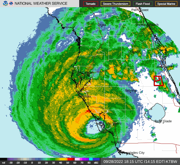
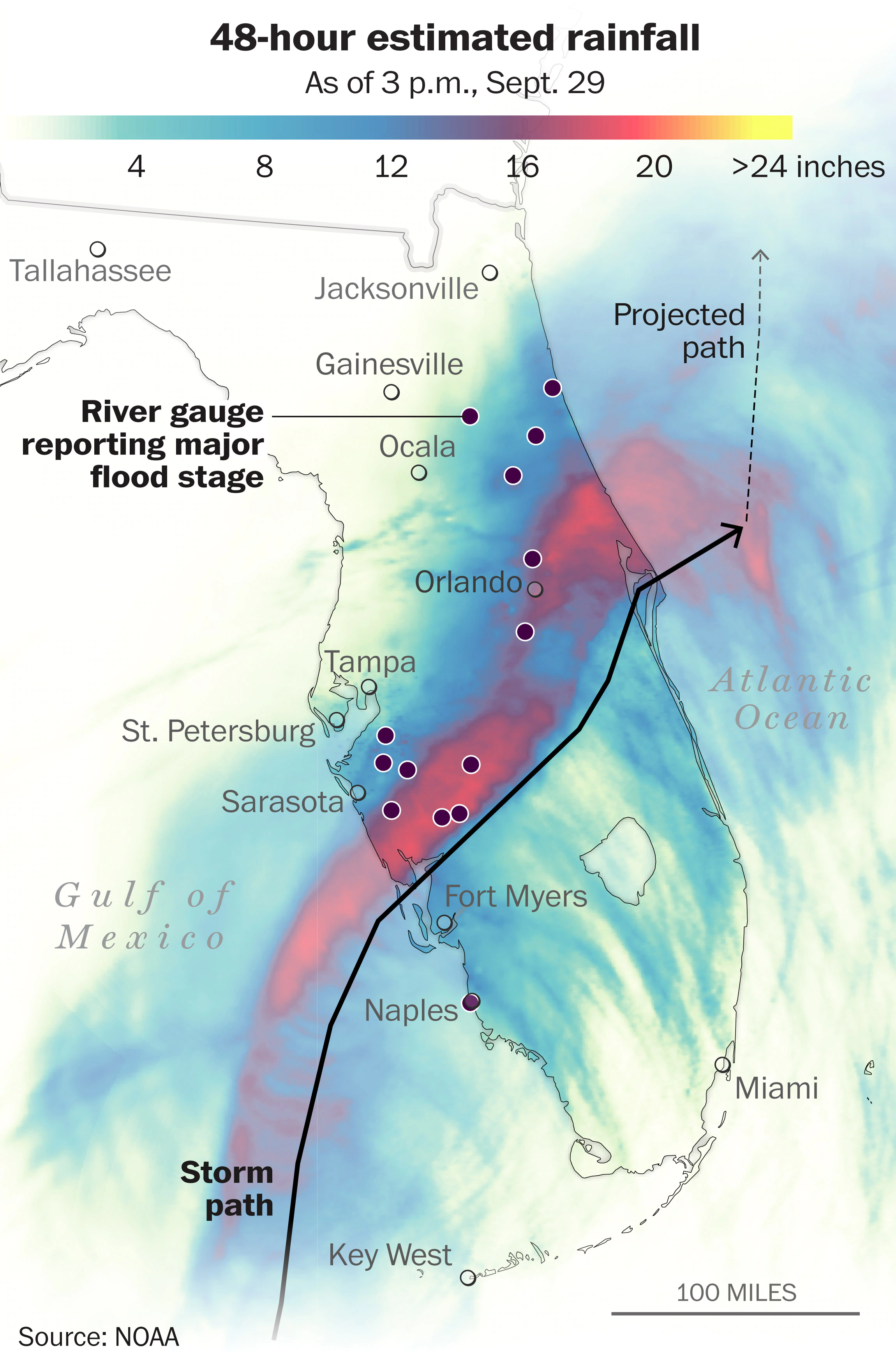
The hurricane made landfall in September 28 2022, and the eye of the hurricane passed through Florida from Saarsola to the Atlantic Ocean.
In this practical, we will use mobility data to see how different communities were affected by hurricane Ian in Florida in September 2022. See [1] for a review about how to use mobile phone data for natural disasters
Loading the data
Census data
First, we download data for different counties in Florida, including some demographic data from the US Census Bureau.
variables <- c(
  population = "B01003_001",              # Total Population
  median_household_income = "B19013_001", # Median Household Income
  median_home_value = "B25077_001"        # Median Home value
)
counties_FL <- get_acs(geography = "county",
                    variables = variables,
                    year = 2021, state = "FL",
                    geometry = TRUE,
                    output = "wide",
                    progress = FALSE,
                    ) |>
  st_transform(4326) |>
  mutate(NAME = str_remove(NAME, ", Florida")) |>
  rename(population = populationE,
         median_income = median_household_incomeE,
         median_home_value = median_home_valueE)
counties_FL <- st_read("/data/CUS/labs/14/counties_FL.geojson")Reading layer `counties_FL' from data source
`/data/CUS/labs/14/counties_FL.geojson' using driver `GeoJSON'
Simple feature collection with 67 features and 8 fields
Geometry type: MULTIPOLYGON
Dimension: XY
Bounding box: xmin: -87.63494 ymin: 24.5231 xmax: -80.03136 ymax: 31.00089
Geodetic CRS: WGS 84FEMA data
The FEMA also publishes those counties (designated areas) that were affected by the hurricane:
designated_areas <- st_read("/data/CUS/labs/14/CURRENT_DISASTER_DECLARATIONS.json") |>
  st_transform(4326)
Reading layer `CURRENT_DISASTER_DECLARATIONS' from data source
`/data/CUS/labs/14/CURRENT_DISASTER_DECLARATIONS.json' using driver `GeoJSON'
Simple feature collection with 75 features and 7 fields
Geometry type: MULTIPOLYGON
Dimension: XY
Bounding box: xmin: -87.6346 ymin: 24.5439 xmax: -80.0311 ymax: 31.0011
Geodetic CRS: WGS 84Here is the map of designated areas:
designated_areas |>
  ggplot() +
  geom_sf(aes(fill = designate)) +
  theme(legend.position = "bottom") +
  labs(title = "Designated areas for Hurricane Ian",
       fill = "Designation")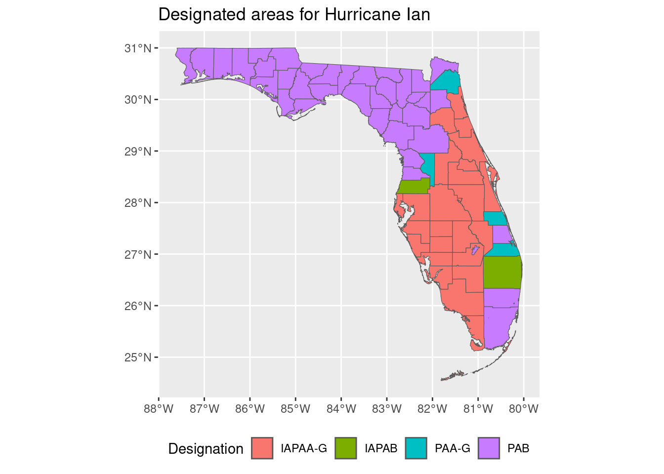
The different designations are:
- IA correspond to different categories of Individual assistance
- PA correspond to different categories of Public assistance
The most severe category is IA, which corresponds to the most severe damage.
Mobility data
We will use weekly patterns of visitations from Advan in FL in 2022. They are in the directory /data/CUS/safegraph/Weekly_Patterns_FL
weekly_patterns <- open_dataset("/data/CUS/safegraph/Weekly_Patterns_FL")Here is the schema
weekly_patternsFileSystemDataset with 22 Parquet files
placekey: string
parent_placekey: string
safegraph_brand_ids: string
location_name: string
brands: string
store_id: string
top_category: string
sub_category: string
naics_code: int64
latitude: double
longitude: double
street_address: string
city: string
region: string
postal_code: string
open_hours: string
category_tags: string
opened_on: string
closed_on: string
tracking_closed_since: string
websites: string
geometry_type: string
polygon_wkt: string
polygon_class: string
enclosed: bool
phone_number: double
is_synthetic: bool
includes_parking_lot: bool
iso_country_code: string
wkt_area_sq_meters: double
date_range_start: string
date_range_end: string
raw_visit_counts: double
raw_visitor_counts: double
visits_by_day: string
visits_by_each_hour: string
poi_cbg: string
visitor_home_cbgs: string
visitor_home_aggregation: string
visitor_daytime_cbgs: string
visitor_country_of_origin: string
distance_from_home: double
median_dwell: double
bucketed_dwell_times: string
related_same_day_brand: string
related_same_week_brand: string
device_type: string
normalized_visits_by_state_scaling: double
normalized_visits_by_region_naics_visits: double
normalized_visits_by_region_naics_visitors: double
normalized_visits_by_total_visits: double
normalized_visits_by_total_visitors: double
See $metadata for additional Schema metadataAs always, we will keep only some columns and only for some categories
cat_selected <- c("Grocery Stores",
                  "Gasoline Stations",
                  "Building Material and Supplies Dealers",
                  "Health and Personal Care Stores",
                  "Restaurants and Other Eating Places",
                  "Clothing Stores"
#                  "Amusement Parks and Arcades",
#                  "Personal Care Services"
#                  "Museums, Historical Sites, and Similar Institutions",
#                  "Other Amusement and Recreation Industries"
)
weekly_patterns <- weekly_patterns |>
  filter(top_category %in% cat_selected) |>
  select(placekey, location_name,
         top_category, sub_category,
         latitude, longitude, poi_cbg,
         date_range_start,
         raw_visit_counts,
         raw_visitor_counts) |>
  collect()
Analysis of the data
Let’s see how the visitation patterns were affected by the hurricane. We add the day to the weekly patterns data.
weekly_patterns <- weekly_patterns |>
  mutate(date = substr(date_range_start, 1, 10))
weekly_patterns |>
group_by(date) |>
summarise(total_visits = sum(raw_visit_counts,na.rm=T)) |>
mutate(total_visits = total_visits/mean(total_visits[date >= "2022-08-29" & date < "2022-09-26"])) |>
ggplot(aes(x = as.Date(date), y = total_visits)) +
geom_step() +
labs(title = "Total visits in Florida in September and October 2022",
subtitle = "Normalized to Aug/Sep 2022",
x = "Date",
y = "Total visits") +
geom_vline(xintercept = as.Date("2022-09-28"),
linetype = "dashed", color = "red")+
geom_hline(yintercept = 1, linetype="dashed")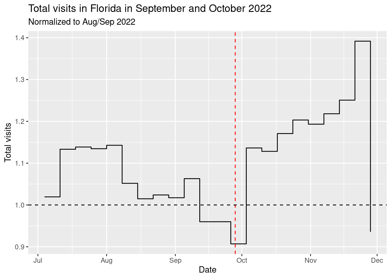
As we can see, the hurricane caused a significant drop (around 15%) in the number of visits during the week of the landfall (September 26-October 2). But after that there was a huge spike in the number of visits.
Let’s see by designated area. To do this, we get the list of counties in Florida in the IAPAA-G category (the one most affected)
counties_affected <- designated_areas |>
  filter(designate == "IAPAA-G") |>
  pull(fips)
And we add a column to the weekly patterns using the poi_cbg column.
weekly_patterns <- weekly_patterns |>
  mutate(county = substr(poi_cbg,1,5)) |>
  mutate(affected = ifelse(county %in% counties_affected,
                           "Affected", "Not Affected"))
Here is the plot of the total visits by designated area:
weekly_patterns |>
  group_by(date,affected) |>
  summarise(total_visits = sum(raw_visit_counts,na.rm=T)) |>
  group_by(affected) |>
  mutate(total_visits = total_visits/mean(total_visits[date >= "2022-08-29" & date < "2022-09-26"])) |>
  ggplot(aes(x = as.Date(date), y = total_visits,col=affected)) +
  geom_step() +
  labs(title = "Total visits in Florida in September and October 2022",
       x = "Date",
       y = "Total visits") +
  geom_vline(xintercept = as.Date("2022-09-28"),
             linetype = "dashed", color = "red")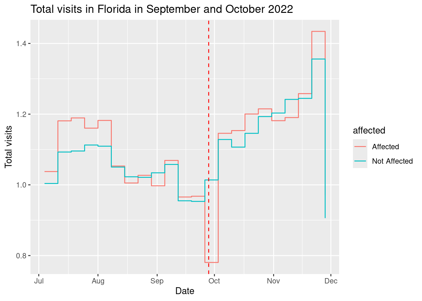
As we can see from the plot, the affected areas had a much larger drop in visits (around 25%) than the non-affected areas.
Variability by county
Let’s get only the counties that were more affected and see how is the recovery in those counties.
weekly_patterns |>
  filter(county %in% counties_affected) |>
  group_by(date,county) |>
  summarise(total_visits = sum(raw_visit_counts,na.rm=T)) |>
  group_by(county) |>
  mutate(total_visits = total_visits/mean(total_visits[date >= "2022-08-29" & date < "2022-09-26"])) |>
  ggplot(aes(x = as.Date(date), y = total_visits, col=county)) +
  geom_line() +
  labs(title = "Total visits in Florida in September and October 2022",
       x = "Date",
       y = "Total visits") +
  geom_vline(xintercept = as.Date("2022-09-28"),
             linetype = "dashed", color = "red")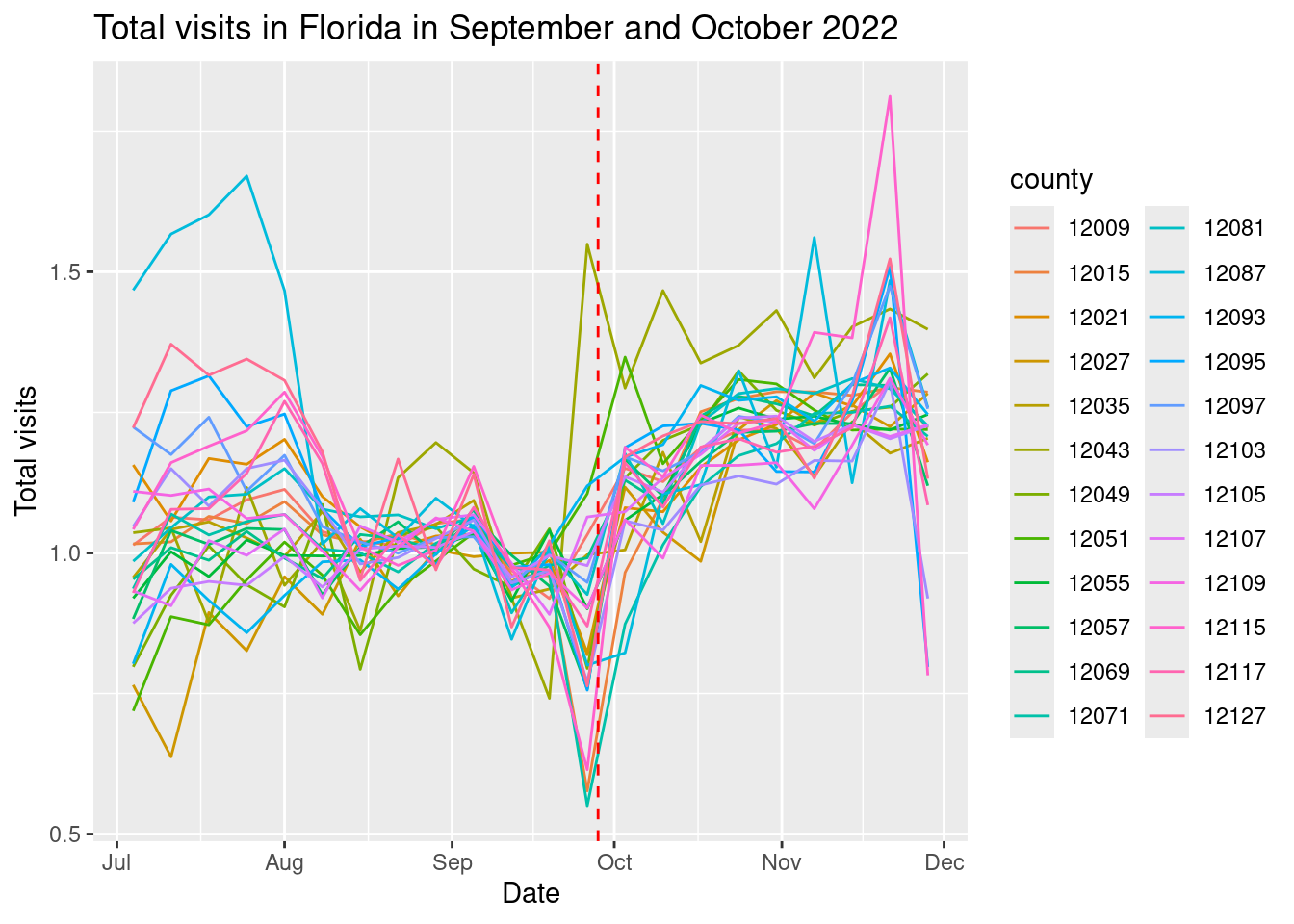
Analysis of impact of hurricane
Let’s define for each county, the drop in the number of visits during the week of the hurricane.
resilience_counties <- weekly_patterns |>
  group_by(date,county,affected) |>
  summarise(total_visits = sum(raw_visit_counts,na.rm=T)) |>
  group_by(county,affected) |>
  mutate(fvisits = total_visits/mean(total_visits[date >= "2022-08-29" & date < "2022-09-26"])) |>
  summarise(drop = 1-fvisits[date=="2022-09-26"])
Let’s put it together with the census data
counties_FL_resilience <- counties_FL |>
  left_join(resilience_counties,by=c("GEOID" = "county"))
Here is the drop by county
require(viridis)
counties_FL_resilience  |>
  ggplot() +  geom_sf(aes(fill=drop*100)) +
  scale_fill_viridis_c(option = "magma") +
  labs(title = "Drop in visits during the landfall of hurricane Ian",
       fill = "Drop in visits")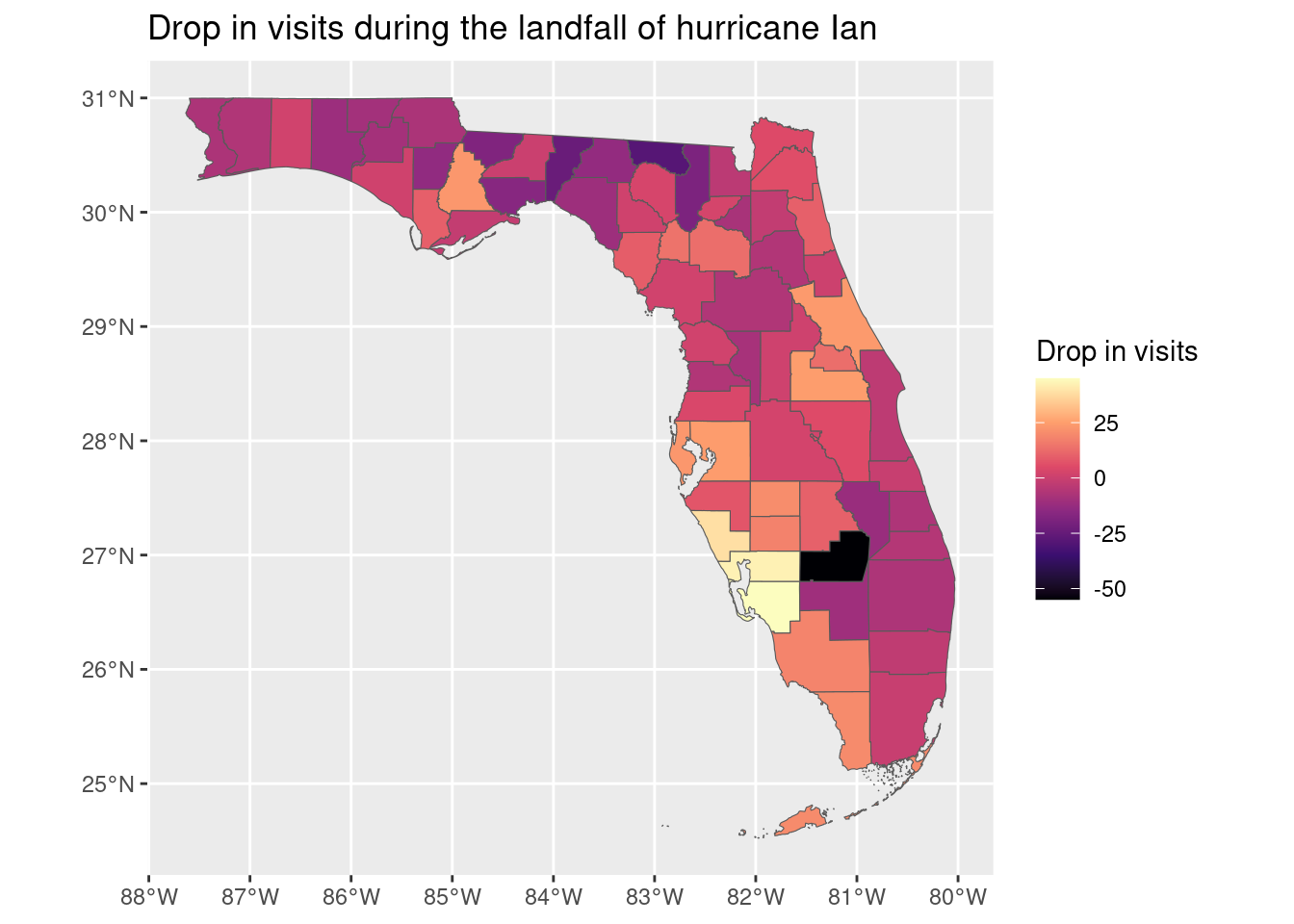
As we can see the drop was higher in the area where the hurricane made landfall (southwest Florida, Sarasota, Charlotte and Lee county).
counties_FL_resilience |> filter(drop > .30) |> st_drop_geometry() |>
  select(GEOID,NAME,drop,median_income,median_home_value) |>
  datatable()
The FEMA also publishes all financial assistance for the hurricane. We will use the Public Assistance Funded Projects Summaries, which is a summary of all the projects funded by FEMA. We collect the information only for disaster number 4673, which is the one for hurricane Ian.
assistance <- open_dataset("/data/CUS/labs/14/PublicAssistanceFundedProjectsSummaries.parquet") |>
  filter(disasterNumber==4673) |> collect() |>
  group_by(county) |> summarize(amount =sum(federalObligatedAmount,na.rm=T))
Let’s add this information to our resilience table:
counties_FL_resilience <- counties_FL_resilience |>
  left_join(assistance,by=c("NAME" = "county"))
Here is the amount of assistance by county and population:
counties_FL_resilience |>
  ggplot() +  geom_sf(aes(fill=amount/population)) +
  scale_fill_viridis_c(option = "magma",trans="log") +
  labs(title = "Amount of federal assistance for hurricane Ian",
       fill = "Federal assistance by person (in $)")+
  theme_minimal()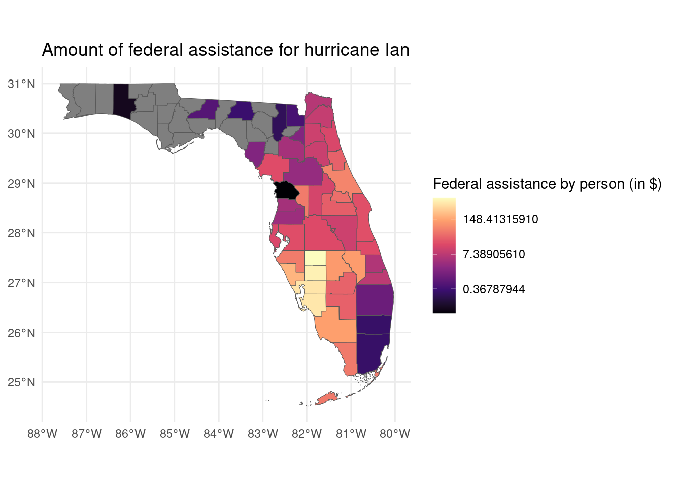
Finally we model the assistance of FEMA with the drop in visits. We will use the amount of assistance per capita, and the drop in visits and the median income of the area
data_model <- counties_FL_resilience |>
  mutate(median_income = scale(median_income),
         median_home_value = scale(median_home_value)) |>
  st_drop_geometry()
fit1 <- lm(amount/population ~ median_income, data = data_model)
fit2 <- lm(amount/population ~ drop, data = data_model)
fit3 <- lm(amount/population ~ drop + median_income, data = data_model)
stargazer(fit1, fit2, fit3, type = "text",
          title = "Impact of hurricane Ian on visits",
          dep.var.labels = c("Median Income", "Drop in visits"),
          covariate.labels = c("Median Income", "Drop in visits"),
          omit.stat = c("f", "ser"),
          single.row = TRUE,
          digits = 3)
Impact of hurricane Ian on visits
===========================================================================
                                   Dependent variable:
               ------------------------------------------------------------
                                      Median Income
                      (1)                 (2)                  (3)
---------------------------------------------------------------------------
Median Income   -42.624 (29.018)                       -84.273*** (24.416)
Drop in visits                    578.425*** (149.173) 738.348*** (141.621)
Constant       90.397*** (28.779)  59.601** (25.908)    66.624*** (23.332)
---------------------------------------------------------------------------
Observations           47                  47                   47
R2                   0.046               0.250                0.410
Adjusted R2          0.025               0.234                0.383
===========================================================================
Note:                                           *p<0.1; **p<0.05; ***p<0.01
As we can see the drop in visits and income are significantly associated with the amount of assistance. The more drop in visits, the more assistance. The more income, the less assistance.
Your turn
Beyond the analysis of the drop in visits, we can also analyze the increase in visits to certain categories which are related to the hurricane. For example, we can see how the visits to home improvement stores increased during and after the hurricane, see [2]. This could be a better way to understand how different communities were affected by the hurricane.
cat_selected <- c("Building Material and Supplies Dealers")Let’s get the time series for them
home_improvement <- weekly_patterns |>
  filter(top_category %in% cat_selected)

home_improvement |>
  group_by(date,top_category) |>
  summarise(total_visits = sum(raw_visit_counts,na.rm=T)) |>
  group_by(top_category) |>
  mutate(total_visits = total_visits/mean(total_visits[date >= "2022-08-29" & date < "2022-09-26"])) |>
  ggplot(aes(x = as.Date(date), y = total_visits, col=top_category)) +
  geom_line()+
  labs(title = "Total visits in Florida in September and October 2022",
       x = "Date",
       y = "Total visits") +
  geom_vline(xintercept = as.Date("2022-09-28"),
             linetype = "dashed", color = "red") +
  scale_color_tableau()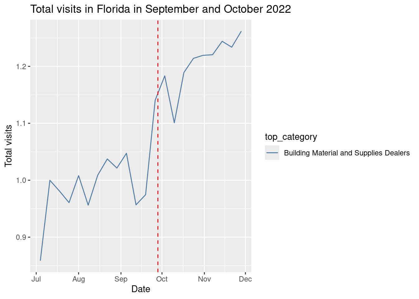
As we can see the visit to building material increased right after the hurricane. Let’s see it by areas:
home_improvement |>
  group_by(date,affected,top_category) |>
  summarise(total_visits = sum(raw_visit_counts,na.rm=T)) |>
  group_by(affected,top_category) |>
  mutate(total_visits = total_visits/mean(total_visits[date >= "2022-08-29" & date < "2022-09-26"])) |>
  ggplot(aes(x = as.Date(date), y = total_visits, col=affected)) +
  geom_line() +
  labs(title = "Total visits to home improvement stores in Florida in September and October 2022",
       x = "Date",
       y = "Total visits") +
  geom_vline(xintercept = as.Date("2022-09-28"),
             linetype = "dashed", color = "red") +
  facet_wrap(~top_category)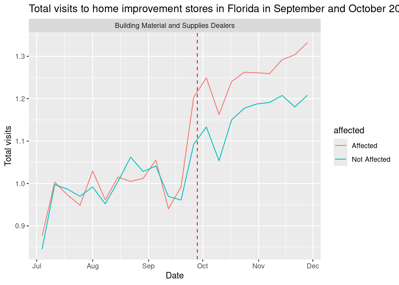
We see that the visits to home improvement stores increased significantly in the affected areas, while the visits the rest of categories increased steadily.
- Define a new variable which is the increase in visits to home improvement stores after the hurricane by county.
- Use that new variable to model the amount of assistance from FEMA.
resilience_counties_home <- home_improvement |>
  group_by(date,county) |>
  summarise(total_visits = sum(raw_visit_counts,na.rm=T)) |>
  group_by(county) |>
  mutate(fvisits = total_visits/mean(total_visits[date >= "2022-08-29" & date < "2022-09-26"])) |>
  summarise(home_improvement = sum(fvisits[date > "2022-09-26"]))
data_model <- data_model |> left_join(resilience_counties_home,by=c("GEOID" = "county")) |>
mutate(home_improvement = scale(home_improvement))
fit1 <- lm(amount/population ~ median_income, data = data_model)
fit2 <- lm(amount/population ~ drop, data = data_model)
fit3 <- lm(amount/population ~ drop + median_income, data = data_model)
fit4 <- lm(amount/population ~ drop + median_income + home_improvement,
data = data_model)
stargazer(fit1, fit2, fit3, fit4, type = "text",
title = "Impact of hurricane Ian on visits",
omit.stat = c("f", "ser"),
single.row = TRUE,
digits = 3)
Impact of hurricane Ian on visits
==================================================================================================
                                                Dependent variable:
                 ---------------------------------------------------------------------------------
                                                 amount/population
                        (1)                 (2)                  (3)                  (4)
--------------------------------------------------------------------------------------------------
median_income     -42.624 (29.018)                       -84.273*** (24.416)  -86.805*** (23.500)
home_improvement                                                                52.070* (27.148)
drop                                578.425*** (149.173) 738.348*** (141.621) 749.192*** (165.719)
Constant         90.397*** (28.779)  59.601** (25.908)    66.624*** (23.332)   55.882** (23.169)
--------------------------------------------------------------------------------------------------
Observations             47                  47                   47                   46
R2                     0.046               0.250                0.410                0.498
Adjusted R2            0.025               0.234                0.383                0.462
==================================================================================================
Note:                                                                  *p<0.1; **p<0.05; ***p<0.01
Evacuation
Mandatory evacuations were ordered for some counties in Florida before hurricane. We can use the mobility data to see how many people evacuated from those counties and where did they go, see [3]. To do that, we are going to use the mobility data to see where people from affected counties shop for groceries during the hurricane and after it.
Let’s get the weekly patterns for groceries
cat_selected <- c("Grocery Stores")
weekly_patterns <- open_dataset("/data/CUS/safegraph/Weekly_Patterns_FL")
groceries <- weekly_patterns |>
  filter(top_category %in% cat_selected) |>
  select(placekey, location_name,
         top_category, sub_category,
         latitude, longitude, poi_cbg,
         date_range_start,
         raw_visit_counts,
         raw_visitor_counts,
         visitor_home_aggregation) |>
  collect()
groceries <- groceries |>
  mutate(date = substr(date_range_start, 1, 10))
and expand it to include the home census tract were people are coming from
groceries_expanded <- groceries |>
  group_by(placekey,location_name) |>
  mutate(visitor_home_aggregation = str_replace_all(visitor_home_aggregation, '""', '"')) |>
  mutate(
    # Parse JSON safely with error handling
    visitor_home_aggregation =
      map(visitor_home_aggregation,
          ~ tryCatch(fromJSON(.x),
                     error = function(e) NULL  # Replace errors with NULL
          ))
  ) |>
  filter(!map_lgl(visitor_home_aggregation, is.null)) |>
  # Expand JSON into rows
  unnest_longer(visitor_home_aggregation) %>%
  # Rename columns
  rename(Home_ID = visitor_home_aggregation_id, Count = visitor_home_aggregation)
Let’s select only the census tracts of those counties more affected: Lee, Charlotte, and Sarasota.
counties_affected <- counties_FL_resilience |> filter(drop > .30) |> pull(GEOID)
groceries_affected <- groceries_expanded |>
  filter(substr(Home_ID,1,5) %in% counties_affected)
Finally, we calculate where people were buying before, during and after the hurricane
groceries_total <- groceries_affected |>
  filter(date %in% c("2022-09-19","2022-09-26","2022-10-03","2022-10-10")) |>
  group_by(county_visit=substr(poi_cbg,1,5),date) |>
  summarise(total_visits = sum(raw_visit_counts,na.rm=T))
This is the change compared to before the hurricane
groceries_table <- groceries_total |>
  group_by(county_visit) |>
  summarize(change_during = total_visits[date=="2022-09-26"]/total_visits[date=="2022-09-19"],
            change_after = total_visits[date=="2022-10-03"]/total_visits[date=="2022-09-19"],
            change_after2 = total_visits[date=="2022-10-10"]/total_visits[date=="2022-09-19"])
Here is for the week before
gduring <- counties_FL |>
  left_join(groceries_table,c("GEOID"="county_visit")) |>
  ggplot() +
  geom_sf(aes(fill=change_during)) +
  scale_fill_viridis_c(option = "magma") +
  labs(title = "Visits week during hurricane",
       fill = "Total visits")
gafter <- counties_FL |>
  left_join(groceries_table,c("GEOID"="county_visit")) |>
  ggplot() +
  geom_sf(aes(fill=change_after)) +
  scale_fill_viridis_c(option = "magma") +
  labs(title = "Visits week after hurricane",
       fill = "Total visits")
gafter2 <- counties_FL |>
  left_join(groceries_table,c("GEOID"="county_visit")) |>
  ggplot() +
  geom_sf(aes(fill=change_after2)) +
  scale_fill_viridis_c(option = "magma") +
  labs(title = "Visits 2 weeks after hurricane",
       fill = "Total visits")
gduring + gafter + gafter2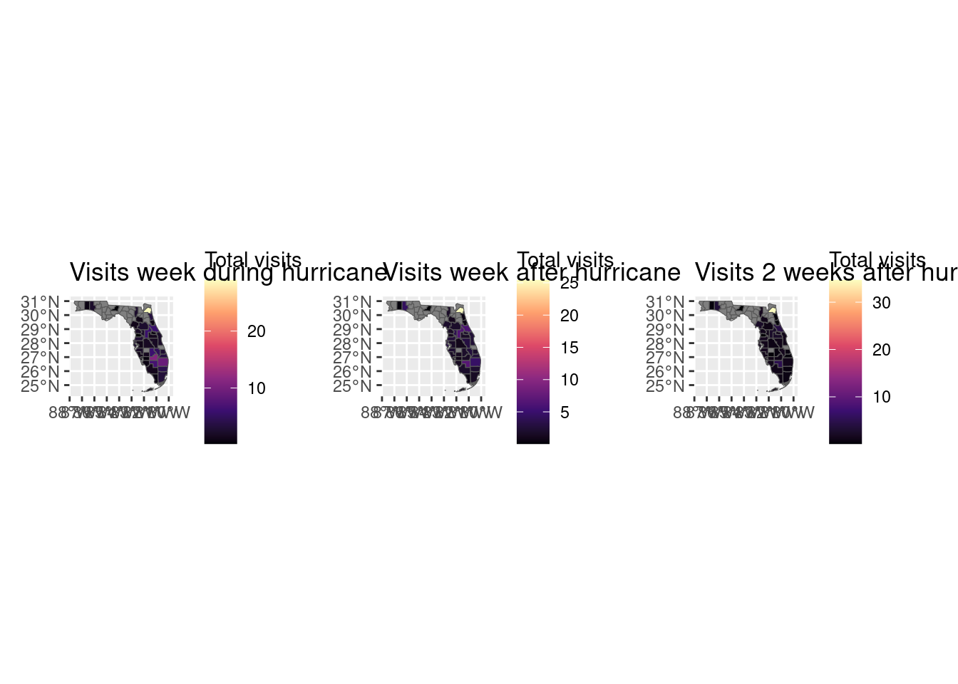
As we can see, visits to grocery for residents of affected areas increased in places like Jacksonville or counties in the south east of Florida.
Conclusion
In this practical, we have seen how to use mobility data to analyze the impact of natural disasters on different communities.
- We have seen how the response of different communities varied widely, and how the amount of federal assistance (almost one year later) was related to the drop in visits.
- We have also seen how mobility data can be use to understand where people evacuated to during the hurricane, and how that changed over time.
References
[1]
T. Yabe, N. K. Jones, P. S. C. Rao, M. C. Gonzalez, and S. V. Ukkusuri, “Mobile phone location data for disasters: A review from natural hazards and epidemics,” Computers, Environment and Urban Systems, vol. 94, p. 101777, 2022.
[2]
B. Li and A. Mostafavi, “Location intelligence reveals the extent, timing, and spatial variation of hurricane preparedness,” Scientific Reports, vol. 12, no. 1, p. 16121, Sep. 2022, doi: 10.1038/s41598-022-20571-3.
[3]
X. Li, Qiang, and G. and Cervone, “Using human mobility data to detect evacuation patterns in hurricane Ian,” Annals of GIS, vol. 30, no. 4, pp. 493–511, Oct. 2024, doi: 10.1080/19475683.2024.2341703.