Lab 15-1 - Impact of NYC Open Streets on foot traffic
Author
Affiliations
Esteban Moro
Network Science Institute, Northeastern University
NETS 7983 Computational Urban Science
Published
April 17, 2025
Objective
In this practical we will study a urban intervention (Open Streets) in New York City and use causal inference to see its effect on foot traffic on those areas. To analyze it we will use Advan/Safegraph data of visits to POIs in NYC during 2020.
We will check the sensibility of the estimated impact of the intervention towards the definition of treated and control areas and possible confounders.
Introduction
The “New York State on PAUSE” executive order, enacted on March 22, 2020 changed completely the life of newyorkers by mandating business closures, limiting gatherings, encouraging mask-wearing and reduced public transport. All those non-pharmatheutical interventions changes completely city’s mobility patterns.
The PAUSE directive was terminated on May 15, 2020 and, around the same time, New York City (NYC) launched the Open Streets Program (OSP) to create more space for pedestrian activities by planning to transform 100 out of New York’s 6000 miles of streets to exclusive pedestrian use, outdoor dining, resulting in more socially distance outdoor space.
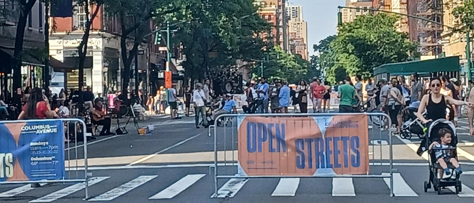
Orchard Street Open Street, from NYC DOT report
The program is still in place and since May 2020 the Department of Transportation of NYC has been working with community-based orgranizations and business districts to decide and execute Open Streets citywide.
The impact of the program is large. According to the NYC DOT report of the interventions done in 2020 and 2021, Open Street areas increased their foot traffic and businesses spending around 20% while areas nearby were down nearly 30%.
However, the evaluation of the intervention was done using traditional methods using changes in mobility in similar urban corridors in nearby areas as counterfactuals. Moreover, the intervention happened right at the beginning of the pandemic, when residents altered their behavior significantly. For all these reasons, the evaluation of the policy was significantly affected by:
Spillovers, by comparing with nearby areas
Confounding changes of behavior, due to the pandemic.
In this practical we will take care of both by defining properly a set of treated and control groups.
Load data
Location of Open Streets
The NYC maitains a webpage with all Open Streets locations and their status. The current version of the data has only the streets that are participating now, but using Internet Archive, we can get the data from the past. From the 2021 version of the webpage we can get the Open Streets locations from the beginning of the program
As always, we only keep the columns we need. In this practical we will only consider bars and restaurants (as was done in the NYC DoT report), but you can also use the data for other types of POIs.
visits <- visits |>filter(TOP_CATEGORY %in%c("Restaurants and Other Eating Places", "Drinking Places (Alcoholic Beverages)")) |>select(PLACEKEY, LOCATION_NAME, TOP_CATEGORY, SUB_CATEGORY, LATITUDE, LONGITUDE, POI_CBG, DATE_RANGE_START, RAW_VISIT_COUNTS, RAW_VISITOR_COUNTS) |>collect() |>mutate(TOP_CATEGORY =recode(TOP_CATEGORY,"Restaurants and Other Eating Places"="Restaurants","Drinking Places (Alcoholic Beverages)"="Bars"))
We only keep the visits in the five counties in NYC
This is the list of POIs considered in the NYC area
pois <- visits |>group_by(PLACEKEY,LOCATION_NAME,TOP_CATEGORY) |>summarize(lat =mean(LATITUDE),lon =mean(LONGITUDE),total_visits =sum(RAW_VISIT_COUNTS,na.rm=T))
Since a number of POI closed down during the pandemic, to evaluate the impact of the policy we only keep places that were open in 2020 and have a number of visits. For those, here is the distribution of the number of visits during 2020:
pois <- pois |>filter(total_visits >100)pois |>ggplot() +geom_density(aes(x=total_visits)) +scale_x_log10()
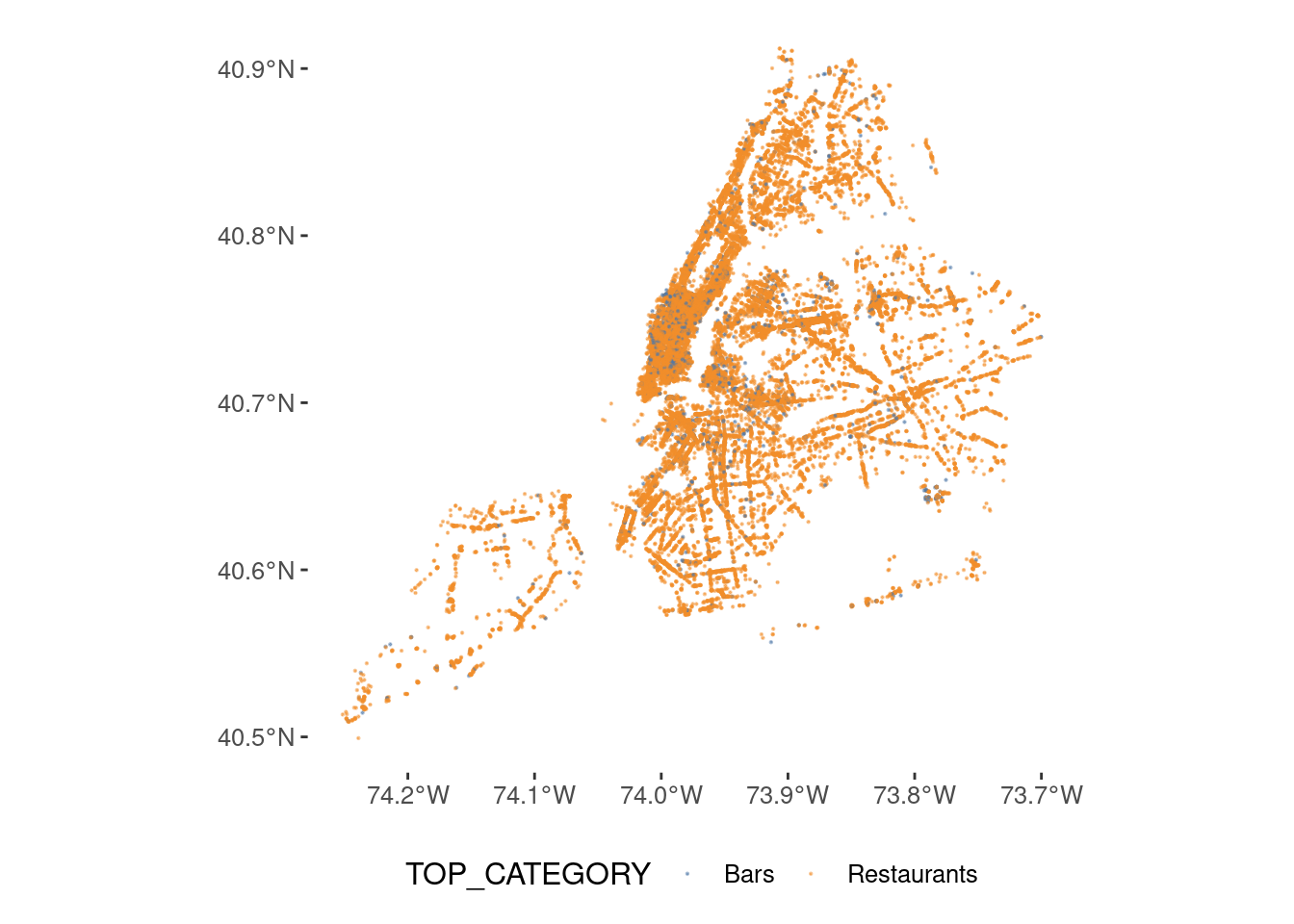
pois <- pois |>st_as_sf(coords =c("lon", "lat"), crs =4326, remove =FALSE) ggplot(pois) +geom_sf(aes(col=TOP_CATEGORY),size=0.1,alpha=0.5) +scale_color_tableau()
This is the distribution by to category
pois |>st_drop_geometry() |>group_by(TOP_CATEGORY) |>count()
# A tibble: 2 × 2
# Groups:   TOP_CATEGORY [2]
  TOP_CATEGORY     n
  <chr>        <int>
1 Bars          2342
2 Restaurants  27982
Monthly visitation patterns
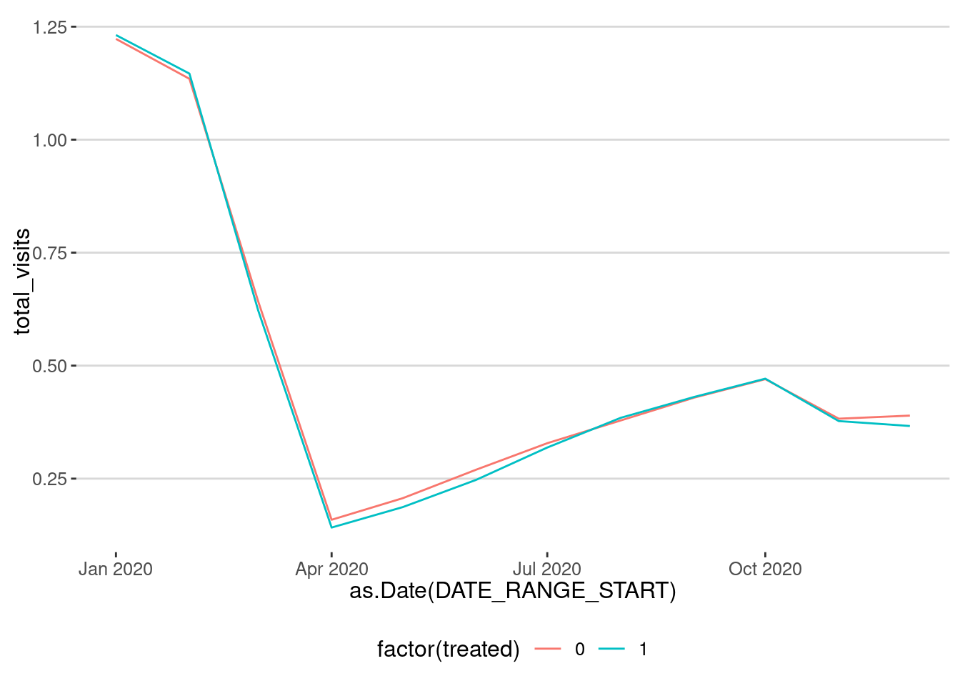
Let’s see how was the visitation pattern to bars and restaurants in NYC during the pandemic:
visits |>group_by(TOP_CATEGORY,DATE_RANGE_START) |>summarize(total_visits =sum(RAW_VISIT_COUNTS, na.rm =TRUE)) |>mutate(total_visits = total_visits/mean(total_visits[DATE_RANGE_START <"2020-03-15"])) |>ggplot(aes(x=as.Date(DATE_RANGE_START), y=total_visits, color=TOP_CATEGORY)) +geom_line() +geom_point() +labs(title="Normalized Monthly visitation patterns to bars and restaurants in NYC",x="Date", y="Normalized Number of visits") +scale_x_date(date_labels ="%b", date_breaks ="1 month")
Causal inference
We first have to define the control and treatment groups. The treatment group are the bars and restaurants that are close to Open Streets. We can define a buffer around each of the streets participating in the program of 50 meters
open_streets_buffer_treated <- open_streets |>st_transform(crs =32618) |># UTM Zone 18N, units = metersst_buffer(dist =50) |>st_transform(crs =4326) |># WGS84, units = degreesst_make_valid()
For example, here is the one of the Open Streets and the buffer around it
leaflet() |>addTiles() |>addPolygons(data=open_streets_buffer_treated[5,], color ="red", fillOpacity =0.2) |>addPolylines(data=open_streets[5,], col="green",weight =10)
We will consider that the restaurants and bars that are within the buffer of the Open Streets are the treated group.
pois_treated <- pois |>st_join(open_streets_buffer_treated |>select(SegmentID), join = st_intersects) |>filter(!is.na(SegmentID)) |>unique()
Here is the map of the bars and restaurants that are within the buffer of the Open Street selected
leaflet() |>addTiles() |>addPolygons(data=open_streets_buffer_treated[5,], color ="red", fillOpacity =0.2) |>addPolylines(data=open_streets[5,], col="green",weight =10) |>addCircleMarkers(data=pois_treated |>filter(SegmentID==open_streets$SegmentID[5]),radius =4, color ="darkblue",weight=10)
For the control we have different options.
The first one is to consider the rest of POIs in NYC that are not within the buffer of the Open Streets.
The second option is to consider POIs which are not far away from the Open Streets, but not within the buffer. For example, we can consider as controls all POIs which are in a buffer between 50 meters and 1 km away from the Open Streets.
Let’s do the last one, by getting all the POIs that are within 1 km the Open Streets, and then removing the ones that are within 50 meters.
open_streets_buffer_control <- open_streets |>st_transform(crs =32618) |># UTM Zone 18N, units = metersst_buffer(dist =1000) |>st_transform(crs =4326) |># WGS84, units = degreesst_make_valid()
Here is the map of treated and control POIs for the Open Street selected
leaflet() |>addTiles() |>addPolygons(data=open_streets_buffer_control[5,], color ="orange", fillOpacity =0.2) |>addPolygons(data=open_streets_buffer_treated[5,], color ="red", fillOpacity =0.2) |>addPolylines(data=open_streets[5,], col="green",weight =10) |>addCircleMarkers(data=pois_treated |>filter(SegmentID==open_streets$SegmentID[5]),radius =4, color ="darkblue",weight=10) |>addCircleMarkers(data=pois_control |>filter(SegmentID==open_streets$SegmentID[5]),radius =2, color ="darkred", fillOpacity =0.2)
Difference in Differences
Ones we have our two groups, we can construct the time series. Since most of the Open Streets were opened in May and June 2020, let’s consider the post period as July 1st.
OLS estimation, Dep. Var.: log(RAW_VISIT_COUNTS)
Observations: 226,922
Fixed-effects: PLACEKEY: 18,916
Standard-errors: Clustered (PLACEKEY)
              Estimate Std. Error   t value   Pr(>|t|)
post         -0.070515   0.002487 -28.35673  < 2.2e-16 ***
treated:post  0.045534   0.006892   6.60678 4.0323e-11 ***
... 1 variable was removed because of collinearity (treated)
---
Signif. codes:  0 '***' 0.001 '**' 0.01 '*' 0.05 '.' 0.1 ' ' 1
RMSE: 0.582163     Adj. R2: 0.897858
                 Within R2: 0.00323
As we can see the effect is positive and around 4.5%.
Controlling for potential spill-overs
The POIs in our control group are just 50 meters away from the Open Streets. Than means that probably they are also affected by the intervention because of spatial spillovers. Here we modify the definition of the buffer area to account for those potential spill overs.
Similarly to [1], we define POIs in the control group to be further than 300m from those streets. Also, we force them to be close enough to be similar to the treated areas, so the are not further than 600m. Thus we define a buffer ring around them
open_streets_buffer_large <- open_streets |>st_transform(crs =32618) |># UTM Zone 18N, units = metersst_buffer(dist =600) |>st_transform(crs =4326) |># WGS84, units = degreesst_make_valid()open_streets_buffer_small <- open_streets |>st_transform(crs =32618) |># UTM Zone 18N, units = metersst_buffer(dist =300) |>st_transform(crs =4326) |># WGS84, units = degreesst_make_valid()pois_small<- pois |>st_join(open_streets_buffer_small |>select(SegmentID), join = st_intersects) |>filter(!is.na(SegmentID))pois_large <- pois |>st_join(open_streets_buffer_large |>select(SegmentID), join = st_intersects) |>filter(!is.na(SegmentID))
OLS estimation, Dep. Var.: log(RAW_VISIT_COUNTS)
Observations: 83,797
Fixed-effects: PLACEKEY: 6,985
Standard-errors: Clustered (PLACEKEY)
              Estimate Std. Error   t value   Pr(>|t|)
post         -0.081586   0.004449 -18.33670  < 2.2e-16 ***
treated:post  0.056604   0.007818   7.24049 4.9487e-13 ***
... 1 variable was removed because of collinearity (treated)
---
Signif. codes:  0 '***' 0.001 '**' 0.01 '*' 0.05 '.' 0.1 ' ' 1
RMSE: 0.580994     Adj. R2: 0.900139
                 Within R2: 0.003553
As we can see, the effect is a little bit bigger, around 5.5%, after we have controlled for potential spillovers.
Your turn
Use different buffer rings and estimate the sensibility of the causal effect with the width and distance from the intervention
Placebo test
To check the validity of our causal inference, especially with DiD and other quasi-experimental techniques, it is always useful to do a placebo test, which ensure that any observed effects are truly due to the intervention and not driven by pre-existing trends, confounding variables, or spurious correlations.
There are several ways to do it.
The first one is very simple: we randomize the beginning of the intervention (time-placebo).
The second one is to randomize the treatment assignment within each group of POIs. In our case, each group is one Open Street (group-placebo).
The third one will be to take randomly other streets in the NYC area and make them our treated group and reconstruct the control group from them (spatial-placebo).
Let’s try the first two. Let’s assume that the treatment started in October 2020, almost 5 months after it started and we only consider the months after the real intervention.
OLS estimation, Dep. Var.: log(RAW_VISIT_COUNTS)
Observations: 83,797
Fixed-effects: PLACEKEY: 6,985
Standard-errors: Clustered (PLACEKEY)
              Estimate Std. Error   t value   Pr(>|t|)
post         -0.083130   0.004451 -18.67735  < 2.2e-16 ***
treated:post  0.060378   0.007830   7.71111 1.4205e-14 ***
... 1 variable was removed because of collinearity (treated)
---
Signif. codes:  0 '***' 0.001 '**' 0.01 '*' 0.05 '.' 0.1 ' ' 1
RMSE: 0.580973     Adj. R2: 0.900147
                 Within R2: 0.003626
As we can see the placebo effect is very large, comparable to the one found. This means that the causal effect detected is not fully due to the intervention and that there is a confounding variable or effect on the visitation patterns which accounts for the different visitation patterns to those streets.
Your turn
To account for possible counfounders and heterogeneous effects, repeat the DiD analysis controlling for:
The county where the intervention was done.
The subcategory of the POIs
The income of the area where the intervention happened
In this practical we have seen how we can use spatial causal inference to analyze the effect of an intervention in urban areas. As we saw, the effect of spillovers of confounders can greatly impact the evaluation of policies and we should:
Design a strategy to select the treatment and control groups.
Check the sensibility and robustness of our results towards our choices
Implement different placebo tests to account for potential unknown confounders.
Our results indicate that the effect of the intervention was not so large as reported by the DoT.
H. H. Rong and L. Freeman, “The impact of the built environment on human mobility patterns during Covid-19: A study of NewYorkCity’s OpenStreetsProgram,”Applied Geography, vol. 172, p. 103429, Nov. 2024, doi: 10.1016/j.apgeog.2024.103429.
 However, the evaluation of the intervention was done using traditional methods using changes in mobility in similar urban corridors in nearby areas as counterfactuals. Moreover, the intervention happened right at the beginning of the pandemic, when residents altered their behavior significantly. For all these reasons, the evaluation of the policy was significantly affected by: