library(tidycensus)
library(tidyverse)
library(tigris)
library(sf)
library(osmdata)
library(leaflet)
library(arrow)
library(corrplot)
library(factoextra)Lab 2-1 - Predicting transit accessibility with census data
Objective
In this practical, we are going to practice with the census: retrieving it, mapping it, and combining it with other spatial data. We will use an analysis of transit accessibility as a way to explore the underlying social characteristics these data measure.
The aim of this practical is to learn how to:
- Retrieve, process, and analyze census data for different geographies / variables.
- Combine geo-referenced census data with other spatial features (from Open Street Map) for analysis.
- Compute a measure of public transit accessibility and assess how well this measure is predicted by census variables.
- Conduct a social area analysis using dimensionality reduction (PCA) to identify the factors which differentiate census variables.
Before starting:
Ensure you have access to the
stellaserver: stella.socialurban.netLoad required packages
Configure the API key in your R environment
Sys.setenv(CENSUS_API_KEY = "YOUR_API_KEY")Then call the
tidycensus::census_api_keyfunction:census_api_key(Sys.getenv("CENSUS_API_KEY"), install = TRUE, overwrite=TRUE)[1] "a4eeffc6464d8c120634bf9e1cfd3b7de47373ff"
Loading Census Data With tidycensus
To recap, the tidycensus package gives us a simple way to retrieve census data for a given variable and set of geographic units.
Note: in this practical, we will use data from the American Community Survey (ACS) because of the greater number of variables. To do this, we will use the tidycensus::get_acs function. The decennial census is also available with tidycensus::get_decennial.
Lets start by retrieving median household income in US states. For a list of the different variables available from the ACS, a good place to start is the ACS Variable Explorer. If you know what you are looking for, you can use the search bar to find the variable code(s). You can also use the Excel files containing all the tables names and their geographical coverage
medincome <- get_acs(geography = "state",
                   variables = "B19013_001",
                   year = 2021,
                   progress = FALSE)

head(medincome)
# A tibble: 6 × 5
GEOID NAME variable estimate moe
<chr> <chr> <chr> <dbl> <dbl>
1 01 Alabama B19013_001 54943 377
2 02 Alaska B19013_001 80287 1113
3 04 Arizona B19013_001 65913 387
4 05 Arkansas B19013_001 52123 458
5 06 California B19013_001 84097 236
6 08 Colorado B19013_001 80184 450Exercise 1
Try downloading other variables using codes you find with the ACS Variable Explorer. Are cross-tabulations of multiple variables in the same format as univariate tables?
Inspect all of the variables available in the 2021 ACS.
tidycensushas a helpful function for this:load_variables(2021, "acs5", cache = TRUE).The beginning of the variable code indicates the table. What does the suffix
_001in the code block above indicate?
Mapping Census Data
tidycensus integrates with sf to return spatial boundaries for geographic units. We can add spatial boundaries using geometry = TRUE.
medincome <- get_acs(geography = "state",
                     variables = "B19013_001",
                     year = 2021,
                     geometry=TRUE,
                     progress=FALSE)

ggplot(medincome) +
    geom_sf(aes(fill=estimate))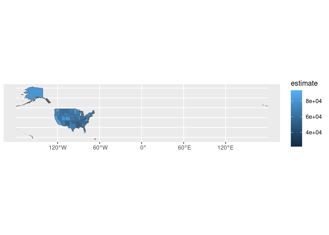
We can simplify the plot by restricting to states in the continental US.
medincome_continental_usa <- medincome %>%
    filter(!NAME %in% c("Alaska", "Hawaii", "Guam", "Puerto Rico"))

ggplot(medincome_continental_usa) +
    geom_sf(aes(fill=estimate))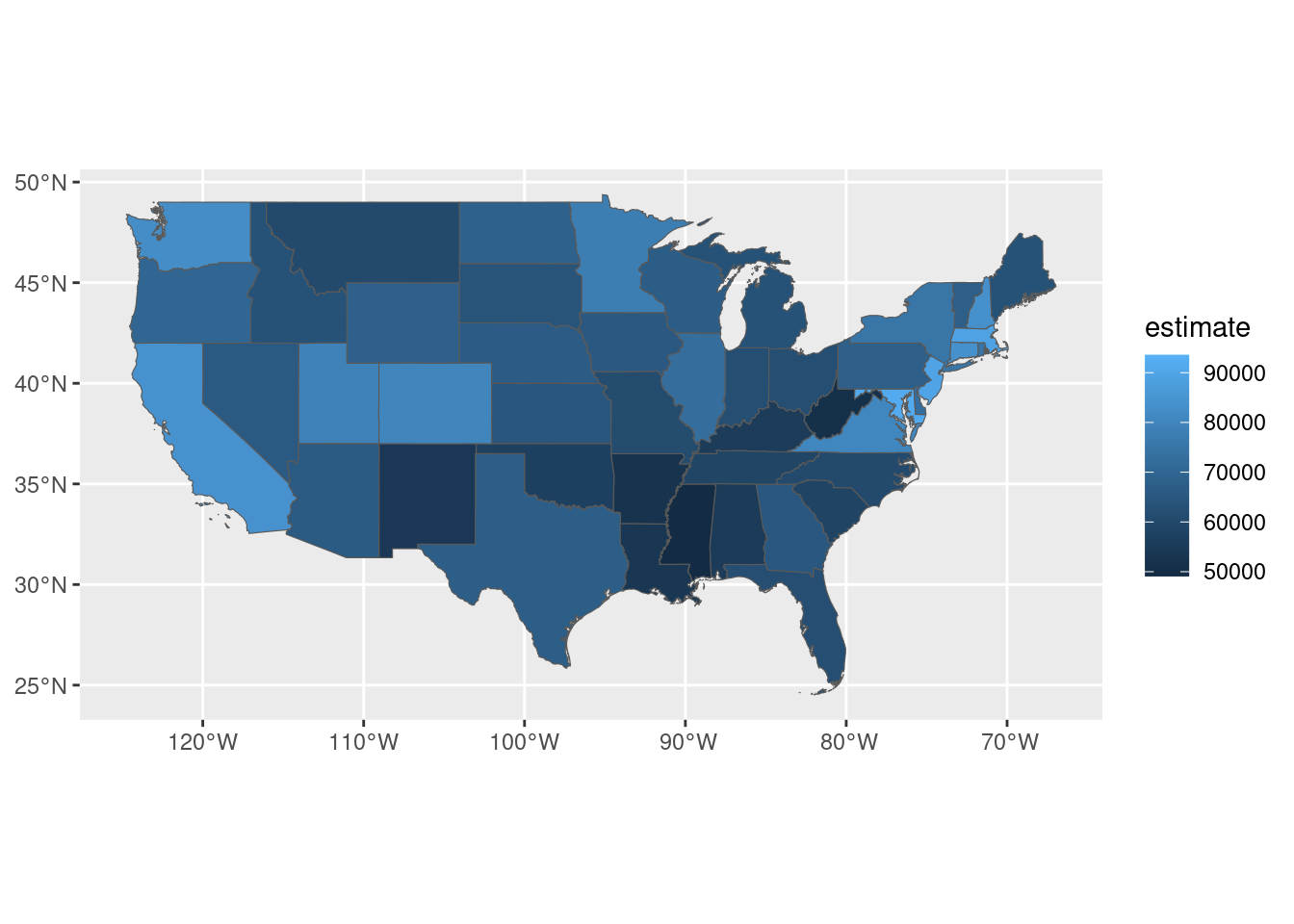
Remember the hierarchy of US statistical geographies? You can download data for any of these geographies with tidycensus.
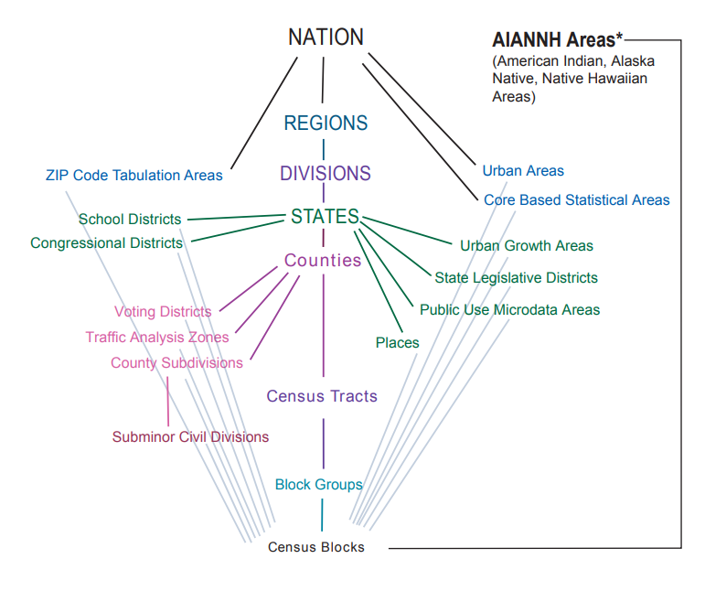
See the list of available geographies here.
We can also filter for some higher-level geographies. Lets get median household income for Census Block Groups in Massachusetts.
medincome_ma <- get_acs(
  geography = "cbg",
  variables = "B19013_001",
  survey = "acs5",
  year = 2021,
  state = "MA",
  geometry = TRUE,
  progress = FALSE
)

head(medincome_ma)
Simple feature collection with 6 features and 5 fields
Geometry type: MULTIPOLYGON
Dimension: XY
Bounding box: xmin: -73.23035 ymin: 42.02425 xmax: -70.17674 ymax: 42.71779
Geodetic CRS: NAD83
GEOID
1 250092201013
2 250277544002
3 250010101003
4 250039352004
5 250092505002
6 250251604003
NAME variable
1 Block Group 3, Census Tract 2201.01, Essex County, Massachusetts B19013_001
2 Block Group 2, Census Tract 7544, Worcester County, Massachusetts B19013_001
3 Block Group 3, Census Tract 101, Barnstable County, Massachusetts B19013_001
4 Block Group 4, Census Tract 9352, Berkshire County, Massachusetts B19013_001
5 Block Group 2, Census Tract 2505, Essex County, Massachusetts B19013_001
6 Block Group 3, Census Tract 1604, Suffolk County, Massachusetts B19013_001
estimate moe geometry
1 46375 31560 MULTIPOLYGON (((-70.62159 4...
2 105221 46248 MULTIPOLYGON (((-71.88907 4...
3 63333 52688 MULTIPOLYGON (((-70.18885 4...
4 NA NA MULTIPOLYGON (((-73.22953 4...
5 42500 28364 MULTIPOLYGON (((-71.17149 4...
6 112393 34802 MULTIPOLYGON (((-71.04615 4...Our study area is the inner core: Boston plus the adjacent places Somerville, Cambridge, Brookline, Revere, Malden, Everett, Medford, Chelsea, and Winthrop. That is smaller than the Boston–Cambridge–Newton MSA, and larger than the City of Boston. We will use this same boundary for the census extract and for the transit-accessibility analysis.
We can get these place boundaries from tigris, an R package that provides access to Census geographic boundaries and is closely coupled to tidycensus. See Census geographic data and applications in R for more information.
boston_area_towns <- c("Boston", "Somerville", "Cambridge", "Brookline", "Revere", "Malden", "Everett", "Medford", "Chelsea", "Winthrop Town")
boston_boundary <- places(state = "MA", cb = TRUE, year=2021,progress=FALSE) %>%
  filter(NAME %in% boston_area_towns)
Exercise 2
- Using what you learned in lab-1-1, check that this inner-core boundary is correct by plotting it on an interactive map using
leaflet. You should see ten place polygons, not the City of Boston alone.
Restricting Census data to our area of interest
Now, using st_filter from the sf package, we can filter for CBGs that intersect the inner core.
medincome_boston <- medincome_ma %>%
  st_filter(boston_boundary)

head(medincome_boston)
Simple feature collection with 6 features and 5 fields
Geometry type: MULTIPOLYGON
Dimension: XY
Bounding box: xmin: -71.11753 ymin: 42.32981 xmax: -71.02934 ymax: 42.40286
Geodetic CRS: NAD83
GEOID
1 250251604003
2 250250106001
3 250250709021
4 250214001001
5 250250811011
6 250251601031
NAME variable
1 Block Group 3, Census Tract 1604, Suffolk County, Massachusetts B19013_001
2 Block Group 1, Census Tract 106, Suffolk County, Massachusetts B19013_001
3 Block Group 1, Census Tract 709.02, Suffolk County, Massachusetts B19013_001
4 Block Group 1, Census Tract 4001, Norfolk County, Massachusetts B19013_001
5 Block Group 1, Census Tract 811.01, Suffolk County, Massachusetts B19013_001
6 Block Group 1, Census Tract 1601.03, Suffolk County, Massachusetts B19013_001
estimate moe geometry
1 112393 34802 MULTIPOLYGON (((-71.04615 4...
2 113875 65734 MULTIPOLYGON (((-71.08182 4...
3 82813 41269 MULTIPOLYGON (((-71.07883 4...
4 56528 27626 MULTIPOLYGON (((-71.11718 4...
5 53988 27818 MULTIPOLYGON (((-71.11302 4...
6 32788 31124 MULTIPOLYGON (((-71.03354 4...We can then make a Choropleth map of income in inner-core CBGs.
ggplot(medincome_boston) +
  geom_sf(aes(fill = estimate), color = NA)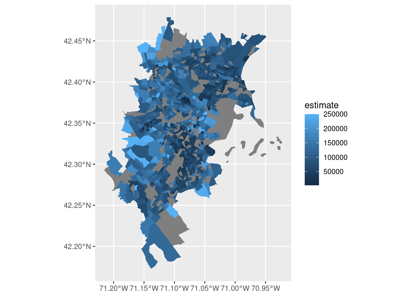
Exercise 3
- What is causing the missing values for some of these areas? Tip: Removing CBGs with
NAvalues and plotting withleafletmay give some indication.
Sidenote: using data visualizations to communicate your findings
Data visualizations are the best tool you have for conveying the results of your analysis. It is well worth spending a bit of effort to (1) think through how to best display your data, (2) take a extra time to polish your visualization, (3) be prepared to make and re-make your visualization as things change. Making a compelling data visualization is often a question of choosing which dimensions in your data that are most important for the message you are trying to convey, then finding a type of plot that can represent them clearly. There is some inspiration for different types of plots in the R Graph Gallery.
Things to keep in mind:
Are your axis labels human readable?
Are you maximizing the data-to-ink ratio?
Does your plot have an appropriate theme? Grid-lines (in default ggplot theme) are often not relevant or need to be reduced.
Have you considered how you are using color? Common mistakes include: colors over-emphasizing minor variations in your data, diverging color scales used for non-diverging data, forgetting accessibility for color blind people.
(Sometimes) Do you have a declarative title conveying the main message of your visualization?
Here is a cleaned up version of the map from above.
ggplot() +
  geom_sf(data = medincome_boston, aes(fill = estimate), color = NA, alpha = 0.8) +
  scale_fill_viridis_c(option = "magma", direction = 1, name = "MHI", label = function(x){paste0("$", scales::comma(x))}) +
  theme_void() +
  labs(
    title = "Median Household Income (2021)",
    subtitle = "Block groups in the inner core"
  ) +
theme(legend.position = c(0.8, 0.2))
Exercise 4
- List or try to add a few more features to improve this visualization.
Combining census data with OSM
Now, the aim of this practical is to understand the factors which predict public transit accessibility in this inner core.
We will follow this methodology:
- Download a range of ACS variables for the same ten-place boundary.
- Download public transit stops from Open Street Map.
- Compute the accessibility of transit stations from CBGs.
- Explore which census variables are associated with transit station accessibility.
Retrieving ACS Variables
Now, lets retrieve a few more variables from the ACS. Because combining ACS variables can be complicated (for example, we might want broad age categories, not one year bands), we have pre-processed a few key variables into an easier-to-use format. You can find this in the file /data/CUS/labs/2/14460_acs_2021_filtered_boston.parquet. The file covers the broader Boston MSA (14460); we will restrict it to our inner-core boundary after attaching geometries.
census <- read_parquet("/data/CUS/labs/2/14460_acs_2021_filtered_boston.parquet")
colnames(census)
[1] "GEOID" "age.total"
[3] "age.u18" "age.u1825"
[5] "age.u2564" "age.a64"
[7] "race.total" "race.white"
[9] "race.black" "race.native"
[11] "race.asian" "median_income"
[13] "ratio_poverty" "education.grade_0_9"
[15] "education.grade_9_12" "education.some_college"
[17] "education.bachelor" "employment.total"
[19] "employment.labor_force" "employment.civilian_labor_force"
[21] "employment.civilian_employed" "employment.civilian_unemployed"
[23] "employment.armed_forces" "employment.not_labor_force" Exercise 5
- Take a moment to re-construct one of the variables (like
age.u1825) in this data frame usingtidycensusand the ACS Variable Explorer. How many variables do you need to combine?
Because this pre-processed census data doesn’t have any associated geography, we need to download and attach geographies using the tigris package, then keep only block groups that intersect the inner core. Use the same boston_boundary as above so the census table and the later distance calculation describe the same places.
block_groups <- block_groups(state = "25", year = 2021, class = "sf",progress=FALSE)
census <- census %>%
    left_join(block_groups %>% select(GEOID, geometry), by = c("GEOID")) %>%
    st_as_sf()
census <- census %>%
    st_filter(st_transform(boston_boundary, st_crs(census)))
head(census)
Simple feature collection with 6 features and 24 fields
Geometry type: MULTIPOLYGON
Dimension: XY
Bounding box: xmin: -71.02757 ymin: 42.43086 xmax: -70.94845 ymax: 42.45977
Geodetic CRS: NAD83
# A tibble: 6 × 25
GEOID age.total age.u18 age.u1825 age.u2564 age.a64 race.total race.white
<chr> <dbl> <dbl> <dbl> <dbl> <dbl> <dbl> <dbl>
1 250092072… 1102 386 91 570 55 1102 382
2 250092081… 1866 284 220 1074 288 1866 1223
3 250092081… 391 27 47 238 79 391 353
4 250092081… 1209 301 46 689 173 1209 998
5 250092081… 942 217 128 474 123 942 795
6 250092082… 1344 382 92 695 175 1344 1177
# ℹ 17 more variables: race.black <dbl>, race.native <dbl>, race.asian <dbl>,
# median_income <dbl>, ratio_poverty <dbl>, education.grade_0_9 <dbl>,
# education.grade_9_12 <dbl>, education.some_college <dbl>,
# education.bachelor <dbl>, employment.total <dbl>,
# employment.labor_force <dbl>, employment.civilian_labor_force <dbl>,
# employment.civilian_employed <dbl>, employment.civilian_unemployed <dbl>,
# employment.armed_forces <dbl>, employment.not_labor_force <dbl>, …Retrieving OSM data
Now that we have some nicely formatted census data, we can move on to downloading our transit stations from OSM.
We have already loaded ACS data for CBGs in the inner core. Now we need to retrieve public transit stations from OSM. We can do this using the osmdata R package (as we did in last week’s practical). The Overpass query below uses a Boston bounding box, which covers this inner core.
boston_bb <- getbb("Boston, Massachusetts")
public_transit_pts <- opq(bbox = boston_bb) %>%
  add_osm_feature(key = "public_transport", value = "station") %>%
  osmdata_sf()

public_transit_pts <- public_transit_pts$osm_points
The Overpass API is often rate-limited, so instead of downloading the data from OSM at render time, we have already saved it in the course directory. Let’s load it:
public_transit_pts <- readRDS("/data/CUS/labs/2/boston_public_transit_stations.RDS")
head(public_transit_pts)
Simple feature collection with 6 features and 8 fields
Geometry type: POINT
Dimension: XY
Bounding box: xmin: -71.13488 ymin: 42.33162 xmax: -71.10369 ymax: 42.34885
Geodetic CRS: WGS 84
element id name station public_transport railway
1 node 69479726 Griggs Street light_rail station halt
2 node 69481020 Summit Avenue light_rail station halt
3 node 69481493 Riverway light_rail station halt
4 node 69481663 Kent Street light_rail station halt
5 node 69481819 Brigham Circle light_rail station halt
6 node 69482402 Washington Square light_rail station halt
network operator geometry
1 MBTA Massachusetts Bay Transportation Authority POINT (-71.13438 42.34885)
2 MBTA Massachusetts Bay Transportation Authority POINT (-71.12616 42.34093)
3 MBTA Massachusetts Bay Transportation Authority POINT (-71.11193 42.33162)
4 MBTA Massachusetts Bay Transportation Authority POINT (-71.11435 42.34401)
5 MBTA Massachusetts Bay Transportation Authority POINT (-71.10369 42.33461)
6 MBTA Massachusetts Bay Transportation Authority POINT (-71.13488 42.3395)Lets display the data in an interactive map that will let us check that we have downloaded the correct features.
leaflet(public_transit_pts) %>%
  addProviderTiles(provider=providers$CartoDB.Positron) %>%
  addCircleMarkers(
    label = ~name,
    radius = 3,
    stroke = FALSE,
    fillOpacity = 0.8,
    color = "blue"
  )
It looks like this data has some duplicated stations, and isn’t restricted to T-stops. This is a common problem in OSM data, which is crowd-sourced from volunteers.
Let’s see if we can filter the data to select only T stops. First, we can check the unique values in the station column.
public_transit_pts %>% pull(station) %>% unique()[1] "light_rail" "subway" NA
[4] "train" "yes" "light_rail;subway"Then, lets filter for “subway” and “light_rail” stations.
t_stops <- public_transit_pts %>%
  filter(station %in% c("subway", "light_rail"))

leaflet(t_stops) %>%
  addProviderTiles(provider=providers$CartoDB.Positron) %>%
  addCircleMarkers(
    label = ~name,
    radius = 3,
    stroke = FALSE,
    fillOpacity = 0.8,
    color = "blue"
  )
This looks pretty good!
Exercise 6
Take a moment to explore OSM data. What other features are accessible? Can you find features for other forms of public transit? Can you identify any limitations cause by the crowd-sourced nature of the data?
- For a list of all of the features available from Open Street Map, see here.
Measuring transit accessibility
Now that we have data on census variables in geographic areas and the location of public transit stations, we can move on to calculating a measure of public transit accessibility.
Our measure will be based on the assumption of proximity-based accessibility and residential anchoring. This means that the proximity of an individual’s home to a transit station (in terms of geometric distance) is indicative of higher / lower public transit accessibility.
Exercise 7
Take a moment to consider the assumptions underlying the ideas of proximity-based accessibility and residential anchoring. Could large-scale behavioral data shed more light on people’s true patterns of behavior in the city?
Why do you think that these ideas have been widely adopted in traditional urban studies (in transit accessibility studies like this one, as well as concepts such as urban food deserts)?
What other types of accessibility might better represent people’s actual ability to use public transportation?
Computing a measure of transit accessibility
In order to compute our accessibility measure, we will calculate the distance from each Block Group centroid to the nearest transit station using st_centroid and st_distance. The centroid is a simple stand-in for a typical residential location inside the block group. Measuring from the polygon itself would give a distance of 0 whenever a station falls anywhere inside the CBG, even if most residents live far from that station.
To make sure our distance calculation is accurate, we need to transform our data into a projected coordinate system (which preserves distance). Because our study area is focused on Boston, we can use the NAD83 / Massachusetts Mainland projection (EPSG:26986).
Sidenote: Understanding Projected Coordinate Systems
Geographic coordinate systems like WGS84 (EPSG:4326), commonly used in latitude/longitude data represent locations on the Earth’s surface using angular measurements. While suitable for global mapping, they aren’t ideal for precise distance or area calculations because the Earth is curved.
Projected coordinate systems, such as the one we’re using, transform geographic data onto a flat surface. This preserves specific properties, such as distance or area, making it more accurate for spatial operations like buffering or intersection analysis within a localized region.
By re-projecting our data to a system measured in meters, we ensure more accurate distance calculations between census block group centroids and transit stations.
t_stops <- t_stops %>% st_transform(26986)
census <- census %>% st_transform(26986)
Now we can compute the distance from each CBG centroid to the nearest transit station.
cbg_centroids <- census %>% st_centroid()
distances <- st_distance(cbg_centroids, t_stops)
census$nearest_t_stop_dist <- apply(distances, 1, min)
census %>% select(GEOID, nearest_t_stop_dist)
Simple feature collection with 1086 features and 2 fields
Geometry type: MULTIPOLYGON
Dimension: XY
Bounding box: xmin: 223439 ymin: 880324.7 xmax: 247797.2 ymax: 914345.2
Projected CRS: NAD83 / Massachusetts Mainland
# A tibble: 1,086 × 3
GEOID nearest_t_stop_dist geometry
<chr> <dbl> <MULTIPOLYGON [m]>
1 250092072001 7313. (((242868.3 911299, 242875.1 911306.7, 2428…
2 250092081012 6725. (((239792.5 911639, 239812 911636.9, 239841…
3 250092081021 5948. (((241361.6 909071.3, 241374.5 909094.1, 24…
4 250092081022 6165. (((240046.3 910469.8, 240050.5 910477, 2400…
5 250092081024 5516. (((240120.3 910027.7, 240123.6 910028.7, 24…
6 250092082004 7102. (((238867.6 910801.2, 238873.5 910823.3, 23…
7 250173363003 7427. (((236574.5 911371.9, 236634.7 911377.2, 23…
8 250173363006 7689. (((236827 911854.3, 236978.5 911887.3, 2370…
9 250173364031 6113. (((234339 910108.2, 234351.6 910215.9, 2343…
10 250173364032 6397. (((235200.4 910398.9, 235203.4 910435.1, 23…
# ℹ 1,076 more rowsTip: if you don’t understand an expression like this (or any of the more complicated expressions that have come before), please take a moment to break the code down piece-by-piece. For example, try inspecting the distances variable, or running only the expression apply(distances, 1, min) in the R console.
Exercise 8
- Make a map (static or interactive) of the
nearest_t_stop_distdistance variable. - Add the
t_stopsto this map, overlaid on top of the census block groups. censusandt_stopsare still in EPSG:26986 from the distance calculation. Forleaflet(or any web map), transform a copy to WGS84 withst_transform(4326). Leave the originals in 26986.
Predicting transit accessibility
Now we have a measure of public transit accessibility for census block groups in the inner core. This means that we can ask the question: what census variables are associated with the accessibility of transit stations?
We can start with a simple approach: a linear regression of our accessibility measure ~ block group characteristics.
The census table stores counts for age, race, education, and employment. Using those counts would confound the size of a block group with its social composition. Convert each group to a share of the relevant total, keep median_income and ratio_poverty as they are, and include population size only once as log(age.total). Within each group, omit one reference category so the shares do not sum to 1.
Age, race, education, and employment therefore enter the model as shares. We omit people 65 and older, Native residents, and grade 0–9 educational attainment as reference categories, and we summarize the labor market with the civilian unemployment rate.
census_model <- census %>%
  st_drop_geometry() %>%
  transmute(
    GEOID,
    nearest_t_stop_dist,
    log_pop = log(age.total),
    age.share_u18 = age.u18 / age.total,
    age.share_u1825 = age.u1825 / age.total,
    age.share_u2564 = age.u2564 / age.total,
    race.share_white = race.white / race.total,
    race.share_black = race.black / race.total,
    race.share_asian = race.asian / race.total,
    education.total = education.grade_0_9 + education.grade_9_12 +
      education.some_college + education.bachelor,
    education.share_grade_9_12 = education.grade_9_12 / education.total,
    education.share_some_college = education.some_college / education.total,
    education.share_bachelor = education.bachelor / education.total,
    emp.unemployed = employment.civilian_unemployed / employment.civilian_labor_force,
    median_income,
    ratio_poverty
  ) %>%
  select(-education.total)
The first step is to compose a formula for this regression. To do this efficiently, I’m using the as.formula function from base R. Again, if you are new to R, take a moment to break down this expression piece-by-piece to understand how each component works. Basically, I want to have my nearest_t_stop_dist on the LHS of the equation, and all other variables on the RHS.
predictors <- setdiff(names(census_model), c("GEOID", "nearest_t_stop_dist"))
lm_formula <- as.formula(paste("nearest_t_stop_dist ~", paste(predictors, collapse = " + ")))
print(lm_formula)
nearest_t_stop_dist ~ log_pop + age.share_u18 + age.share_u1825 +
age.share_u2564 + race.share_white + race.share_black + race.share_asian +
education.share_grade_9_12 + education.share_some_college +
education.share_bachelor + emp.unemployed + median_income +
ratio_povertyNow that we have the formula for our regression, we can create our model and inspect the results.
model <- lm(lm_formula, data = census_model)
summary(model)
Call:
lm(formula = lm_formula, data = census_model)

Residuals:
    Min      1Q  Median      3Q     Max
-3108.4  -879.6  -257.1   649.1  5352.6

Coefficients:
                               Estimate Std. Error t value Pr(>|t|)
(Intercept)                  -1.065e+03  1.147e+03  -0.928   0.3534
log_pop                       7.293e+00  1.013e+02   0.072   0.9426
age.share_u18                 3.481e+03  7.159e+02   4.862 1.37e-06 ***
age.share_u1825              -7.609e+02  5.811e+02  -1.309   0.1907
age.share_u2564              -1.144e+03  5.426e+02  -2.108   0.0353 *
race.share_white              1.826e+03  4.443e+02   4.109 4.33e-05 ***
race.share_black              1.936e+02  4.561e+02   0.425   0.6713
race.share_asian              2.412e+03  4.974e+02   4.851 1.45e-06 ***
education.share_grade_9_12    3.753e+03  9.397e+02   3.993 7.04e-05 ***
education.share_some_college  5.177e+03  9.695e+02   5.340 1.18e-07 ***
education.share_bachelor      4.156e+02  8.695e+02   0.478   0.6327
emp.unemployed               -2.968e+02  8.062e+02  -0.368   0.7129
median_income                 1.588e-03  1.359e-03   1.169   0.2428
ratio_poverty                -2.527e+03  4.603e+02  -5.489 5.24e-08 ***
---
Signif. codes:  0 '***' 0.001 '**' 0.01 '*' 0.05 '.' 0.1 ' ' 1

Residual standard error: 1345 on 915 degrees of freedom
  (157 observations deleted due to missingness)
Multiple R-squared:  0.338, Adjusted R-squared:  0.3286
F-statistic: 35.93 on 13 and 915 DF,  p-value: < 2.2e-16
Exercise 9
Try to interpret these model results. Remember that a larger
nearest_t_stop_distmeans a block group is farther from the nearest T stop.Which variables are positively associated with distance to the T? Which are negatively associated?
How should you read a coefficient, given the omitted reference categories (age 65+, Native residents, and grade 0–9)?
Which variables are statistically significant? In particular, why might
ratio_povertybe significant whilemedian_incomeandemp.unemployedare not?Why were 157 observations deleted due to missingness? How might that affect who is in the model?
The model explains about a third of the variation in
nearest_t_stop_dist(\(R^2 \approx 0.34\)). What does that say about how well census composition predicts this accessibility measure?
Multicollinearity of census variables
Our regression results raise a number of interesting questions: why is the overall predictability of nearest_t_stop_dist only moderate? Are the share variables contributing unique information, or are some of them still standing in for the same underlying social differences?
To understand how differentiated the predictors in our model are from one another, we can create a cross-correlation plot using the corrplot function. This shows the correlation coefficient of each share (and the other model variables) against all others. A few variables contain missing values which we will drop for convenience.
corrplot(cor(census_model %>% select(-GEOID,-nearest_t_stop_dist) %>% drop_na()), method="number")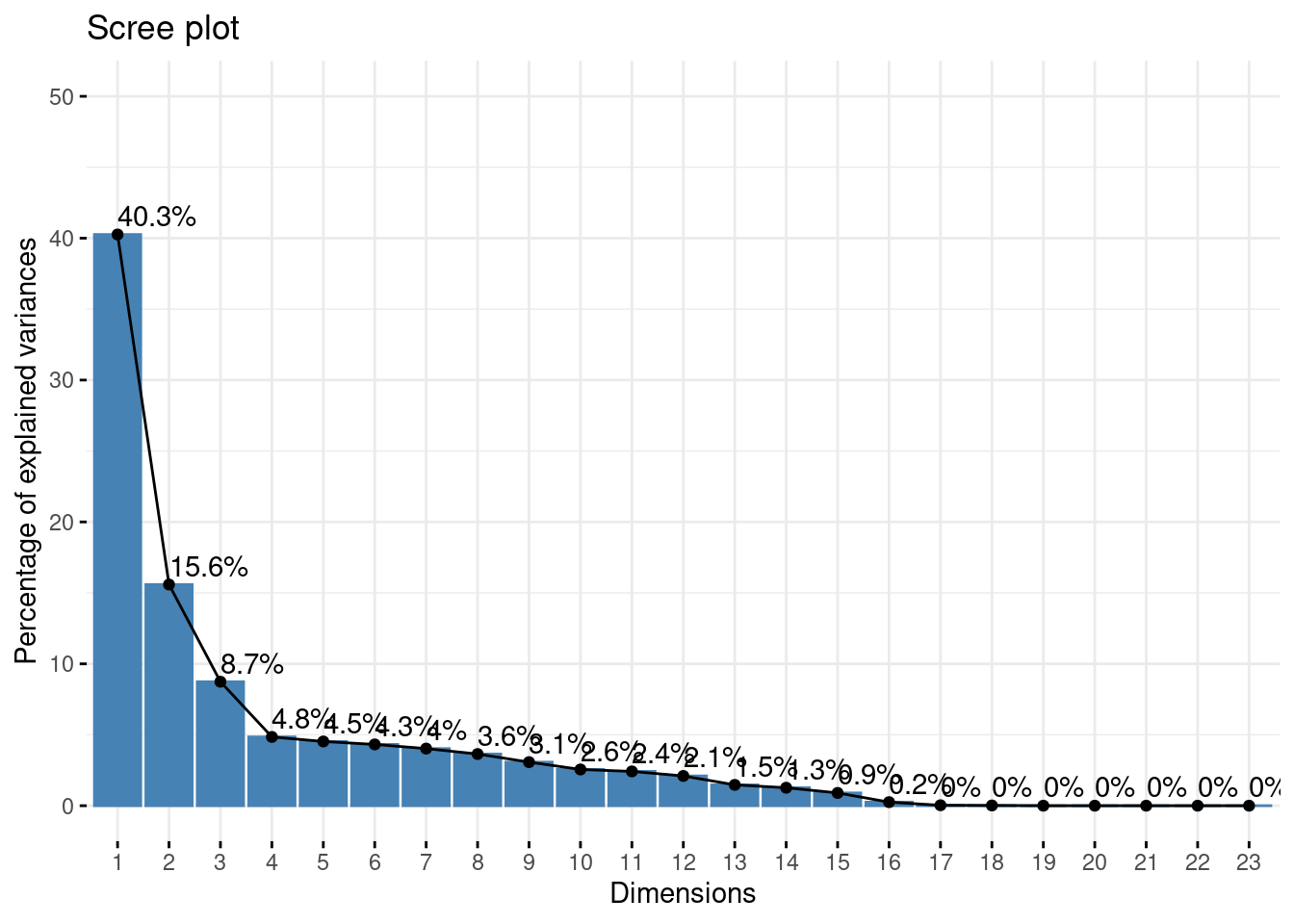
Exercise 10
Interpret the results of
corrplotabove. What variables seem to be providing unique information? What groups of variables seem to be correlated with one another?Explore the
corrplotpackage. How else could we assess multicollinearity in our variables?
Introduction: Social Area Analysis
The correlation plot raises a more interesting question than “which variable predicts transit.” If many of our shares move together, block groups may differ along a small number of latent social dimensions, not along a dozen independent census columns.
That is the idea behind social area analysis, a mid-century tradition in human geography and sociology (Shevky, Bell, and later factorial ecology). Researchers take a wide set of census variables and use dimensionality reduction — here, Principal Component Analysis (PCA) — to recover the few axes that actually differentiate neighborhoods.
In U.S. cities those axes often come back as three themes: socioeconomic status, household / family structure, and race / ethnicity.
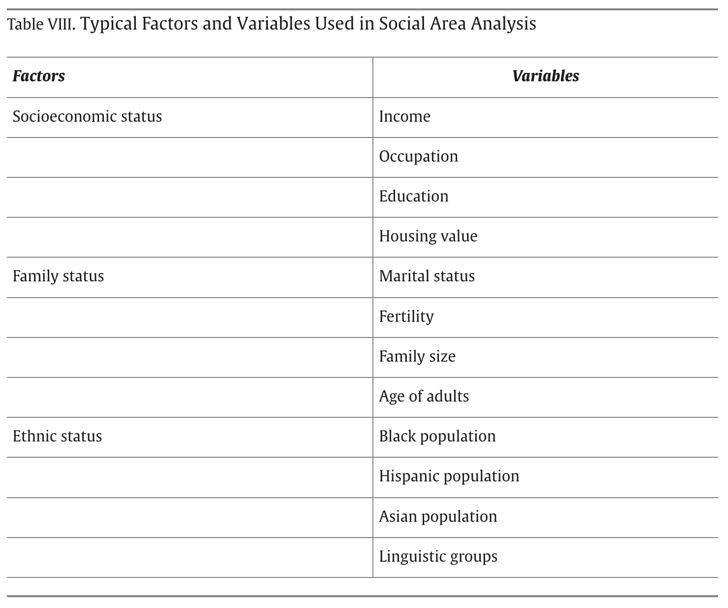
We will run the PCA on the same share variables we used in the regression. That keeps the two halves of the lab talking to each other: first we asked whether composition predicts distance to the T; now we ask what composition is made of.
Dimensionality reduction of census variables
Sidenote: factoextra is a convenient way to plot PCA and clustering results in R.
PCA is sensitive to units. median_income is in dollars; the shares are between 0 and 1. We therefore standardize every column (scale. = TRUE), the same idea as prcomp’s usual advice: without scaling, income would dominate because its variance is larger, not because it is more important.
We also drop rows with missing values. That is the same complete-case sample the regression used (about 157 block groups were already excluded there). The PCA describes those block groups, not the ones where ACS income or unemployment is missing.
pca_ready <- census_model %>%
  filter(if_all(-c(GEOID, nearest_t_stop_dist), ~ !is.na(.)))

pca_input <- pca_ready %>%
  select(-GEOID, -nearest_t_stop_dist)

pca <- prcomp(pca_input, scale. = TRUE)
The scree plot shows how much of the original variation each component captures.
fviz_eig(pca, addlabels = TRUE, ylim = c(0, 50), ncp = Inf)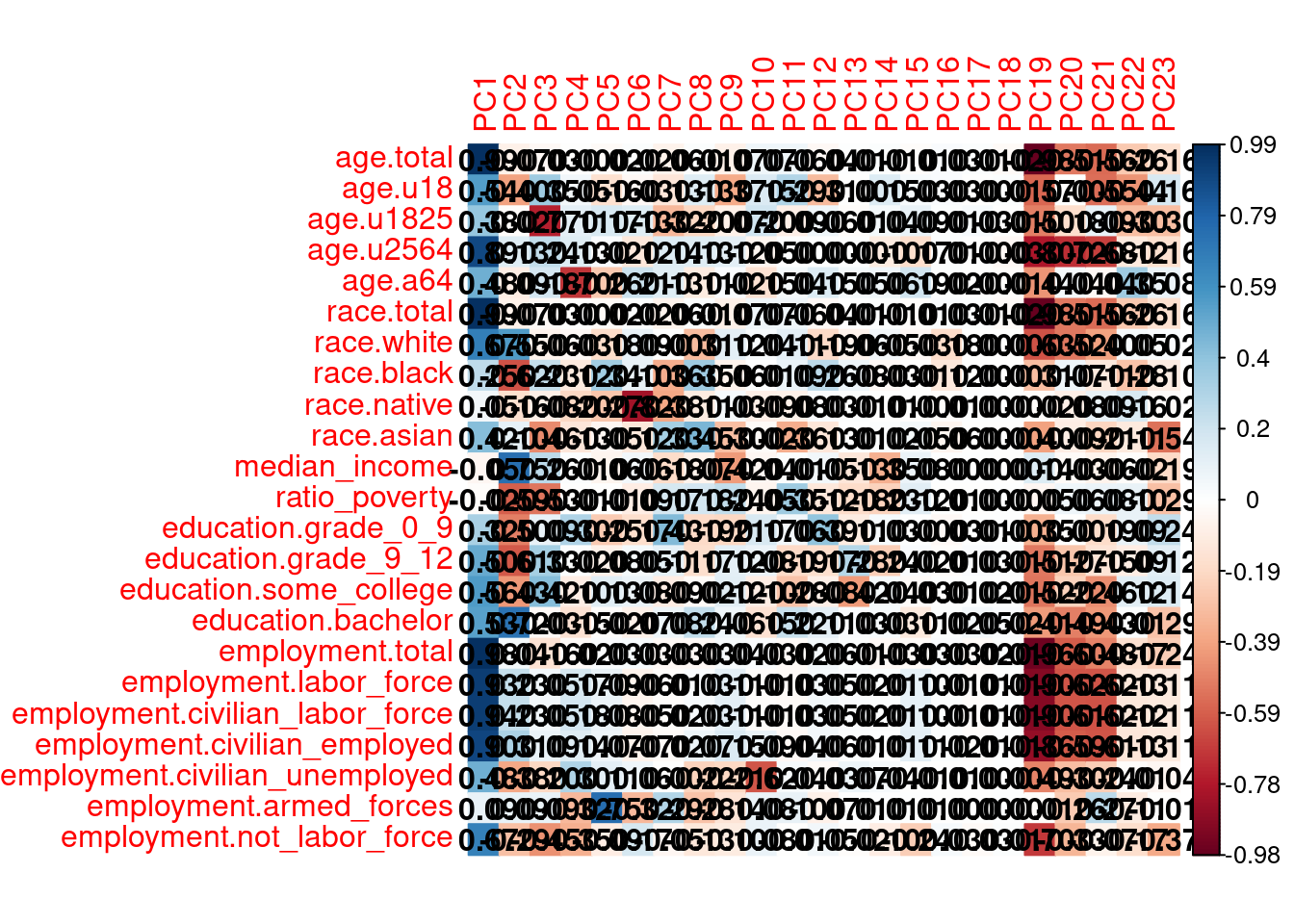
Exercise 11
How many components do you need before the curve flattens? What share of variation do the first three capture?
Why is it useful that a handful of components can stand in for this whole table of shares?
The biplot shows how the original variables sit in the plane of the first two components. Arrows that point the same way are variables that move together; longer arrows contribute more to those two components. We hide the individual block groups so the variables are readable.
fviz_pca_biplot(pca, repel = TRUE, col.var = "blue", col.ind = NA)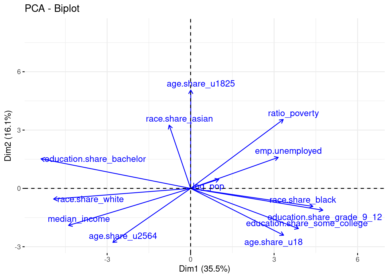
A complementary view is the correlation between each share and each principal component. This is closer to asking “what is PC1 about?”
cor_matrix <- cor(pca_input, pca$x)
corrplot(cor_matrix, method = "color", is.corr = FALSE, addCoef.col = "black")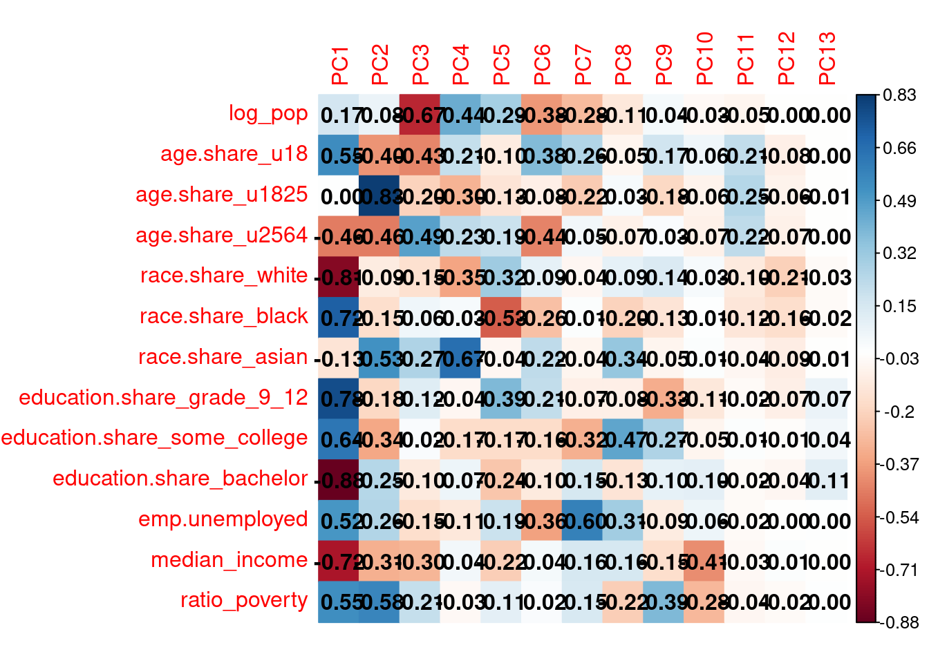
Exercise 12
Using the biplot and the correlation plot together, give PC1 and PC2 a short name based on what is on the plot, not on the table above. Which variables define each pole?
Race and class often appear as separate themes in the literature. Do they here, or do they load on the same component? What about household / family structure — is PC2 “families with children,” or something else (look at
age.share_u1825versusage.share_u18)?How well do these axes match the three themes in the table from the literature? Where does this Boston sample disagree, and why might that be?
Look back at the regression. The variables that were significant for
nearest_t_stop_dist— do they mostly load on PC1, or do they split across components? What does that imply about whether transit proximity is a class gradient, an age-structure gradient, or both?
Exercise 13
Make the same kind of map for
PC2andPC3.Which components have a clear spatial pattern (for example a downtown–outlying gradient, or clustering by municipality)? Which look noisier?
If a component is socially meaningful in the biplot but looks spatially random on the map, what would that suggest?
Do the social factors predict transit accessibility?
We can now close the loop. Instead of a kitchen-sink of shares, we can ask how nearest_t_stop_dist lines up with the first three components.
census_pca %>%
  st_drop_geometry() %>%
  select(nearest_t_stop_dist, PC1, PC2, PC3) %>%
  drop_na() %>%
  cor() %>%
  corrplot(method="number")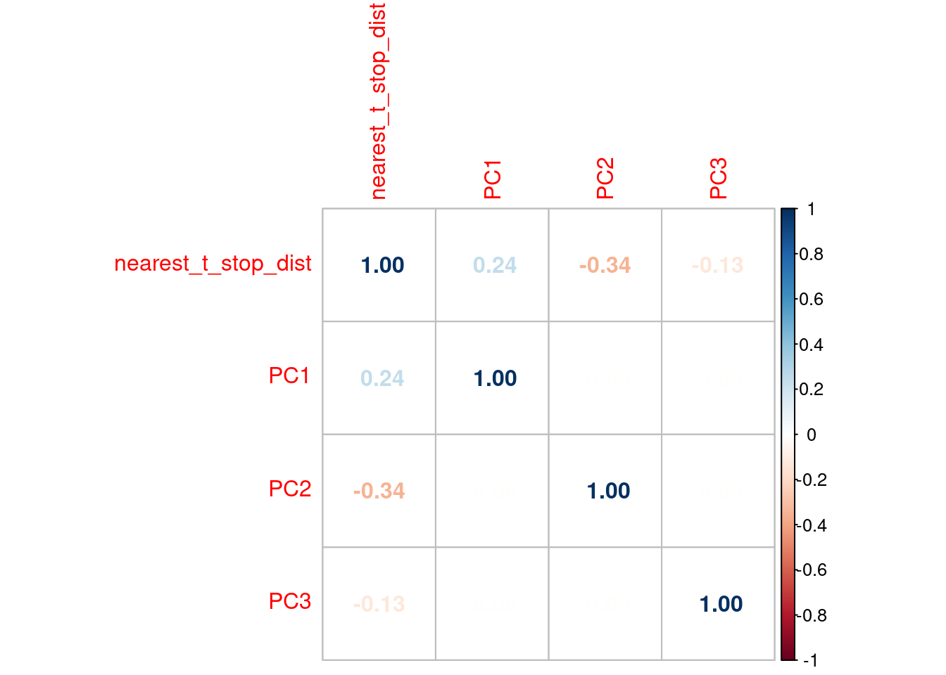
Exercise 14
Which principal component is most associated with distance to the T? Does that match the story you told in Exercise 9 and Exercise 12?
Today’s lecture discussed the Modifiable Areal Unit Problem: results can change if you aggregate the same people into different spatial units. You do not need to rebuild the whole lab. Collapse the original count columns (
age.*,race.*,education.*,employment.*) to census tracts withgroup_by(tract = substr(GEOID, 1, 11))andsummarise(across(where(is.numeric), sum)). Then recompute the same shares we used above, recompute nearest-station distance from the tract centroid, and rerun either the regression or the PCA. Do not take the mean ofage.share_*or ofnearest_t_stop_dist— those are the wrong quantities to aggregate.Do the same social factors appear?
Does the association with transit accessibility get stronger, weaker, or stay put? Why might aggregation do that?
Closing thoughts
Census data are one of the best big sources we have on cities, but they are a narrow slice of urban life: where people live, how they are counted, and how those counts are packaged into areal units. A few latent components can absorb most of the variation in those tables because the underlying processes — income sorting, racial segregation, household structure, the historical layout of the T — produce bundles of attributes, not independent columns.
Take a moment to consider what is missing from this picture. Large-scale behavioral data (mobility, spending, social connections) could show who actually uses the T, not just who lives near a station. They would not replace the census; they would sit beside it. And any such analysis still has to choose a spatial unit. The social factors you recovered, and the accessibility gradient you measured, are statements about block groups in this inner-core study area in 2021 — not automatic facts about “Boston.”