library(tidyverse)
library(arrow)
options(arrow.unsafe_metadata = TRUE)
library(DT)
library(knitr)
library(ggthemes)
theme_set(theme_hc() + theme(axis.title.y = element_text(angle = 90))) Lab 3-1 - Working with Location Based Services Data
Objective
In this practical, we will use mobile phone data to understand visitation patterns to places in urban areas. Specifically, we will use Location Based Services datasets from Safegraph / Advan to:
- Understand the structure, coverage, and types of location data from LBS aggregators.
- Analyze patterns of visitation to POIs in the Boston area.
- Estimate (population and demographic) biases in the data.
- Post-stratify location data to correct those biases.
- Investigate changes in mobility during COVID-19.
Load some libraries and settings we will use
Location Based Services datasets
Location-based Services data come from apps that use users’ geolocation to provide a service. For example, maps, place recommendations, weather, ride-sharing, and shopping apps collect users’ locations. Apps collect those locations at different times. They typically collect them when used (foreground), but they also collect them in the background to minimize the response time.
Aggregator companies like Cuebiq, Safegraph, Placer.ai, and others collect those locations from different apps and curate and aggregate them to get detailed trajectories of users in urban areas. This raw trajectory data is processed and combined with census data and Points-of-Interest (POI) datasets to produce secondary datasets:
- Footfall/Visits to areas or POIs (e.g., daily visits to a Museum by POI of origin).
- Flows between areas or to particular POIs (e.g., Origin/Destination matrices between CBGs).
- Trips (e.g., the number of trips by car between different areas).
- Contacts between people (e.g., number of face-to-face contacts between people within a county).
And many others.
Safegraph / Advan data
Safegraph data, or Advan Patterns since 2023, has been one of the most frequently utilized sources of mobile location data in academic research across multiple domains, particularly in urban science, public health, consumer behaviors, and environmental science.
Safegraph data was extensively used during the COVID-19 pandemic to track the spread of the disease, monitor social distancing behaviors, and examine the effectiveness of control measures [1]
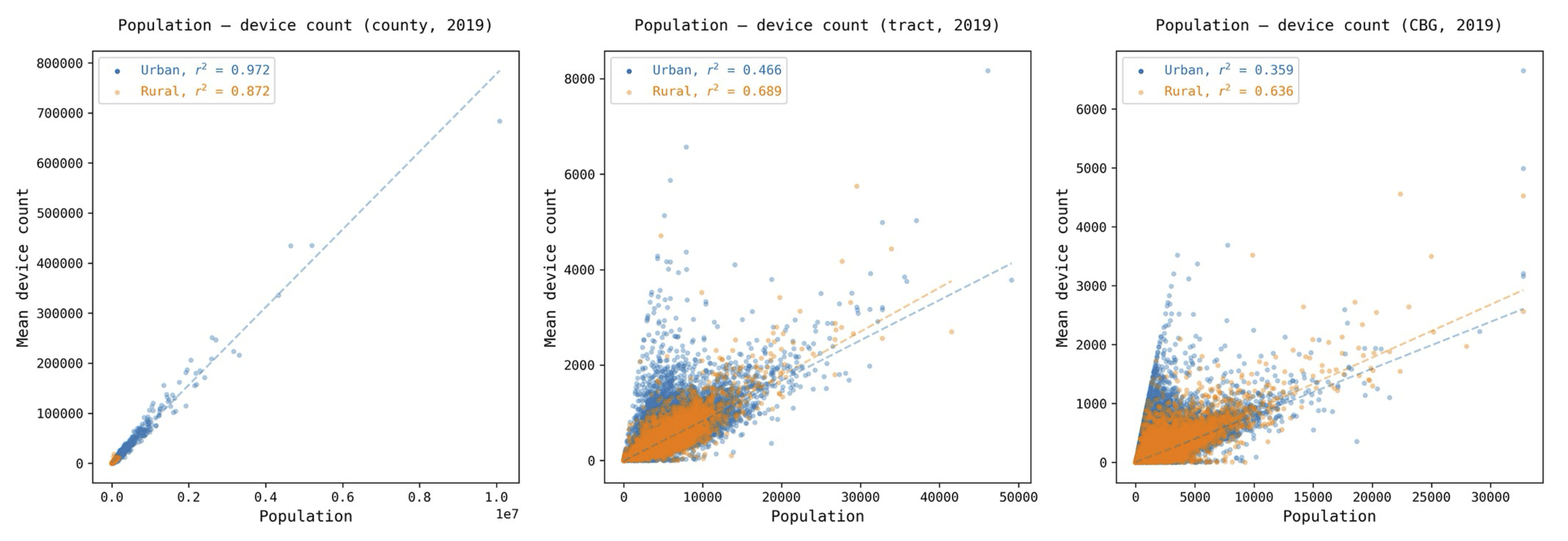
Safegraph / Advan data comes from a mobile device panel containing around 5-10% of the US population. Although that sample has a strong correlation with the population at the county level (> 0.96) and for different demographic groups at the national level (> 0.99), the sample is biased geographically and demographically at small scales [2] [3]. For example, the device count and census population correlation at the census block group level drops to < 0.4. For more details on the bias of Safegraph, see this Google Colab.
Advan Research Data
In this practical, we will use Advan Research data provided through the Dewey platform. Advan data is based on Safegraph data, but it is processed a little bit differently.
Advan provides three different datasets to the academic community:
- Monthly Patterns: Aggregated raw counts of visits to POIs from a panel of mobile devices over a given month.
- Weekly Patterns: Aggregated raw counts of visits to POIs from a panel of mobile devices over a given week.
- Neighborhood Patterns: Aggregated raw counts of visits to CBGs from a panel of mobile devices over a given month.
Let’s work with the Monthly patterns dataset. It contains aggregated raw counts of visits to POIs from a panel of mobile devices over a given time since 2019 in the United States. The data is aggregated at the monthly level and includes the following groups of variables (see the full schema):
- Information about the POI (e.g., name, location, category, street, size of venue, etc.)
- Information about the visits (e.g., raw counts, unique visitors, dwell time, etc.)
- Information about the visitors (e.g., home CBG, distance traveled, etc.)
Monthly patterns of visits to POIs
Let’s load some of the data to have a look at it. We have put the Monthly Patterns for the city of Boston since 2019 in the /data/CUS/Boston_Monthly_Patterns folder. They are already in parquet format
files <- Sys.glob("/data/CUS/safegraph/Monthly_Patterns/*.parquet")
patterns <- open_dataset(files,format = "parquet")
This is the number of records we have in the dataset:
dim(patterns)[1] 1408603 34Here is the schema of the data.
schema(patterns)Schema
PLACEKEY: string
LOCATION_NAME: string
TOP_CATEGORY: string
SUB_CATEGORY: string
NAICS_CODE: int32
LATITUDE: double
LONGITUDE: double
STREET_ADDRESS: string
CITY: string
REGION: string
POSTAL_CODE: string
ISO_COUNTRY_CODE: string
WKT_AREA_SQ_METERS: int32
DATE_RANGE_START: timestamp[us, tz=UTC]
DATE_RANGE_END: timestamp[us, tz=UTC]
RAW_VISIT_COUNTS: int32
RAW_VISITOR_COUNTS: int32
VISITS_BY_DAY: string
POI_CBG: int64
VISITOR_HOME_CBGS: string
VISITOR_HOME_AGGREGATION: string
VISITOR_DAYTIME_CBGS: string
VISITOR_COUNTRY_OF_ORIGIN: string
DISTANCE_FROM_HOME: int32
MEDIAN_DWELL: int32
BUCKETED_DWELL_TIMES: string
POPULARITY_BY_HOUR: string
POPULARITY_BY_DAY: string
DEVICE_TYPE: string
NORMALIZED_VISITS_BY_STATE_SCALING: int32
NORMALIZED_VISITS_BY_REGION_NAICS_VISITS: double
NORMALIZED_VISITS_BY_REGION_NAICS_VISITORS: double
NORMALIZED_VISITS_BY_TOTAL_VISITS: double
NORMALIZED_VISITS_BY_TOTAL_VISITORS: double
See $metadata for additional Schema metadataFor example:
patterns |> head(3) |>
  select(PLACEKEY, LOCATION_NAME,
         LATITUDE, LONGITUDE,
RAW_VISIT_COUNTS, VISITOR_HOME_CBGS) |> collect() |> kable()| PLACEKEY | LOCATION_NAME | LATITUDE | LONGITUDE | RAW_VISIT_COUNTS | VISITOR_HOME_CBGS |
|---|---|---|---|---|---|
| 22g-225@62j-sj4-2c5 | Boston Blossoms | 42.34855 | -71.09347 | 28 | |
| 22c-224@62j-sjq-3wk | Jay Cashman | 42.33063 | -71.05842 | 42 | {““250250920001”“:4} |
| 23j-224@62j-sjm-7dv | Naild It Southie | 42.33541 | -71.03802 | 30 | {““250250605011”“:4,”“250250604003”“:4,”“250250603013”“:4} |
PLACEKEYis a universal identifier for the POI. Placekey standard has been developed and adopted by many companies. See more information here.LOCATION_NAMEis the name of the POI.RAW_VISIT_COUNTSis the number of visits to the POI.VISITOR_HOME_CBGSis a JSON object containing the number of visitors to the POI from each census block group based on the visitor’s home location.
Again, see the full schema for more information.
Points of interest in the dataset
Let’s have a look at the different POIs in our dataset:
pois <- patterns |>
  select(PLACEKEY,LOCATION_NAME,CITY,REGION,
         TOP_CATEGORY,SUB_CATEGORY,LATITUDE,LONGITUDE) |>
  distinct() |> collect()
We have 62344 different POIs. Let’s have a look at them. First, we get the boundary of the city of Boston:
require(tigris)
require(sf)
ma_places <- places(state = "MA", year = 2022, class = "sf",progress=FALSE)  # Cities in MA
# Filter for Boston
boston_boundary <- ma_places[ma_places$NAME == "Boston", ]require(leaflet)
pois |> sample_n(10000) |> leaflet() |> addProviderTiles(provider=providers$CartoDB.Positron) |>
addPolygons(data=boston_boundary,fillColor = "gray",color="gray")|>
addCircles(lng=~LONGITUDE,lat=~LATITUDE,label=~LOCATION_NAME) As we can see, some of the locations are not in the city of Boston.
Since Advan and Safegraph data are mainly used for commercial applications, most POIs are businesses. POIs are categorized using the 4-digit NAICS category (TOP_CATEGORY) and the 6-digit NAICS sub-category (SUB_CATEGORY). The North American Industry Classification System (NAICS) is the standard used by the US government to classify business establishments. See more information about it here.
Here are the top categories included:
pois |> count(TOP_CATEGORY) |> arrange(-n) |> datatable()We have 172 top categories. Note that it contains a lot of offices for physicians, health practitioners, and lawyers.
Regarding the subcategories, here are the number of POIS by subcategory
pois |> count(SUB_CATEGORY) |> arrange(-n) |> datatable()We have 272 of them. Note that some POIs do not have a subcategory.
Footfall temporal patterns
The Advan dataset contains the visitation pattern to those POIs as a function of time. It covers the period from 2019 to mid-2024.
patterns |> group_by(DATE_RANGE_START) |>
  summarize(n_unique_POIs=n_distinct(PLACEKEY),
            n_POIs = n()) |> collect() |>
  ggplot() +
  geom_line(aes(x=DATE_RANGE_START,y=n_POIs,col="# of POIs")) +
  geom_line(aes(x=DATE_RANGE_START,y=n_unique_POIs,col="# of unique POIS"))+
  scale_y_continuous(limits=c(0,60000)) +
  labs(x="Date",y="Number of unique POIs")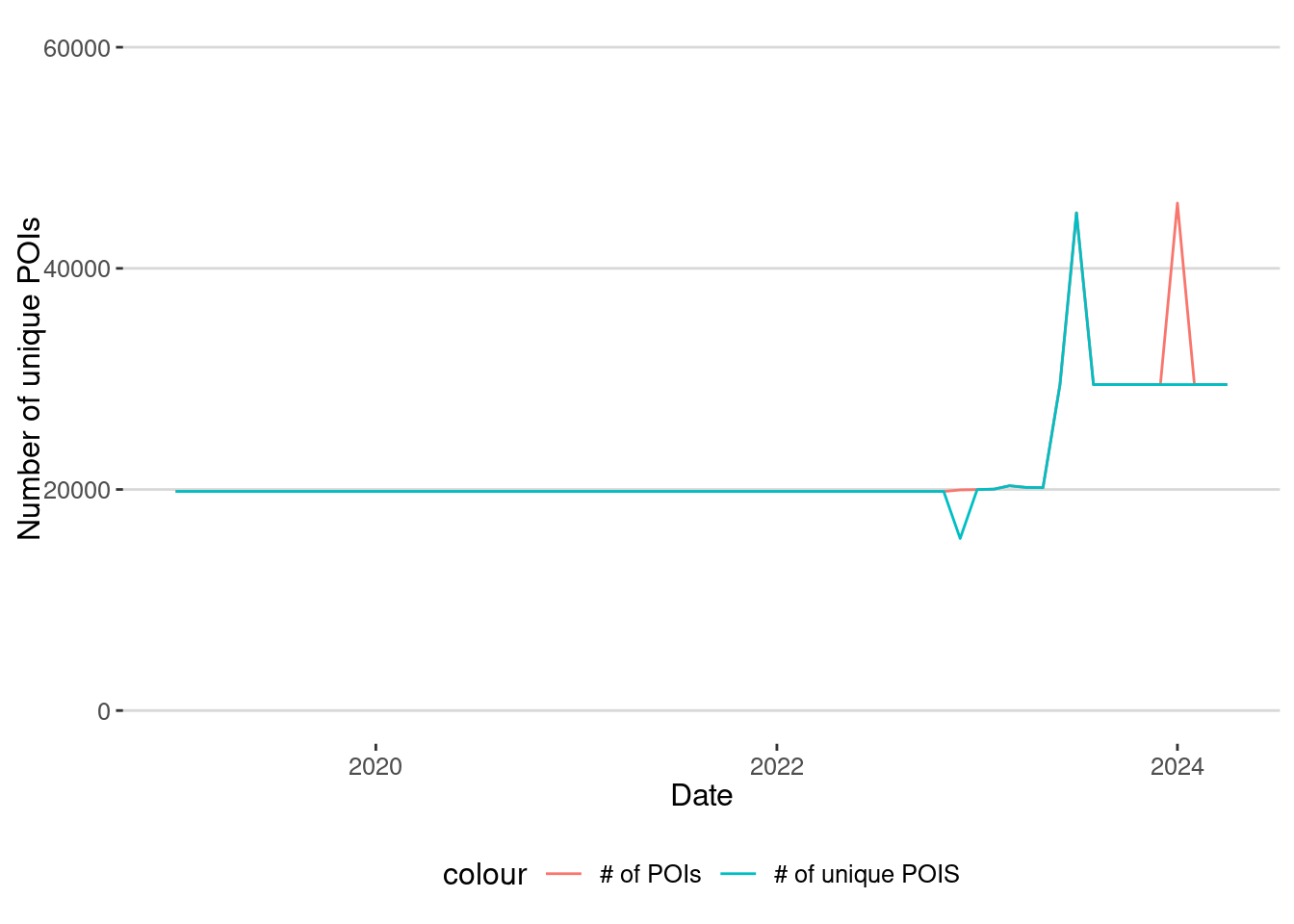
As we can see from 2019 until the end of 2022, the number of POIs is more or less stable, but since then, there have been a lot of changes in the database of POIs. This is related to two things:
- From 2019 to 2022, the data came from Safegraph. After that, Advan started collecting the data using a different method and set of POIs.
- From January 2023, there was a significant change in the apps used to collect the data.
Thus, when comparing total visits in a geographical area, we should be careful with this change in the number of POIs.
Let’s see how the number of visits to Museums has changed in the last years:
museums <- patterns |>
  filter(TOP_CATEGORY=="Museums, Historical Sites, and Similar Institutions") |>
  select(PLACEKEY,LOCATION_NAME,LATITUDE,LONGITUDE,DATE_RANGE_START,
         MEDIAN_DWELL,RAW_VISIT_COUNTS,RAW_VISITOR_COUNTS) |>
  collect()
Here is the number of visits to the Museum of Fine Arts
museums |> filter(LOCATION_NAME=="Museum Of Fine Arts") |>
  ggplot() +
  geom_line(aes(x=DATE_RANGE_START,y=RAW_VISIT_COUNTS,col="Raw")) +
  labs(x="Date",y="Number of visitors to MFA")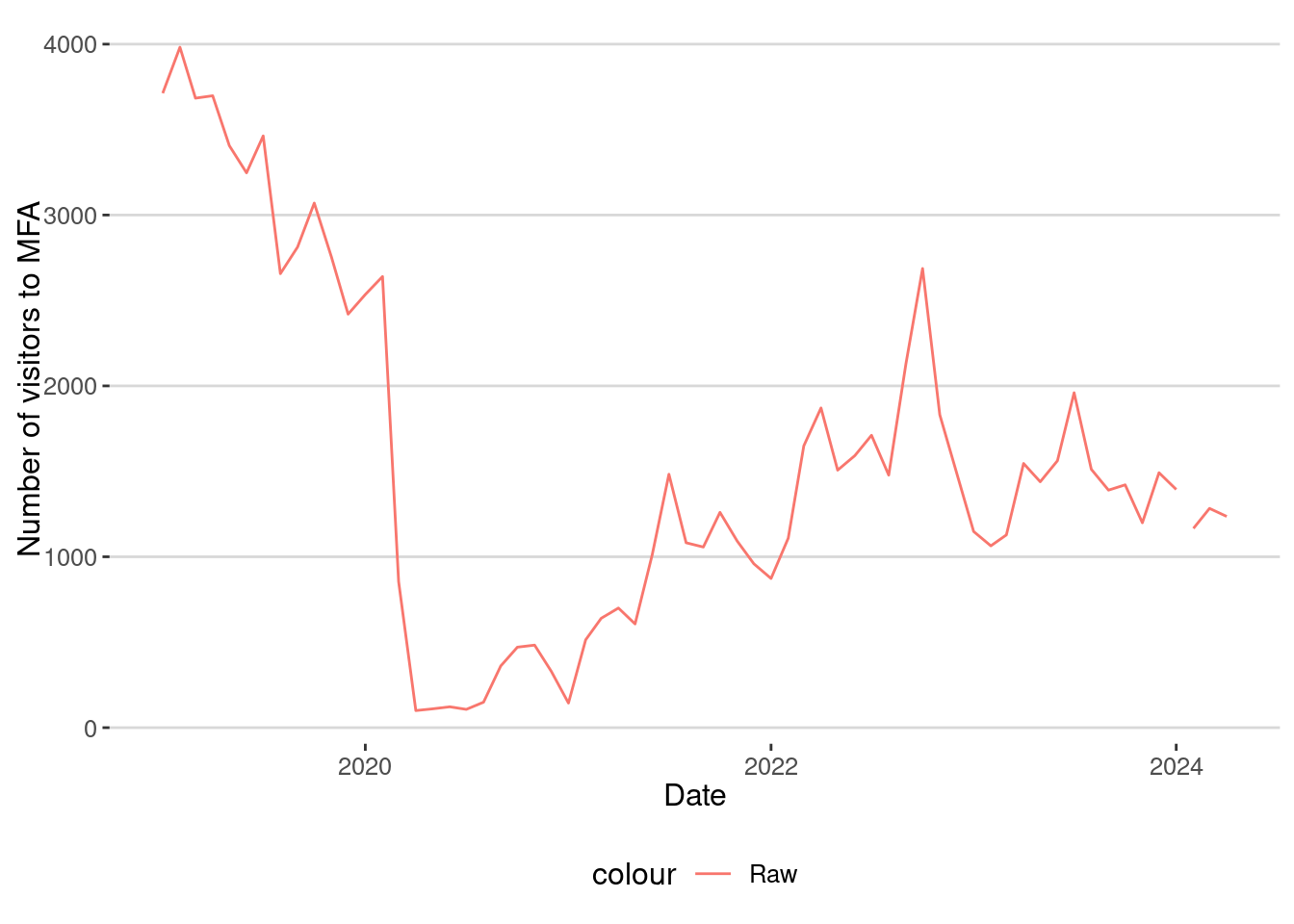
We can clearly see the drop in the number of visits due to the COVID-19 confinement, but there are many other things:
- The raw number of visitors to the MFA collected by Safegraph is very small. This is because the penetration rate of the data is around 5% of the population.
- There was a drop in the number of people visiting the MFA even before the pandemic.
- We can see that during the COVID-19 lockdown the number of visitors decreased significant (MFA was closed).
- Although the number of visitors recovers in 2021 and 2022, it seems to have flattened out after 2023.
As we will see later, this is not actually what happened.
Exercise 1
Investigate the temporal patterns of visits to POIs. For example:
- Study also how the median dwell time of the visits
MEDIAN_DWELLhas changed in museums. - Do the same thing for all grocery stores, using the average for all of them.
- Do you see any difference in the dwell time before, during, and after COVID-19 in museums or grocery stores?
Exercise 2
- Make a list of POIs related to Northeastern University.
- You can use tools like https://geojson.io to define the polygon of the university
- Use the
st_withinfunction from thesfpackage to filter the POIs that are inside the polygon.
- Investigate how the monthly raw number of visitors to those POIs has changed.
Visitors by Home area
The Advan data includes the monthly number of visitors to each POI and the home CBGs (Census Block Groups) of these visitors. This information is provided in JSON format within the following columns:
VISITOR_HOME_CBGScontains the number of visitors to the POI from each census block group based on visitor’s home location.VISITOR_HOME_AGGREGATIONis the number of visitors from each census tract based on home location.
Since the penetration rate is around 5% of the population, depending on how we use this data, we might want to utilize CBGs or Census Tracts to investigate where visitors come from. In our case, we are going to use Census Tracts.
First, we need to extract the JSON object in those columns and expand it. Here is the data just for the MFA
mfa <- patterns |> filter(LOCATION_NAME=="Museum Of Fine Arts") |>
  select(LOCATION_NAME,LATITUDE,LONGITUDE,
         DATE_RANGE_START,RAW_VISIT_COUNTS,
         RAW_VISITOR_COUNTS,
         VISITOR_HOME_AGGREGATION) |>  collect()
And then we expand it:
require(jsonlite)
mfa_expanded <- mfa |>
  # Fix double quotes
  mutate(VISITOR_HOME_AGGREGATION = str_replace_all(VISITOR_HOME_AGGREGATION, '""', '"')) |>
  mutate(
    # Parse JSON safely with error handling
    VISITOR_HOME_AGGREGATION =
      map(VISITOR_HOME_AGGREGATION,
          ~ tryCatch(fromJSON(.x),
                     error = function(e) NULL  # Replace errors with NULL
          ))
  ) |>
  filter(!map_lgl(VISITOR_HOME_AGGREGATION, is.null)) |>
  # Expand JSON into rows
  unnest_longer(VISITOR_HOME_AGGREGATION) %>%
  # Rename columns
  rename(Home_ID = VISITOR_HOME_AGGREGATION_id, Count = VISITOR_HOME_AGGREGATION)
Now, we have a row for each day and each census tract for the origin of visitors. One thing to notice is that the sum of the visitors counts for each Census Tract does not coincide.
mfa_expanded |> group_by(DATE_RANGE_START) |>
  summarize(raw_counts=mean(RAW_VISITOR_COUNTS),
            sum_count=sum(Count,na.rm=T)) |>
  ggplot() + geom_line(aes(x=DATE_RANGE_START,y=raw_counts,col="Raw"))+
  geom_line(aes(x=DATE_RANGE_START,y=sum_count,col="Sum"))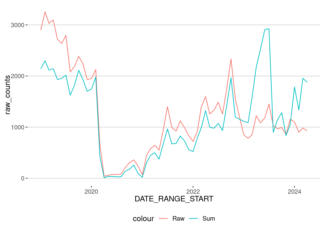
The reason for this discrepancy is due to privacy restrictions:
- In general, we see that the sum is smaller than the raw count before 2023. This is because a census tract is considered in the table only if it contains more than 4 users.
- Starting in 2023, Advan also introduced some differential privacy measures, including adding some noise to those counts. Thus, we see more people in the raw count than in the sum.
Let’s map out those census tracts where visitors to MFA come from. To do that, we compute the total number of visitors by tract.
mfa_tracts <- mfa_expanded |> group_by(Home_ID) |>
  summarize(sum_count = sum(Count,na.rm=T))
mfa_tracts |> arrange(-sum_count) |> datatable()
Most users come from the Boston area, but some visitors are from other states. Remember that the first 2 digits of the GEOID of a census tract is the state’s ID. Massachusetts is “25.” To investigate those census tracts visiting the MFA further, let’s get some information about those in Massachusetts. As in the previous lab, let’s use tidycensus to get the geometry of those tracts, along with some demographic variables
# ACS 5-year estimates variables
variables <- c(
  population = "B01003_001",              # Total Population
  median_household_income = "B19013_001", # Median Household Income
  poverty_rate = "B17001_002"             # Population Below Poverty Level
)require(tidycensus)
ma_tracts <- get_acs(
geography = "tract",
variables = variables,
state = "MA",
county = "Suffolk", # Boston is in Suffolk County
year = 2022, # Latest available year
geometry = TRUE, # Include spatial data
output = "wide",
progress = FALSE
) |>
st_transform(4326)
ma_tracts <- ma_tracts %>%
mutate(
poverty_rate_percent = (poverty_rateE / populationE) * 100
)Merge with the number of visitors by Census Tract
ma_tracts <- merge(ma_tracts,mfa_tracts,by.x="GEOID",by.y="Home_ID")Visualize it
require(mapview)
mapview(ma_tracts,zcol="sum_count",at = c(0,10,100,1000,10000))
As we can see, most MFA visits come from areas related to the University and the city of Boston.
Exercise 3
- This data can be very useful for investigating audience markets, especially for commercial businesses. Investigate the number of visitors to the different POIs in the dataset. For example, investigate the number of visitors to the different groceries in the dataset.
- Do visitors to groceries come from nearby areas?
Homes panel
To assess the potential use of Safegraph / Advan data in our problem, it is critical to know the panel of devices contained in the data. The company uses a home detection algorithm every month and reports the number of devices by home CBG.
That dataset can also be found in the /data/CUS/safegraph folder:
homes <- read_csv_arrow("/data/CUS/safegraph/Home_Panels/Boston_Monthly_Patterns_Home_Panel_Summary.csv.gz")Convert the date to match that of the Monthly patterns
homes <- homes |> mutate(DATE=as.Date(paste0(YEAR,"/",MON,"/01")))Let’s also get the CBGs for Massachusetts
ma_CBGs <- get_acs(
  geography = "block group",
  variables = variables,
  state = "MA",
  county = "Suffolk",  # Boston is in Suffolk County
  year = 2022,         # Latest available year
  geometry = TRUE,     # Include spatial data
  output = "wide",
  progress = FALSE
) |>
  st_transform(4326)
ma_CBGs <- ma_CBGs %>%
  mutate(
    poverty_rate_percent = (poverty_rateE / populationE) * 100
  )
Because of data drifting (users dropping from the panel or not using the apps), the number of devices by CBG changes over time. Let’s examine one of the CBGs. As we can see, the number of devices detected to have homes in the CBG is very small compared to the Census population.
CBG_selected <- "250250103001"
population_CBG <- ma_CBGs |> filter(GEOID==CBG_selected) |> pull(populationE)
homes |> filter(CENSUS_BLOCK_GROUP==CBG_selected) |>
  ggplot(aes(x=DATE,y=NUMBER_DEVICES_RESIDING)) + geom_line() +
  geom_hline(yintercept=population_CBG, linetype=2) +
  labs(x="Date",y="Number of Devices Residing",
       title = paste("CBG ",CBG_selected))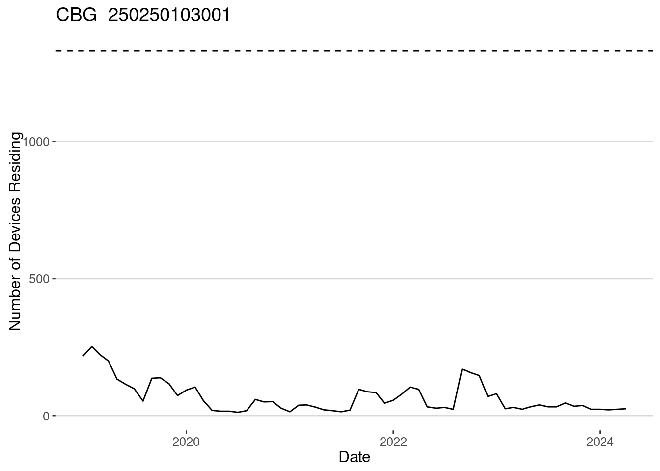
What is the penetration ratio of the Safegraph / Advan data for this CBG?
homes |> filter(CENSUS_BLOCK_GROUP==CBG_selected) |>
  ggplot(aes(x=DATE,y=NUMBER_DEVICES_RESIDING/population_CBG*100)) +
  geom_line() +
  labs(x="Date",y="Penetration Rate of Devices Residing in the CBG",
       title = paste("CBG ",CBG_selected))
Which is around 2%-5% from 2020, as found in [2]. Let’s investigate the penetration rate for all CBGs in the Boston area as a function of time.
require(sf)
homes <- homes |>
  merge(ma_CBGs |> st_drop_geometry() |>
        select(GEOID,populationE,median_household_incomeE,
               poverty_rateE),
        by.x="CENSUS_BLOCK_GROUP",by.y="GEOID")
homes <- homes |> mutate(
  penetration_rate = NUMBER_DEVICES_RESIDING/populationE
)
Distribution of penetration ratio by year
homes |> ggplot(aes(x=penetration_rate,col=factor(YEAR))) +
  geom_density() + scale_x_log10() +
  geom_vline(xintercept = 1,linetype="dashed")+
  labs(x="Penetration rate")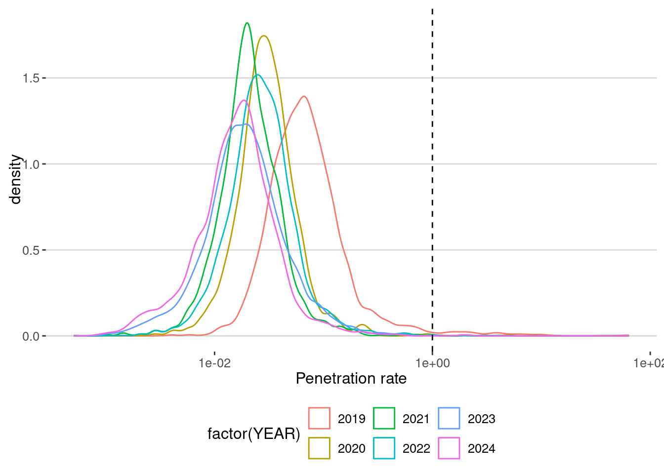
What we see:
- Penetration ratios are around 5% (0.05), meaning we have around 5% of the population as we discussed before.
- Also, the penetration rate decreases with years (drifting!).
homes |> group_by(YEAR) |> filter(populationE>0) |>
  summarize(avg_penetration_rate = mean(penetration_rate,na.rm=T))
# A tibble: 6 × 2
YEAR avg_penetration_rate
<int> <dbl>
1 2019 0.198
2 2020 0.0468
3 2021 0.0306
4 2022 0.0380
5 2023 0.0307
6 2024 0.0245- What’s more important is that for some CBGs, we have penetration ratios that are larger than one. This means that in those CBGs, we found more devices than reported in the Census. Which are those places? For example, here are the ones in which the penetration ratio is bigger than 50%.
CBGS_bigger_one <- homes |>
  filter(penetration_rate < Inf) |>
  filter(penetration_rate >= 0.5) |>
  select(CENSUS_BLOCK_GROUP) |> pull() |> unique()
ma_CBGs |> filter(GEOID %in% CBGS_bigger_one) |>
  leaflet() |> addTiles() |> addPolygons()
As you can see, most of them correspond to parks or outdoor areas and the airport. In those places, the number of residents in the census is very small (or even zero), and thus any small error in the estimation of homes from mobility data can create these large penetration ratios.
homes |> filter(penetration_rate < Inf) |>
  group_by(high_penetration = penetration_rate > 1) |>
  summarize(avg_population = median(populationE,na.rm=T))
# A tibble: 2 × 2
high_penetration avg_population
<lgl> <dbl>
1 FALSE 1092
2 TRUE 592As we can see, the CBGs affected by this problem are typically small.
Also, in 2019, the penetration ratio is very high (around 20%). Let’s investigate whether the high penetration ratio is due to an overestimation of devices’ residence.
homes |> filter(penetration_rate < Inf) |>
  group_by(DATE) |>
  summarize(avg_high_penetration = mean(penetration_rate >= 0.5,na.rm=T)) |>
  ggplot(aes(x=DATE,y=avg_high_penetration)) + geom_line() +
  labs(x="Date",y="Percentage of CBGs with high penetration")
There is a difference between the before and after summer of 2019. Thus, using 2019 as it is might lead to an overestimation of the movements, visits, and other metrics in this dataset. For this reason, we will only use data from August 2019 (including it).
homes <- homes |> filter(DATE >= "2019-08-01")Data Bias
Population bias
So far, we have seen that the home estimation algorithm overestimates the number of devices residing in some areas. But also, the penetration ratio is very different across areas. For example, this is the penetration rate choropleth for October 2019
ma_vis <- ma_CBGs |> merge(homes |> filter(DATE=="2019-10-01"),
                 by.x = "GEOID", by.y = "CENSUS_BLOCK_GROUP") |>
  filter(penetration_rate < Inf)
ma_vis |> mapview(zcol="penetration_rate",at = c(0,0.01,0.1,1,10))
As we can see, the penetration rate varies even several orders of magnitude from one CBG to the next. Thus, we don’t have an homogeneous penetration rate, that is, we have a significant population bias. For example, this is the correlation between the population detected and the one for the census for all months together
homes |> filter(populationE>0 & NUMBER_DEVICES_RESIDING>0)|>
  ggplot(aes(x=populationE,y=NUMBER_DEVICES_RESIDING,col=factor(YEAR)))+
  geom_point() + scale_x_log10() + scale_y_log10()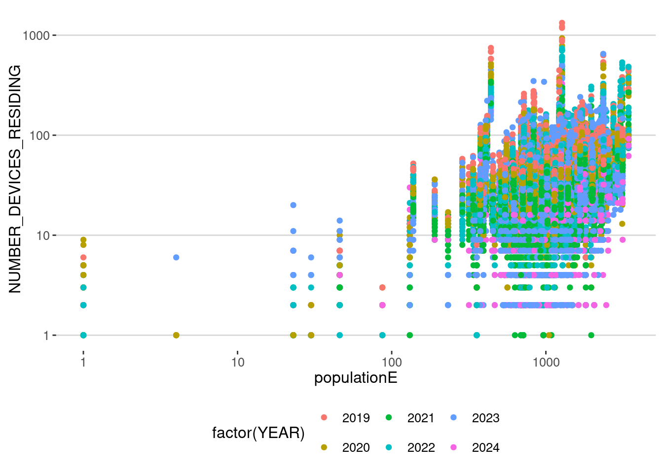
which correlates $= $ 0.256. This is a really low correlation, and a big question should be asked when using this data without any consideration.
Because different years have different penetration rates, let’s measure how this population bias evolves over time:
homes |> group_by(DATE) |>
  summarize(cor_pop=cor(populationE,NUMBER_DEVICES_RESIDING,use="na")) |>
  ggplot(aes(x=DATE,y=cor_pop)) + geom_line() +
  labs(x="Date", y = "Correlation of populations and devices",
       title="Evolution of the Population bias",
subtitle ="At CBG level") 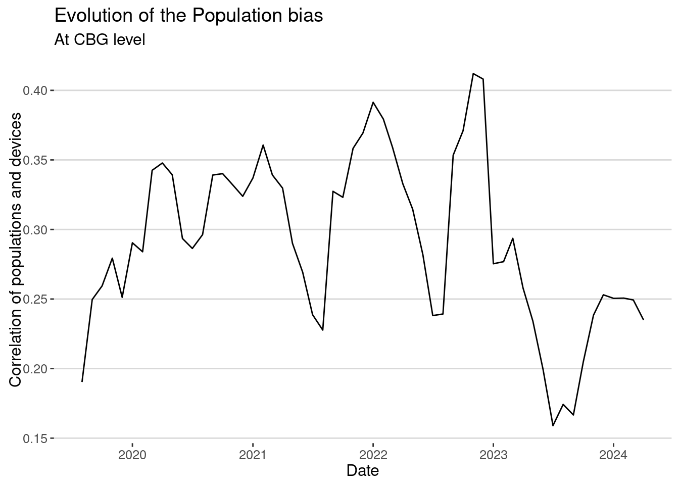
Again, we see the same thing. The correlation is very small, and in some years (2023) drops closer to 0.15. Of course, one of the possible solutions is to aggregate the data for larger areas. That will reduce the noise associated with our small number problem (very small penetration ratio). For example, let’s aggregate to the Census Tract level:
homes_tract <- homes |>
  group_by(TRACT = substr(CENSUS_BLOCK_GROUP,1,11),DATE) |>
  summarize(
    NUMBER_DEVICES_RESIDING=sum(NUMBER_DEVICES_RESIDING,na.rm=T),
    populationE = sum(populationE,na.rm=T)
  )
and then investigate the correlation as a function of time
homes_tract |> group_by(DATE) |>
  summarize(cor_pop=cor(populationE,NUMBER_DEVICES_RESIDING,use="na")) |>
  ggplot(aes(x=DATE,y=cor_pop)) + geom_line() +
  labs(x="Date", y = "Correlation of populations and devices",
       title="Evolution of the Population bias",
subtitle ="At Census Tract level") 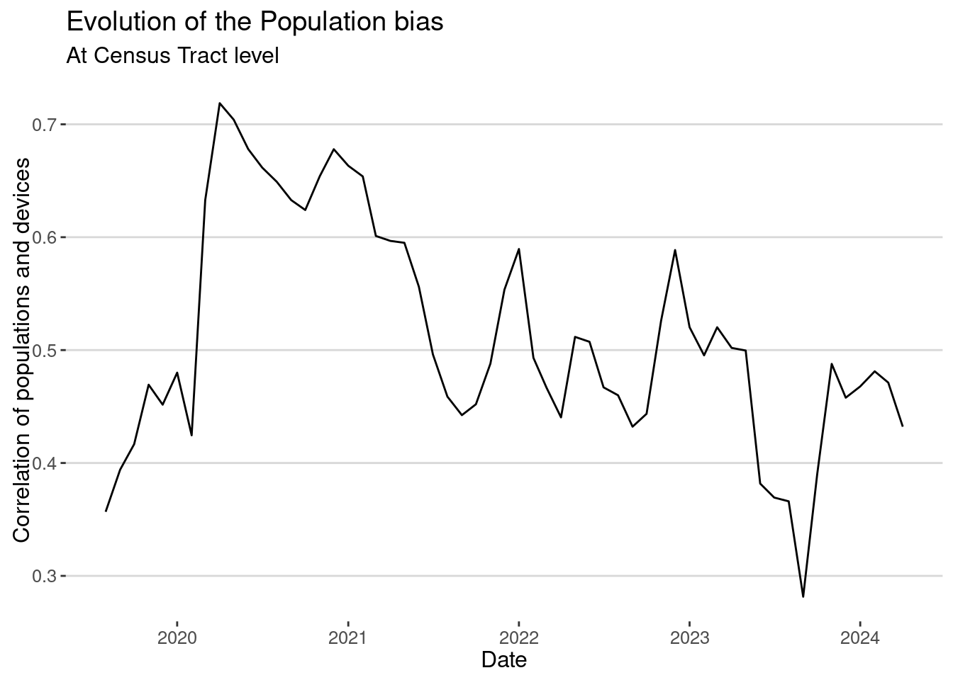
The correlation is better. Depending on the problem we want to investigate, we might not need to work at the CBG level; instead, it is better to aggregate at least to the Census tract level.
Demographic bias
The next question is whether the population bias is random or affects some demographic groups more often. As we know, mobile phone use and some applications are more prevalent among high-income, educated, and urban users, so SafeGraph could have more users residing in areas with those demographic traits.
To investigate this, we will use a very simple linear regression to examine the dependence of the penetration rate by CBG on the demographic traits of those areas. We will use the census data we used in the previous lab.
census <- read_parquet("/data/CUS/labs/2/14460_acs_2021_filtered_boston.parquet")
colnames(census)
[1] "GEOID" "age.total"
[3] "age.u18" "age.u1825"
[5] "age.u2564" "age.a64"
[7] "race.total" "race.white"
[9] "race.black" "race.native"
[11] "race.asian" "median_income"
[13] "ratio_poverty" "education.grade_0_9"
[15] "education.grade_9_12" "education.some_college"
[17] "education.bachelor" "employment.total"
[19] "employment.labor_force" "employment.civilian_labor_force"
[21] "employment.civilian_employed" "employment.civilian_unemployed"
[23] "employment.armed_forces" "employment.not_labor_force" Let’s transform the variables so they become ratios
census <- census |>
  mutate(across(-c(GEOID), ~ .x / age.total))
Merge with the homes dataset
homes <- homes |>
  merge(census,by.x="CENSUS_BLOCK_GROUP",by.y="GEOID")
And fit the regression for different years
require(stargazer)
var_demo <- c("median_income","age.u18","age.u1825","age.u2564",
              "race.white","race.black","ratio_poverty",
              "education.some_college","employment.civilian_employed")
fl <- formula(paste0("penetration_rate ~",paste0(var_demo,collapse="+")))
data_model <- homes |>
  mutate(median_income=log(median_income)) |>
  mutate(across(all_of(var_demo), scale)) #normalize regressors
fit2019 <- lm(fl,data=data_model |> filter(year(DATE)==2019))
fit2020 <- lm(fl,data=data_model |> filter(year(DATE)==2020))
fit2021 <- lm(fl,data=data_model |> filter(year(DATE)==2021))
fit2022 <- lm(fl,data=data_model |> filter(year(DATE)==2022))
stargazer(fit2019,fit2020,fit2021,fit2022,type="html")| Dependent variable: | ||||
| penetration_rate | ||||
| (1) | (2) | (3) | (4) | |
| median_income | 0.012*** | 0.007*** | 0.005*** | 0.005*** |
| (0.002) | (0.001) | (0.001) | (0.001) | |
| age.u18 | -0.004 | -0.001 | -0.001 | -0.001 |
| (0.003) | (0.001) | (0.001) | (0.001) | |
| age.u1825 | 0.008** | 0.003** | 0.004*** | 0.007*** |
| (0.004) | (0.001) | (0.001) | (0.001) | |
| age.u2564 | -0.001 | -0.003* | -0.002 | -0.002 |
| (0.004) | (0.002) | (0.001) | (0.001) | |
| race.white | -0.006 | -0.005*** | -0.003*** | -0.005*** |
| (0.004) | (0.002) | (0.001) | (0.001) | |
| race.black | -0.003 | -0.004*** | -0.003*** | -0.006*** |
| (0.004) | (0.001) | (0.001) | (0.001) | |
| ratio_poverty | 0.021*** | 0.015*** | 0.010*** | 0.011*** |
| (0.002) | (0.001) | (0.001) | (0.001) | |
| education.some_college | 0.007*** | 0.008*** | 0.005*** | 0.004*** |
| (0.002) | (0.001) | (0.001) | (0.001) | |
| employment.civilian_employed | 0.004 | 0.005*** | 0.002* | -0.001 |
| (0.004) | (0.001) | (0.001) | (0.001) | |
| Constant | 0.055*** | 0.038*** | 0.027*** | 0.034*** |
| (0.002) | (0.001) | (0.0005) | (0.001) | |
| Observations | 2,285 | 5,484 | 5,478 | 5,484 |
| R2 | 0.059 | 0.076 | 0.076 | 0.104 |
| Adjusted R2 | 0.056 | 0.074 | 0.075 | 0.102 |
| Residual Std. Error | 0.083 (df = 2275) | 0.049 (df = 5474) | 0.034 (df = 5468) | 0.038 (df = 5474) |
| F Statistic | 15.953*** (df = 9; 2275) | 49.843*** (df = 9; 5474) | 50.130*** (df = 9; 5468) | 70.219*** (df = 9; 5474) |
| Note: | p<0.1; p<0.05; p<0.01 | |||
As we can see, the penetration rate is positively correlated with the median income, the percentage of people in the area between 18 and 25 years old, and the percentage of people with some college education. It is negatively correlated with the percentage of people in poverty. This is a clear sign of the demographic bias in the data, but it is not a very strong one (see the value of the coefficients and \(R^2\)).
Post-stratification
To alleviate the effect of the population/demographic bias in our data, we can use pre- or post-stratification methods. Since Safegraph / Advan data is already aggregated, we can only try to post-stratify the results. The idea is to reweight a quantity (visits, trips, or any other metric) for a given geographical area, assuming that the collection of devices from that area is a random selection of the population or the demographics of people residing there. That is a big assumption because, as we know it, mobile phone data might have a lot of potential biases even within the same geographical area.
Assuming that we know \(w_{\alpha,d}\) the penetration ratio in the area \(\alpha\) and demographic groups \(d\), we can reweight any aggregated metric \(m_{\alpha,d}\) obtained using Safegraph data to
\[ \hat m_{\alpha,d} = m_{\alpha,d} / w_{\alpha,d} \]
For example, suppose that \(m_{\alpha,d}\) is the number of visits to the MFA of devices in group \(d\) that reside in area \(\alpha\). Then \(\hat m_{\alpha,d}\) is an approximation of the total number of visits of all people from demographic group \(\alpha\) living in area \(\alpha\). Since LBS data like Safegraph does not contain demographic information about their users, it is impossible to do this post-stratification by group \(d\), so we can only control for population biases by area:
\[ \hat m_{\alpha} = m_{\alpha} / w_{\alpha} \]
For example, let’s see how we can apply this technique to alleviate the problem of highly heterogeneous population bias in Safegraph data using Census Tracts for the special case of visits to POIs in the Monthly Patterns dataset.
Let’s denote \(T_i(t)\) the total number of visitors to place \(i\) during month \(t\), that is, the variable RAW_VISITOR_COUNTS in the patterns dataset. We also have that number desaggregated by home Census Tract of the devices in the variable VISITOR_HOME_AGGREGATION. Let’s called this variable \(T_{\alpha,i}(t)\). Using post-stratification, we can reweight the new number of visitors from each census tract and month as
\[ \hat T_{\alpha,i}(t) = T_{\alpha,i}(t) / w_{\alpha}(t) \]
where \(w_{\alpha}(t)\) is the penetration ratio of Census tract \(\alpha\) for month \(t\). Aggregating these reweighted number of visitors we get an estimation of the total number of visitors as
\[ \hat T_{i}(t) = \sum_\alpha \hat T_{\alpha,i}(t) \] Let’s do it for the visits to the MFA. First we merge our visits data with the census to calculate the penetration ratio by Census tract.
homes_tract <-  homes_tract |>
  mutate(penetration_rate = NUMBER_DEVICES_RESIDING/populationE)
mfa_expanded_hat <- mfa_expanded |>
merge(homes_tract |> select(TRACT,DATE,penetration_rate),
by.x=c("Home_ID","DATE_RANGE_START"),
by.y=c("TRACT","DATE"),all.x=T) |>
filter(!is.na(penetration_rate))Note that by merging with the census tracts in MA, we discard the visits from people from other states. Finally, we apply the equations above to calculate the reweighted number of visitors by day.
mfa_hat <- mfa_expanded_hat |>
  group_by(DATE_RANGE_START) |>
  summarize(RAW_VISITOR_COUNTS = mean(RAW_VISITOR_COUNTS),
            RAW_VISITOR_COUNTS_HOME = sum(Count),
            HAT_VISITOR_COUNTS = sum(Count/penetration_rate))
Let’s compare the 3 of them
mfa_hat |>
  ggplot()+
  geom_line(aes(x=DATE_RANGE_START,y=RAW_VISITOR_COUNTS,col="RAW (all states)")) +
  geom_line(aes(x=DATE_RANGE_START,y=RAW_VISITOR_COUNTS_HOME,col="Raw (only MA)")) +
  geom_line(aes(x=DATE_RANGE_START,y=HAT_VISITOR_COUNTS,col="Stratified (only MA)"))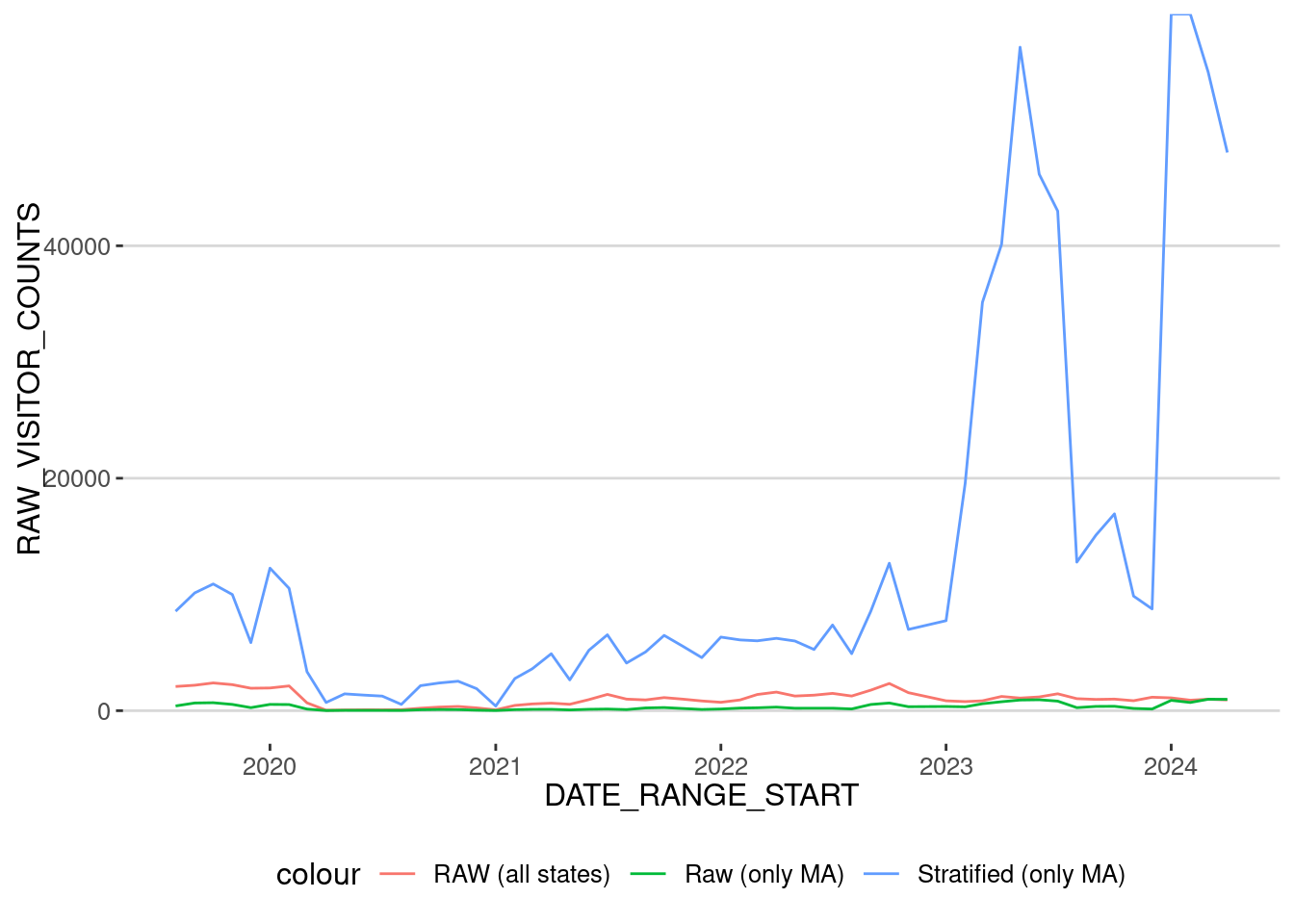
As we can see, using our stratification method from 2023 creates a (probably) overestimation of the number of visits because the number of users in 2023 and 2024 is very small. So let’s concentrate only on the period until Jan 2023
mfa_hat |> filter(DATE_RANGE_START < "2023-01-01") |>
  ggplot()+
  geom_line(aes(x=DATE_RANGE_START,y=RAW_VISITOR_COUNTS,col="RAW (all states)")) +
  geom_line(aes(x=DATE_RANGE_START,y=RAW_VISITOR_COUNTS_HOME,col="Raw (only MA)")) +
  geom_line(aes(x=DATE_RANGE_START,y=HAT_VISITOR_COUNTS,col="Stratified (only MA)")) + scale_y_log10()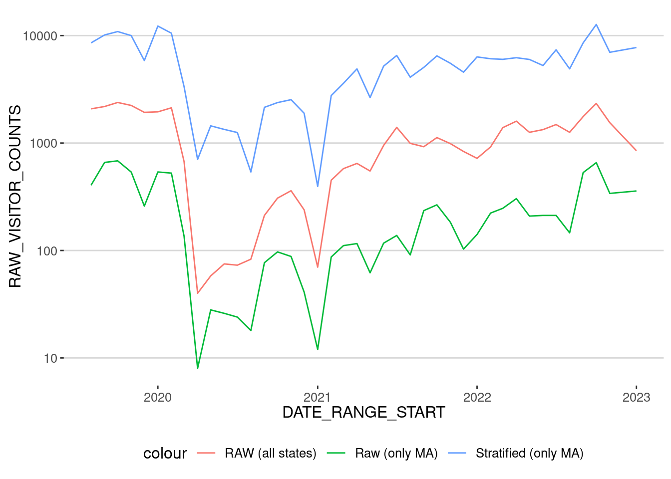
As we can see, the time series are very similar, but the reweighted has (as expected) larger numbers corresponding to population levels. Let’s normalize them to the levels before the lockdown to see better the difference:
mfa_hat |> filter(DATE_RANGE_START < "2023-01-01") |>
  mutate(RAW_VISITOR_COUNTS = RAW_VISITOR_COUNTS/mean(RAW_VISITOR_COUNTS[DATE_RANGE_START < "2020-03-01"]),
         RAW_VISITOR_COUNTS_HOME = RAW_VISITOR_COUNTS_HOME/mean(RAW_VISITOR_COUNTS_HOME[DATE_RANGE_START < "2020-03-01"]),
         HAT_VISITOR_COUNTS = HAT_VISITOR_COUNTS/mean(HAT_VISITOR_COUNTS[DATE_RANGE_START < "2020-03-01"])) |>
  ggplot()+
  geom_line(aes(x=DATE_RANGE_START,y=RAW_VISITOR_COUNTS,col="RAW (all states)")) +
  geom_line(aes(x=DATE_RANGE_START,y=RAW_VISITOR_COUNTS_HOME,col="Raw (only MA)")) +
geom_line(aes(x=DATE_RANGE_START,y=HAT_VISITOR_COUNTS,col="Stratified (only MA)")) 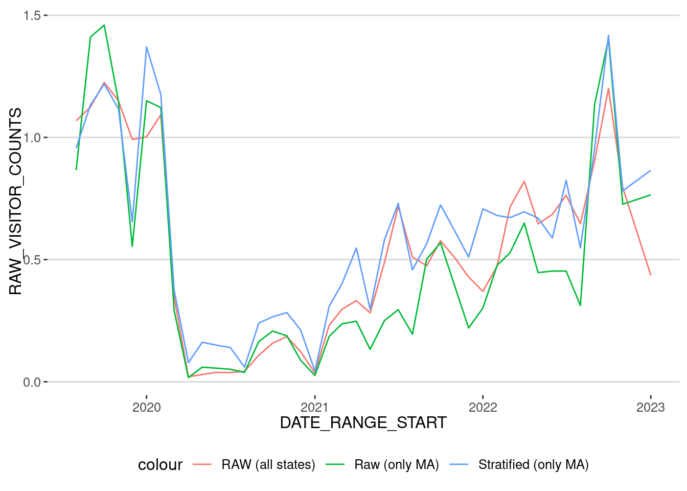
Exercise 4
- Repeat the post-stratification process with the visits to the POI in Northeastern University.
- Investigate the difference between the raw number of visits and the post-stratified number of visits.
Validation
Which metric should we use to estimate the number of visitors to a POIs? The raw number or the post-stratified? In general, it is good to follow the following protocol:
- Test how different your results ared between the raw and post-stratified counts. In our case, for the MFA, we got:
mfa_hat |> filter(DATE_RANGE_START < "2023-01-01") |>
  summarize(cor(RAW_VISITOR_COUNTS_HOME,HAT_VISITOR_COUNTS))
# A tibble: 1 × 1
`cor(RAW_VISITOR_COUNTS_HOME, HAT_VISITOR_COUNTS)`
<dbl>
1 0.936Which is a large correlation. Thus, although maybe the absolute number of visitors might be different, trends in both time series are similar.
- Try to compare your results to other datasets. For example,
- In [4], we compared the post-stratified number of visits to professional sports stadiums with official attendance to those games.
- Using the Department of Transportation data, [5] compared the number of trips to the number of trips in the DoT data.
- Finally, [3] uses voting roll data to validate the number of visits to polling places.
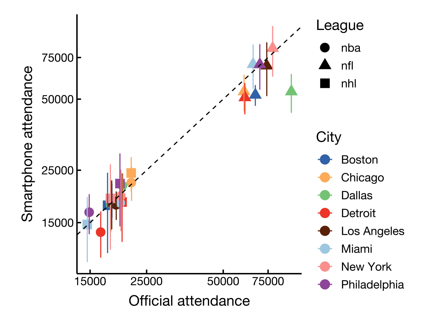
For example, here is the number of visitors to the MFA by Fiscal Year (ending on June 30) reported by the MFA (see here)
visitors_MFA <- tibble(year=c(2019,2020,2021,2022,2023),
                       visitors=c(1351966,765000,201000,632000,849000))
Let’s aggregate the number of visits to the MFA by Fiscal Year from the 1st of July to the 30th of June of the following year and also normalize them to coincide during FY 2020
mfa_hat |>
  mutate(year = ifelse(month(DATE_RANGE_START) < 7, year(DATE_RANGE_START),year(DATE_RANGE_START) + 1)) |>
  group_by(year) |>
  summarize(across(c(RAW_VISITOR_COUNTS,RAW_VISITOR_COUNTS_HOME,HAT_VISITOR_COUNTS,),sum)) |>
  merge(visitors_MFA) |>
  mutate(RAW_VISITOR_COUNTS = RAW_VISITOR_COUNTS/RAW_VISITOR_COUNTS[year==2020]*visitors[year==2020],
         RAW_VISITOR_COUNTS_HOME = RAW_VISITOR_COUNTS_HOME/RAW_VISITOR_COUNTS_HOME[year==2020]*visitors[year==2020],
         HAT_VISITOR_COUNTS = HAT_VISITOR_COUNTS/HAT_VISITOR_COUNTS[year==2020]*visitors[year==2020]
  )
year RAW_VISITOR_COUNTS RAW_VISITOR_COUNTS_HOME HAT_VISITOR_COUNTS visitors
1 2020 765000.0 765000.0 765000.0 765000
2 2021 219529.3 170893.6 308195.1 201000
3 2022 655089.6 472872.5 694646.3 632000
4 2023 697314.2 1164488.8 2510498.4 849000As we can see, the number of visits to the MFA is very similar to the official numbers, even the raw ones. The post-stratified overestimate them during the pandemic due to the small numbers. Note, however, that the post-stratified method only includes visits from people in the city of Boston. This is a good example of how to validate the results of the post-stratification method.
Changes in mobility during and after COVID-19
Instead of visits to a particular place (MFA), let’s see the evolution of visits to all places in the city of Boston by category of the place. As we know, our mobility changed dramatically during the lockdowns and we haven’t recovered our pre-pandemic activity levels in some aspects of our life. For example, working from home has probably affected commuting or visits to places in downtown Boston. Let’s investigate which activities have changed or not.
We select some of the categories of places that could have been affected
cat_COVID <-
  c("Convenience Stores",
    "Supermarkets and Other Grocery (except Convenience) Stores",
    "Hair, Nail, and Skin Care Services",
    "Fitness and Recreational Sports Centers")
Aggregate all visits to those POIs categories for the period from 2019-01-01 to 2023-01-01
cat_patterns <- patterns |>
  filter(SUB_CATEGORY %in% cat_COVID) |>
  group_by(DATE_RANGE_START,SUB_CATEGORY) |>
  summarize(RAW_VISIT = sum(RAW_VISIT_COUNTS,na.rm=T)) |>
  collect() |>
  filter(DATE_RANGE_START >= "2019-01-01" &
         DATE_RANGE_START < "2023-01-01")
cat_patterns |>
group_by(SUB_CATEGORY) |>
mutate(RAW_VISIT = RAW_VISIT / mean(RAW_VISIT[DATE_RANGE_START < "2020-03-01"])) |>
ggplot(aes(x=DATE_RANGE_START,
y=RAW_VISIT,
col=SUB_CATEGORY))+
geom_line() + theme(
legend.direction = "vertical") +
scale_y_log10() + scale_color_tableau()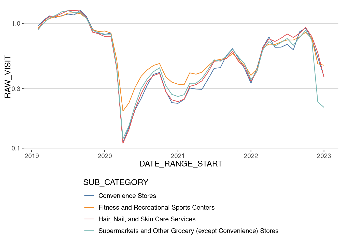
As we can see, the number of visits to the places has not recovered if we use the raw number of visits. What happens if we post-stratify that number of visits? In principle, we should have to expand the visits to each POI and stratify the number of visits like we did before. Since this is a computationally expensive operation, let’s just divide each of the time series for each category by the penetration ratio that month in the whole Boston Area
homes_total <- homes |>
  group_by(DATE) |>
  summarize(NUMBER_DEVICES_RESIDING=sum(NUMBER_DEVICES_RESIDING,na.rm=T),
            populationE = sum(populationE,na.rm=T))
cat_patterns |> mutate(DATE_RANGE_START = as.Date(DATE_RANGE_START)) |>
merge(homes_total,by.x="DATE_RANGE_START",by.y="DATE") |>
mutate(RAW_VISIT = RAW_VISIT / NUMBER_DEVICES_RESIDING * populationE) |>
group_by(SUB_CATEGORY) |>
mutate(RAW_VISIT = RAW_VISIT / mean(RAW_VISIT[DATE_RANGE_START < "2020-03-01"])) |>
ggplot(aes(x=DATE_RANGE_START,
y=RAW_VISIT,
col=SUB_CATEGORY))+
geom_line() + theme(
legend.direction = "vertical") +
scale_y_log10() + scale_color_tableau()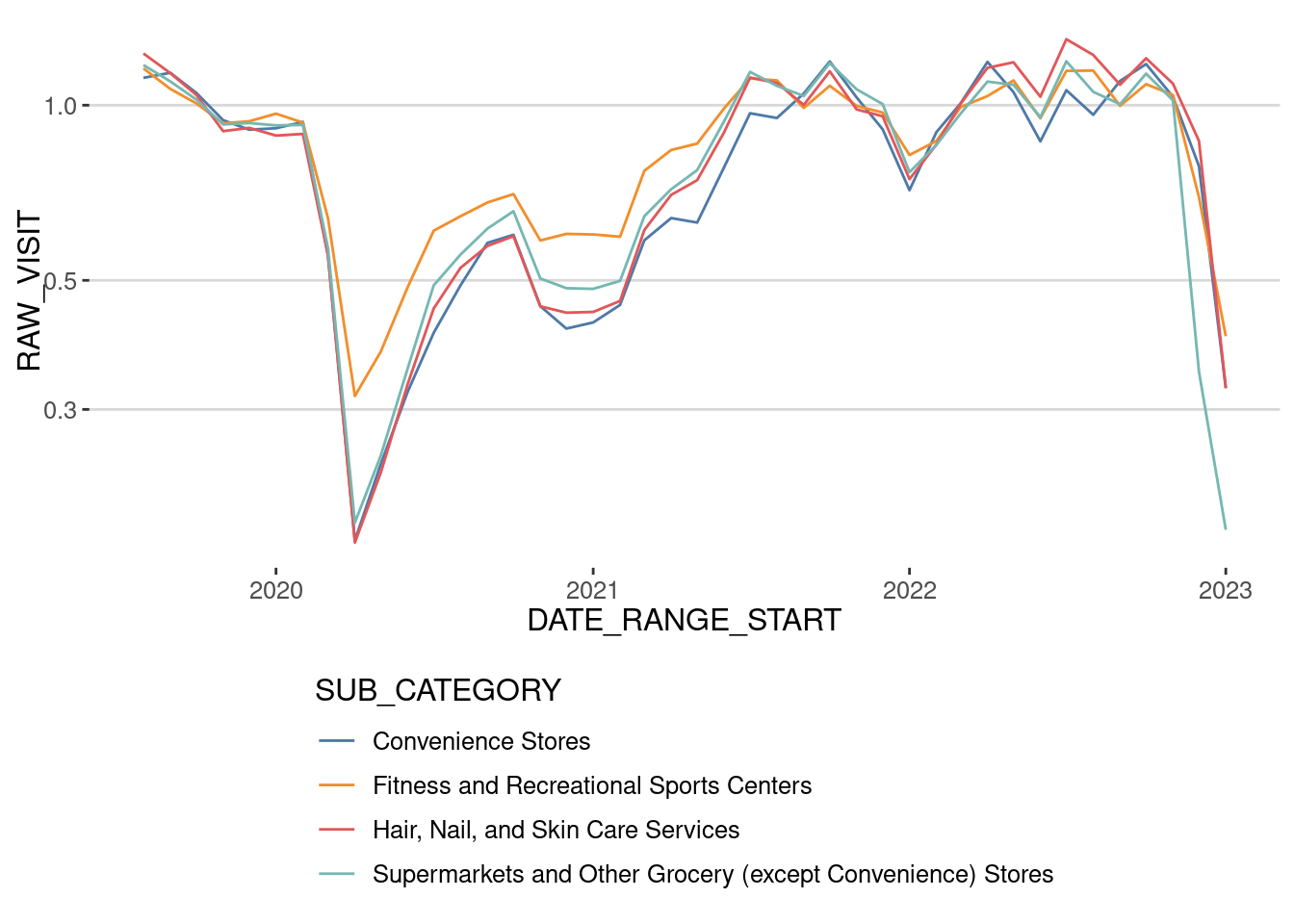
As we can see, the activity level recovered around mid-2021 for these categories, coinciding with other analyses made with Cuebiq data [6]. This shows the importance of stratifying the data or at least comparing it with and without stratification.
Let’s also investigate other aspects of the visit that COVID-19 influenced. During the first wave, researchers also found that, because of the risk of infection, people minimized the number of visits (as shown above) and the time they spent at those places. Let’s have a look at that:
cat_patterns <- patterns |>
  filter(SUB_CATEGORY %in% cat_COVID) |>
  group_by(DATE_RANGE_START,SUB_CATEGORY) |>
  summarize(DWELL_TIME = sum(MEDIAN_DWELL,na.rm=T)) |>
  collect() |>
  filter(DATE_RANGE_START >= "2019-01-01" &
         DATE_RANGE_START < "2023-01-01")
cat_patterns |>
group_by(SUB_CATEGORY) |>
mutate(DWELL_TIME = DWELL_TIME / mean(DWELL_TIME[DATE_RANGE_START < "2020-03-01"])) |>
ggplot(aes(x=DATE_RANGE_START,
y=DWELL_TIME,
col=SUB_CATEGORY))+
geom_line() + theme(
legend.direction = "vertical") +
scale_y_log10() + scale_color_tableau()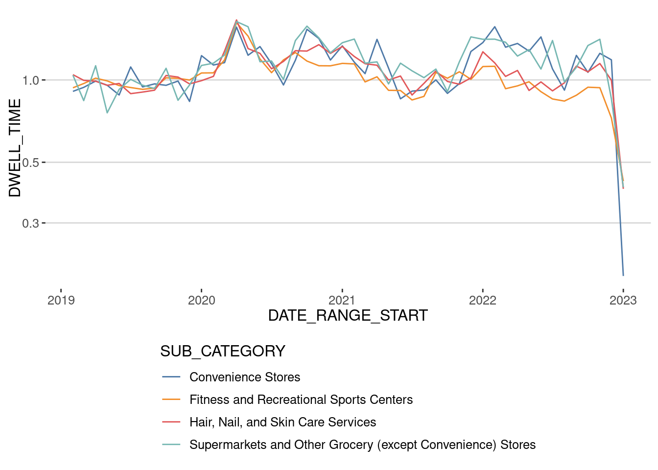
As we can see, it is the opposite. During the lockdown, people visited those places fewer times but spent more time per visit. This behavior has stuck, especially in grocery and convenience stores. We now spend around 20% more per visit than before the pandemic.
Conclusions
The raw data from SafeGraph/Advan presents several challenges:
- Spatial noise: The data is highly variable across areas due to low penetration rates in many regions studied.
- Temporal noise: The quality and quantity of devices have fluctuated significantly, particularly after January 2023.
- Population bias: The correlation between device counts and census population is approximately 0.25 for Census Block Groups (CBGs) and 0.5 for Census tracts, highlighting severe biases.
These limitations imply that using SafeGraph/Advan data without addressing its noise and biases requires careful consideration of the geographical and temporal context of the analysis, especially at the CBG level. Many researchers have employed this data at the CBG level during and after the pandemic without accounting for these issues or at least trying to alleviate them by using post-stratification or validation techniques. Our findings suggest that such practices can be problematic, as the temporal and population biases inherent in the data may substantially affect the validity of these results.
References
[1]
S. Chang et al., “Mobility network models of COVID-19 explain inequities and inform reopening,” Nature, vol. 589, no. 7840, pp. 82–87, Jan. 2021, doi: 10.1038/s41586-020-2923-3.
[2]
Z. Li, H. Ning, F. Jing, and M. N. Lessani, “Understanding the bias of mobile location data across spatial scales and over time: A comprehensive analysis of SafeGraph data in the United States,” PLOS ONE, vol. 19, no. 1, p. e0294430, Jan. 2024, doi: 10.1371/journal.pone.0294430.
[3]
A. Coston, N. Guha, D. Ouyang, L. Lu, A. Chouldechova, and D. E. Ho, “Leveraging Administrative Data for Bias Audits: Assessing Disparate Coverage with Mobility Data for COVID-19 Policy,” in Proceedings of the 2021 ACM Conference on Fairness, Accountability, and Transparency, in FAccT ’21. New York, NY, USA: Association for Computing Machinery, Mar. 2021, pp. 173–184. doi: 10.1145/3442188.3445881.
[4]
E. Moro, D. Calacci, X. Dong, and A. Pentland, “Mobility patterns are associated with experienced income segregation in large US cities,” Nature Communications, vol. 12, no. 1, pp. 1–10, Jul. 2021, doi: 10.1038/s41467-021-24899-8.
[5]
Y. Xu, R. D. Clemente, and M. C. González, “Understanding vehicular routing behavior with location-based service data,” EPJ Data Science, vol. 10, no. 1, pp. 1–17, Dec. 2021, doi: 10.1140/epjds/s13688-021-00267-w.
[6]
T. Yabe, B. G. B. Bueno, X. Dong, A. Pentland, and E. Moro, “Behavioral changes during the COVID-19 pandemic decreased income diversity of urban encounters,” Nature Communications, vol. 14, no. 1, p. 2310, Apr. 2023, doi: 10.1038/s41467-023-37913-y.