library(tidyverse)
library(arrow)
options(arrow.unsafe_metadata = TRUE)
library(DT) # for interactive tables
library(knitr) # for tables
library(ggthemes) # for ggplot themes
library(sf) # for spatial data
library(tigris) # for US geospatial data
library(tidycensus) # for US census data
library(fixest) # for fixed effects models
library(stargazer) # for tables
library(leaflet) # for interactive maps
library(jsonlite) # for JSON data
theme_set(theme_hc() + theme(axis.title.y = element_text(angle = 90))) Lab 8-1 - Individual Mobility Models
Objectives
In this lab, we will use individual mobility models to analyze human behavior in urban areas. We will use your own mobility data and data from Cuebiq to analyze mobility patterns using the Exploration-Preferential Return (EPR) model.
Specifically, we will learn how to:
- Download and load our own mobility data from the Google Maps App.
- Analyze the data to understand our mobility patterns.
- Model our mobility using the Exploration-Preferential Return (EPR) model.
- Model mobility data using the EPR model for a group of individuals and understand demographic differences.
Load some libraries and settings we will use
Note
As before, participation in this lab is entirely voluntary. If you have any concerns about sharing or collecting your mobility data with Google or other providers, please don’t hesitate to contact the lab coordinator or instructor. We’re happy to explore alternative ways for you to participate. Your privacy matters; we want to ensure your involvement aligns with your preferences and comfort level.
Modeling your own mobility using EPR model
Let’s use the mobility data we start collecting in Lab 2-1
Your personal data can be downloaded from your Google Maps app on your phone. Here are the instructions for iOS:
- On you iPhone or iPad, open the Google Maps app
- Tap your Profile Picture or Initials and then Settings.
- Tap Personal content > Export Timeline Data.
- Download the file to your phone or send it to your computer
The downloaded file is a JSON collection of visits and trips
Load your data
Here is how the file looks like:
output <- system("head -n 20 ~/location-history.json", intern = TRUE)
cat(output,sep ="\n")
[
{
"endTime" : "2018-03-07T22:41:09.418-05:00",
"startTime" : "2018-03-07T22:40:09.418-05:00",
"visit" : {
"hierarchyLevel" : "0",
"topCandidate" : {
"probability" : "1.000000",
"semanticType" : "Unknown",
"placeID" : "ChIJxSG_b6VZwokRI4BZTxqjQFI",
"placeLocation" : "geo:40.745864,-73.992649"
},
"probability" : "1.000000"
}
},
{
"endTime" : "2020-02-11T07:38:46.539-05:00",
"startTime" : "2020-02-10T20:43:34.017-05:00",
"visit" : {
"hierarchyLevel" : "0",The file contains three kind of objects:
visitwhich are stays in a particular spatial pointactivitywhich are the activities (movements)timelinePathwhich are contains the paths of movements.
Let’s load the data and see what it looks like.
data <- fromJSON("~/location-history.json",flatten = FALSE)Let’s get the visits and add the lat, lon:
require(lubridate) #to work with date formatted data
visits <- data.frame(
  endTime = data$endTime, startTime=data$startTime,
  data$visit$topCandidate) |>
  drop_na() |>
  mutate(lat = as.numeric(sub("geo:([0-9.-]+),.*", "\\1", placeLocation)),
         lon = as.numeric(sub("geo:[0-9.-]+,([0-9.-]+)", "\\1", placeLocation))
         ) |>
  select(-placeLocation) |>
  mutate(endTime = ymd_hms(endTime), startTime = ymd_hms(startTime)) |>
  mutate(probability = as.numeric(probability)) |>
  filter(startTime >= "2020-01-01")
Let’s look at the data:
visits |> head() |> datatable()Here is the spatial distribution of them.
visits |> # add some noise to the data
  mutate(lon = lon + rnorm(n(),mean=0,sd=0.001),
         lat = lat + rnorm(n(),mean=0,sd=0.001)) |>
  leaflet() |> addTiles() |> addCircles(~lon, ~lat, popup = ~semanticType)
For simplicity, let’s keep only the places in the Boston Area
visits <- visits |>
  filter (lat > 42.2 & lat < 42.5 & lon > -71.2 & lon < -70.9)
visits |> # add some noise to the data
  mutate(lon = lon + rnorm(n(),mean=0,sd=0.001),
         lat = lat + rnorm(n(),mean=0,sd=0.001)) |>
  leaflet() |> addTiles() |> addCircles(~lon, ~lat, popup = ~semanticType)
Here is the distribution of the visits by type of place detected by Google:
visits |>
  ggplot(aes(x = semanticType)) + geom_bar(fill="darkblue") +
  labs(title="Number of visits by type of place",
       x="Type of place", y="Number of visits") + coord_flip()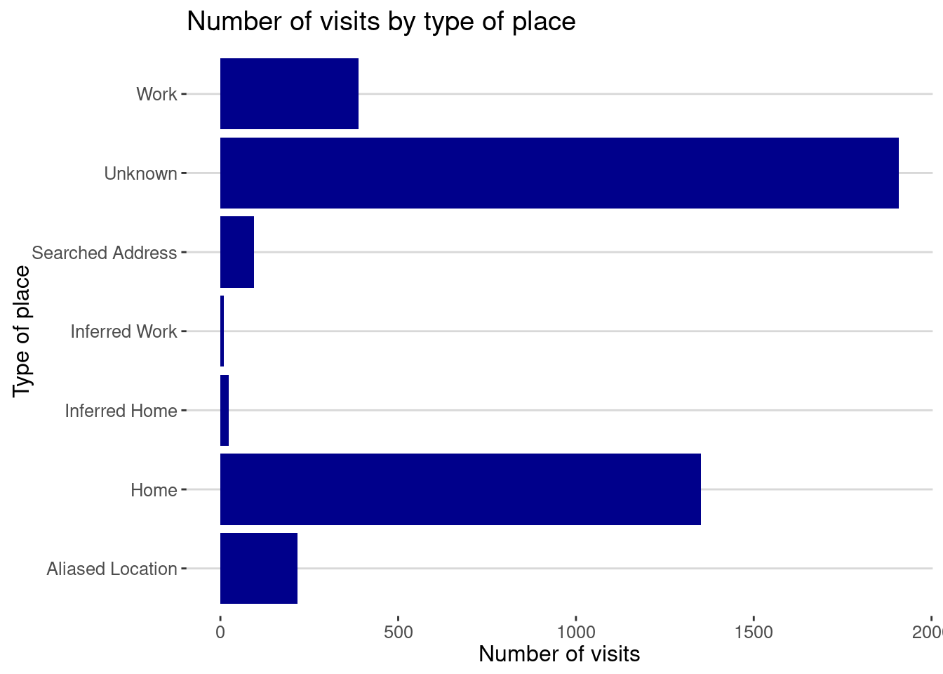
As you can see, Google classifies the places you visit in different categories.
HomeandWorkare the ones you set up in the Google App.Inferred HomeandInferred Workare the ones Google infers from your behavior.Unknownare the places that Google cannot classify. The are typically other 3rd places like the restaurants you visit, the gym, etc.Searched Addressare the places you search for in Google Maps.Aliased Locationare places that are private
Analyze your mobility data
Here is the distribution of the number of visits by place. We use the placeID to identify the places.
visits |> group_by(placeID) |>
  summarize(nvisits = n(), time = sum(difftime(endTime, startTime, units = "hours"))) |>
  ggplot(aes(x=nvisits)) + geom_density(fill="red",alpha=0.5) +
  scale_x_log10() +
  labs(title="Density of number of visits by place",
       x="Number of visits", y="Density")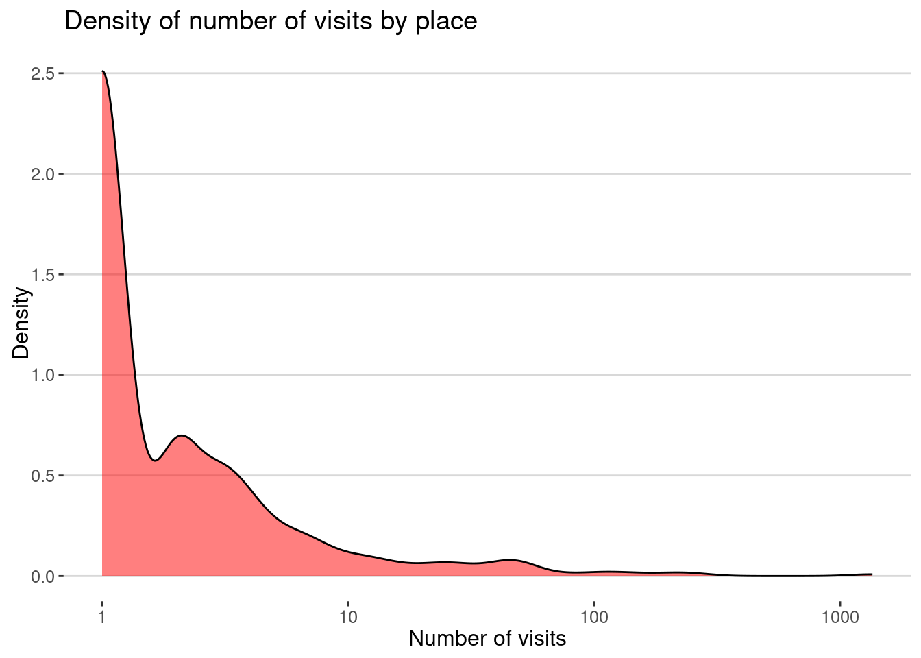
The same for the time spent in each place:
visits |> group_by(placeID) |>
  summarize(time = as.numeric(
    sum(difftime(endTime, startTime, units = "hours")))
    ) |>
  ggplot(aes(x=time)) + geom_density(fill="red",alpha=0.5)+ scale_x_log10() +
  labs(title="Density of time spent by place",
       x="Time spent (hours)", y="Density")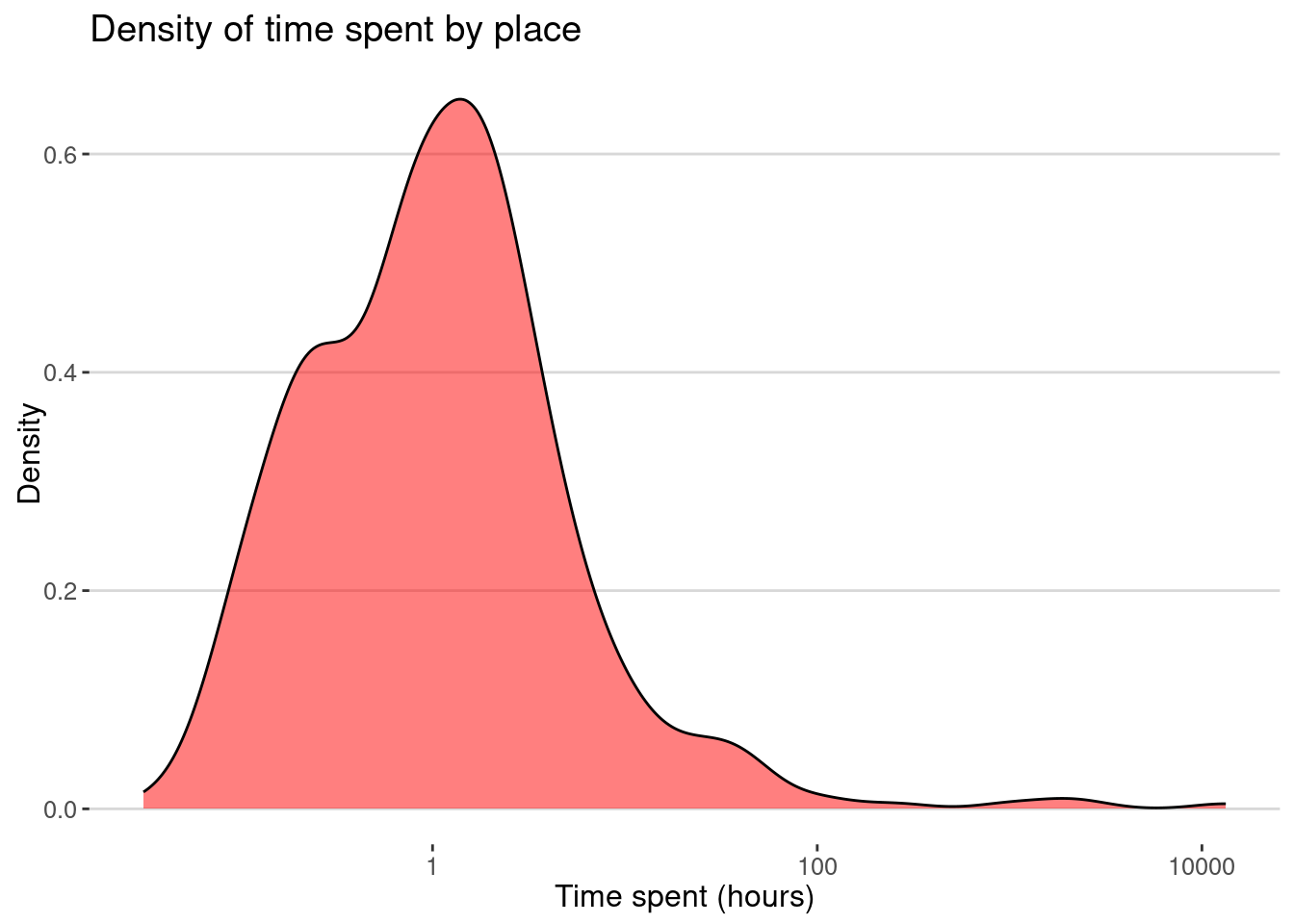
Exploration rate
Let’s model our mobility using the Exploration and Preferential Return model [1] [2]. The model assumes that individuals explore new places with a rate \(\rho\) and return to places they have visited before with a rate \(1-\rho\).
We calculate know the exploration rate \(\sigma\), which is fraction of times we visited a new place every time we visited a place.
length(unique(visits$placeID))/nrow(visits)[1] 0.1267535here is the plot:
places <- unique(visits$placeID)
visits <- visits |>
  mutate(place = match(placeID, places))
visits |>
  ggplot(aes(x=startTime, y=place)) + geom_point(aes(col=semanticType)) +
  labs(x = "Date", y ="Place ID")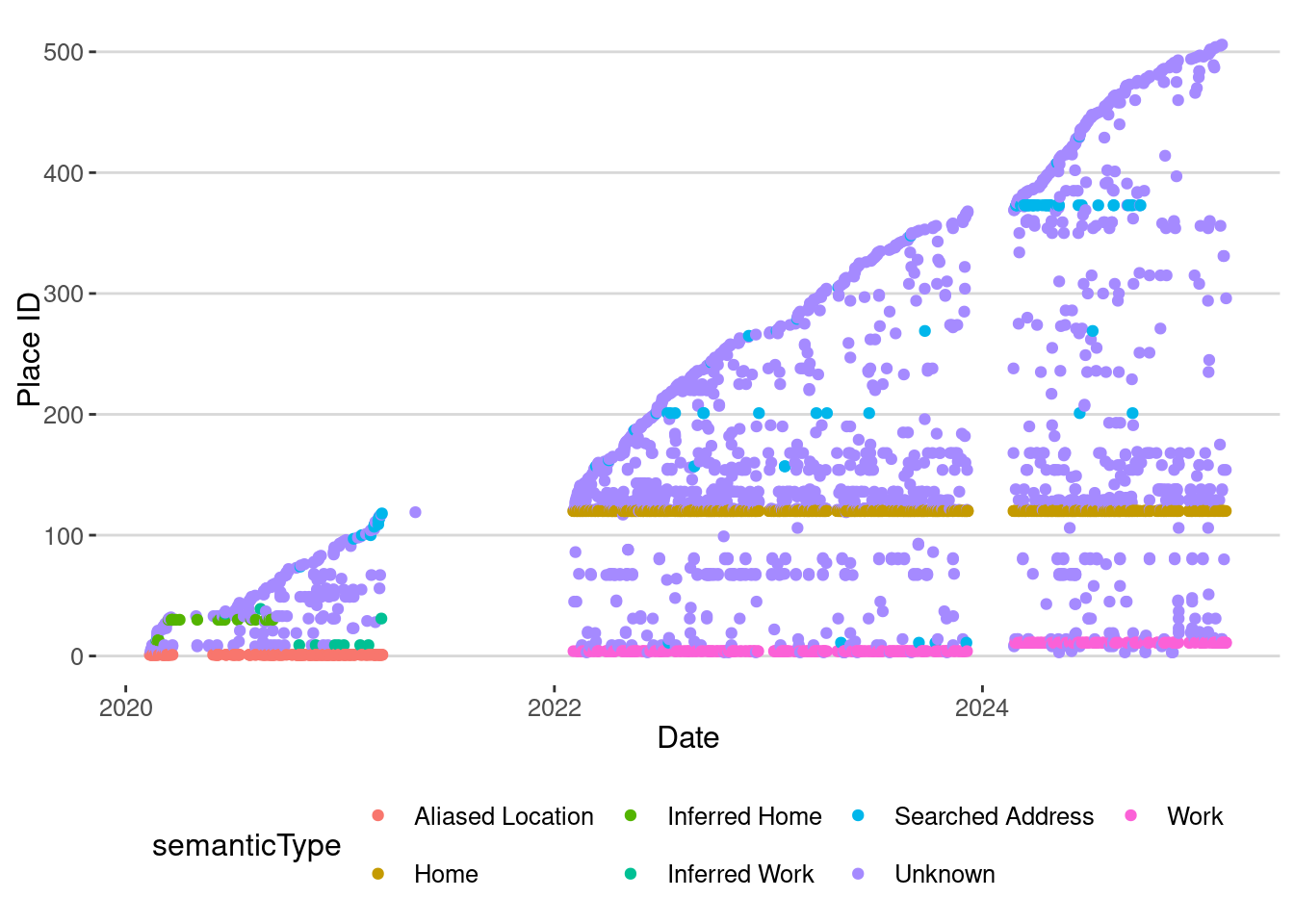
My exploration rate has changed over time:
visits |> group_by(year=year(startTime),quarter=quarter(startTime)) |>
  summarize(nvisits = n(),
            exploration = length(unique(placeID))/n()) |>
  mutate(date=as.Date(paste0(year,"-",(quarter-1)*3+1,"-01"))) |>
  filter(nvisits > 20) |>
  ggplot(aes(x=date, y=exploration)) + geom_point() + geom_smooth() +
  scale_x_date(date_breaks = "1 year", date_labels = "%Y")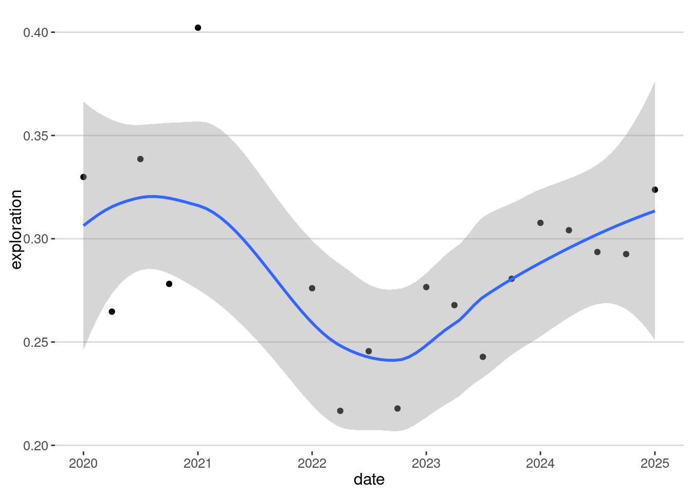
To model the data, let’s get only the exploration events from 2024:
visits_2024 <- visits |> filter(startTime >= "2024-01-01")
places <- unique(visits_2024$placeID)
visits_2024 <- visits_2024 |>
  mutate(place = match(placeID, places))
visits_2024 |>
  ggplot(aes(x=startTime, y=place)) + geom_point(aes(col=semanticType))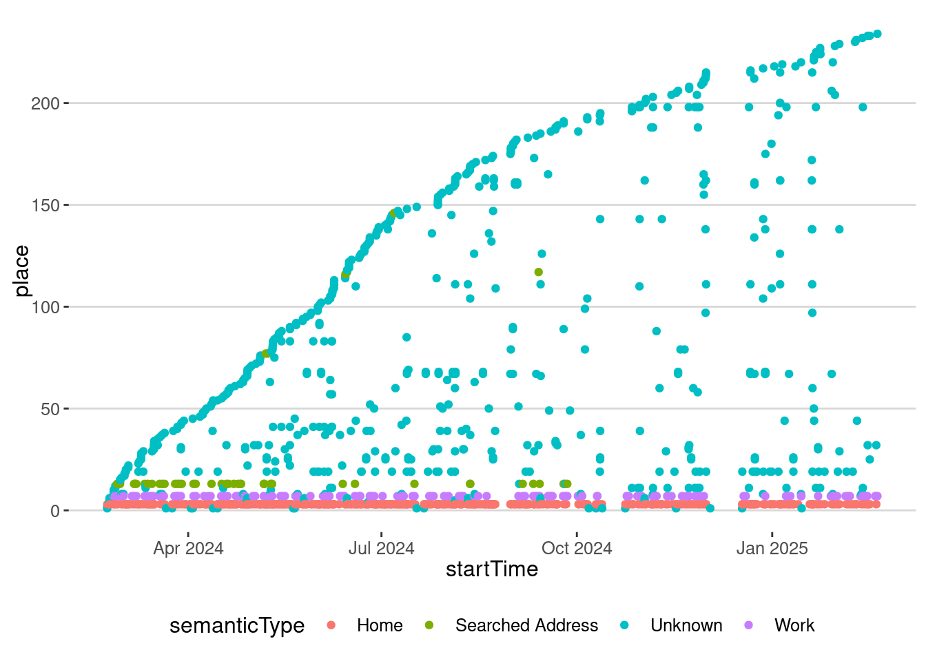
Fit our data with the EPR model
Let’s simulate our behavior using the Exploration and Preferential Return model [1] [2]. First we use the following equation from the model to calculate \(\rho\)
\[ S_T = [1+\rho (1+\gamma)N]^{1/(1+\gamma)} \] and then
\[ \rho = \frac{S_T^{1+\gamma}-1}{(1+\gamma)N} \]
Of course, we need to get our own \(\gamma\). For simplicity let’s use \(\gamma = 0.23\) as was found in [3] and [2].
ST <- length(unique(visits_2024$placeID))
N <- nrow(visits_2024)
gamma <- 0.23
rho = (ST^(1+gamma)-1)/(1+gamma)/N
rho
[1] 0.5435135Let’s simulate the model:
set.seed(123)
visits_sim <- 1
ST <- 1
for(i in 2:N){
  if(runif(1) < rho/ST^(gamma)){ # exploration
    visits_sim <- c(visits_sim,ST+1)
    ST <- ST + 1
  } else { # preferential return
    visits_sim <- c(visits_sim,
                sample(visits_sim,1))
  }
}
visits_sim <- tibble(
  time = 1:N,
  placeID = visits_sim
)
Let’s see how the analytical average for the EPR compares with our simulation
visits_sim |>
  ggplot(aes(x=time, y=placeID,col="EPR model (simulation)")) + geom_point() +
  geom_line(aes(x=time,y=(1+rho*(1+gamma)*time)^(1/(1+gamma)),col="EPR Model (average)"))+
  geom_point(data=visits_2024,aes(x=1:nrow(visits_2024), y=place,col="Real Data"))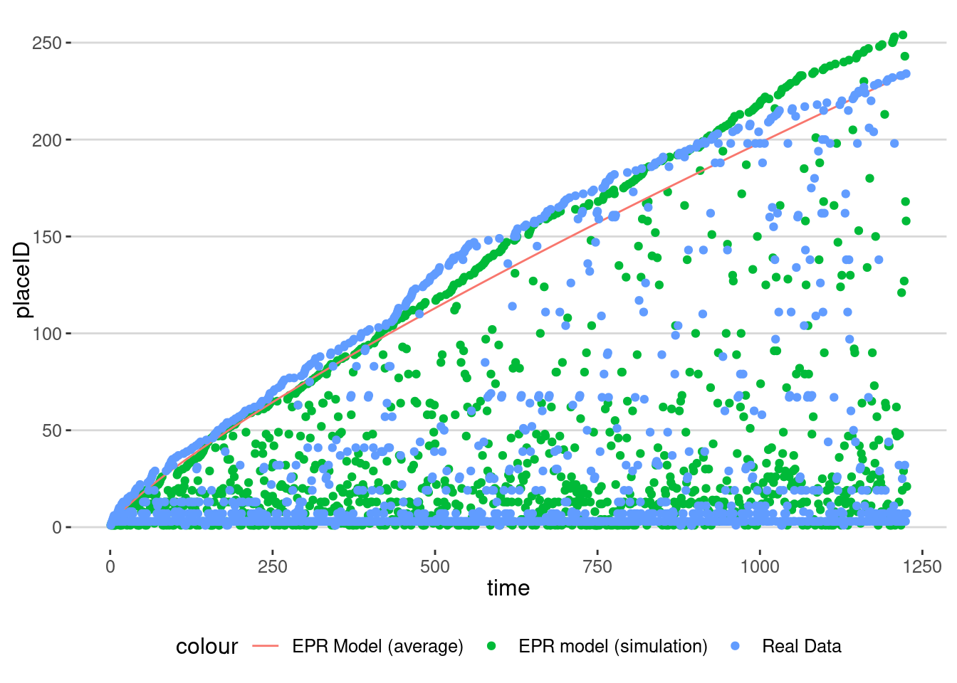
As we can see, one realization of the model is very close to the analytical average but also to the real data.
One of the outcomes of the EPR model is that it predicts that the frequency of visitation to places decays like:
\[f(n) \sim 1/n^{(2+\gamma)/(1+\gamma)}\]
We compare the distribution of the number of visits in the real data and the model:
places_visits <- visits_2024 |> group_by(place) |>
  summarize(nvisits = n()) |>
  mutate(type="Real Data")
places_visits_sim <- visits_sim |> group_by(place=placeID) |>
  summarize(nvisits = n()) |>
  mutate(type="EPR Model")
rbind(places_visits,places_visits_sim) |>
  ggplot(aes(x=nvisits)) +
  geom_density(aes(col=type)) +
  labs(title="Density of number of visits by place",
       x="Number of visits", y="Density") +
  geom_line(data=data.frame(x=1:500),aes(x=x,y=x/x^((2+gamma)/(1+gamma)),
                                         col="EPR prediction"),
            linetype="dashed") +
  scale_x_log10() + scale_y_log10()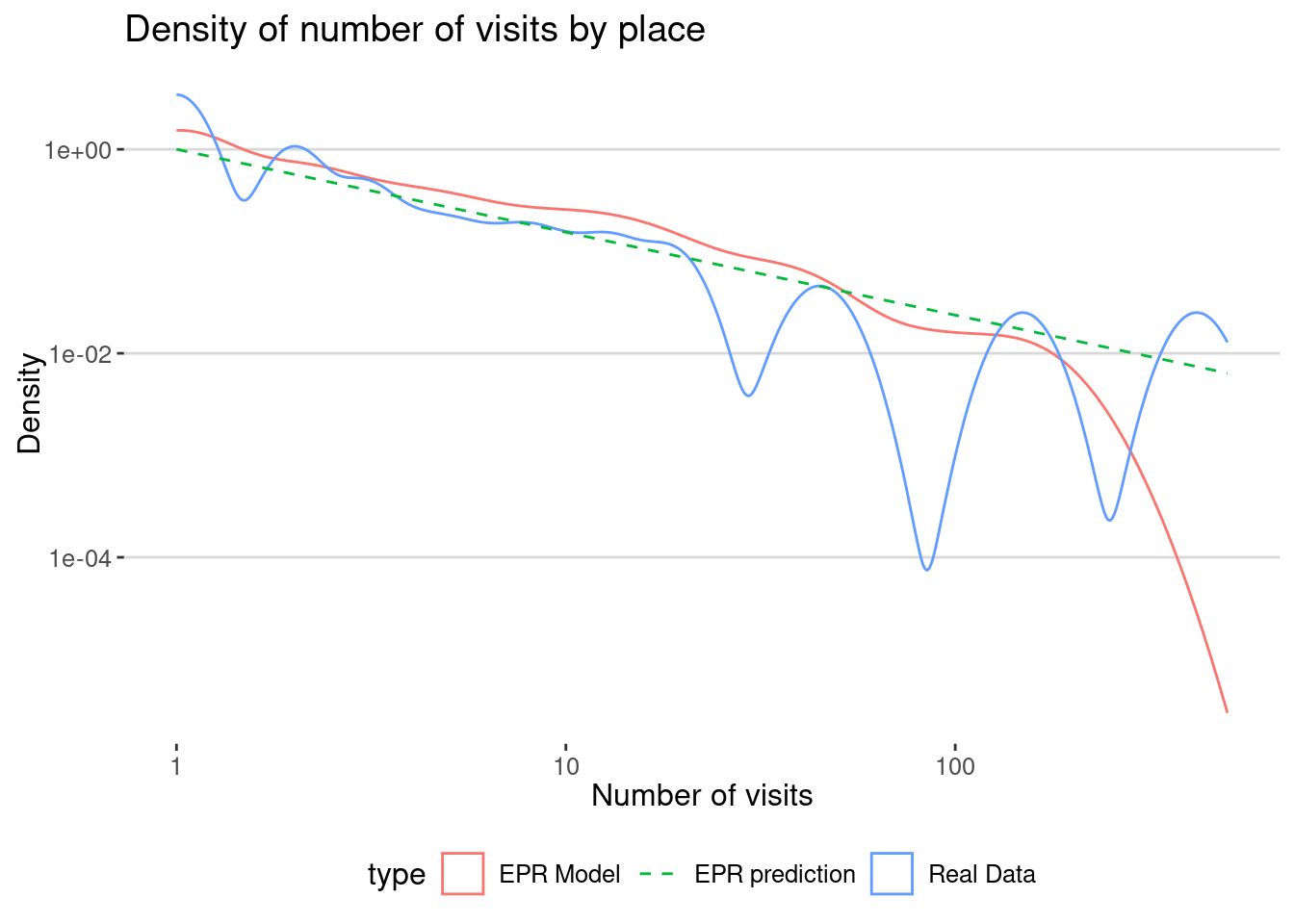
Your turn
Use your own mobility data to calculate your exploration ration or \(\rho\) and simulate your behavior using the EPR model. Compare the distribution of the number of visits in the real data and the model.
Modeling mobility data using the EPR model for a group of individuals
Let’s use the Cuebiq data to analyze mobility patterns using the Exploration-Preferential Return (EPR) model. The data that we have contains the visitation patterns of around 10k users in the Boston area during one month
visits <- read_csv("/data/CUS/mob10kusers.csv")
visits |> head() |> datatable()
As we can see, the data contains the information about the user, the CBG where the user lives (estimated), the CBG where the visit happens and the activity type of the visit. For privacy reasons, both the location and the time of the visit are up-leveled to the CBG level and the hour of the day.
Let’s change the id of the CBG to be as in the census and convert the date to R format.
visits <- visits |>
  mutate(
    HOME_CBG = ifelse(substr(HOME_CBG,1,2)=="MA",paste0("25",substr(HOME_CBG,3,12)),
                      paste0("33",substr(HOME_CBG,3,12))),
    VISIT_CBG = ifelse(substr(VISIT_CBG,1,2)=="MA",paste0("25",substr(VISIT_CBG,3,12)),
                      paste0("33",substr(VISIT_CBG,3,12))),
    TIME = ymd_hms(TIME, tz = "America/New_York"),
  )
Descriptive statistics
Here is the number of visits by user
visits |> group_by(USER) |>
  summarize(nvisits = n()) |>
  ggplot(aes(x=nvisits)) + geom_density(fill="red",alpha=0.5) +
  scale_x_log10() +
  labs(title="Density of number of visits by user",
       x="Number of visits", y="Density")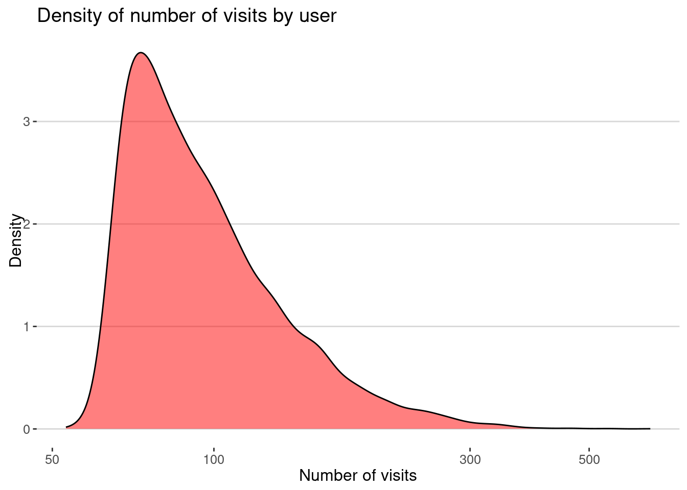
By category of activity
visits |> count(ACTIVITY) |>
  ggplot(aes(x=reorder(ACTIVITY,n),y=n)) + geom_col(fill="gray") +
  labs(title="Number of visits by category", x="Category",y="Number of visits") +
  coord_flip()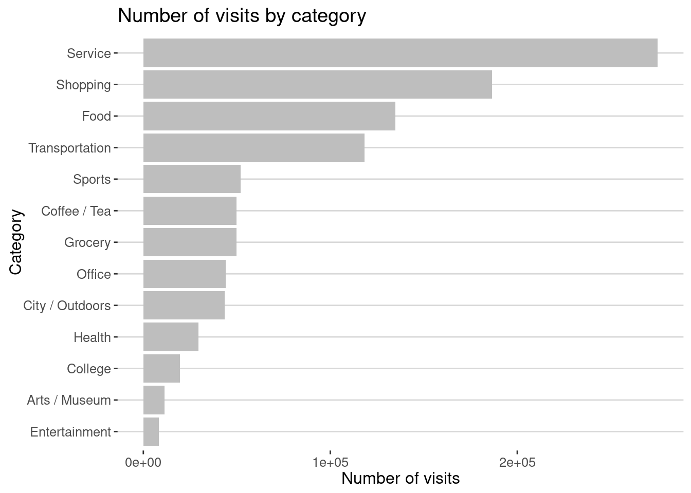
And dwell time by category
visits |> group_by(ACTIVITY) |>
  summarise(mean_dwell = mean(DWELL_TIME_MINUTES)) |>
  ggplot(aes(x=reorder(ACTIVITY,mean_dwell),y=mean_dwell)) + geom_col(fill="gray") +
  labs(title = "Mean dwell time by category",x="Category",y="Mean dwell time") +
  coord_flip()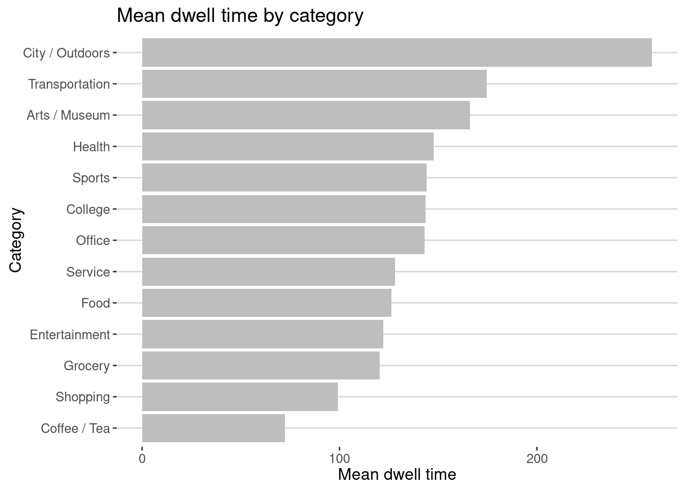
As we can see there is a difference between what places we visit more and what we spend more time.
Let’s add distance from home. We use the data collected for Lab 6 to calculate the distance between the CBGs.
cbgs <- st_read("/data/CUS/labs/6/14460_acs_2021_boston.geojson")Reading layer `14460_acs_2021_boston' from data source
`/data/CUS/labs/6/14460_acs_2021_boston.geojson' using driver `GeoJSON'
Simple feature collection with 3418 features and 66 fields
Geometry type: MULTIPOLYGON
Dimension: XY
Bounding box: xmin: -71.89877 ymin: 41.56585 xmax: -70.32252 ymax: 43.57279
Geodetic CRS: NAD83cc <- st_coordinates(st_centroid(cbgs))
centroids_cbgs <- tibble(CBG = cbgs$GEOID, lon = cc[,1], lat = cc[,2], pop = cbgs$age.total)Use this function to calculate distances:
dist_cities_haver <- function(lon1,lat1,lon2,lat2){
  # lo primero que hay que hacer es convertir todo a radianes
  long1 <- lon1*pi/180
  lat1 <- lat1*pi/180
  long2 <- lon2*pi/180
  lat2 <- lat2*pi/180
  R <- 6371 # Earth mean radius [km]
  delta.long <- (long2 - long1)
  delta.lat <- (lat2 - lat1)
  a <- sin(delta.lat/2)^2 + cos(lat1) * cos(lat2) * sin(delta.long/2)^2
  c <- 2 * asin(ifelse(sqrt(a)<1,sqrt(a),1))
  d = R * c
  return(d)
}
and get the distance from home to each visit
visits <- visits %>%
  left_join(centroids_cbgs, by = c("HOME_CBG" = "CBG")) %>%
  rename(lon_home = lon, lat_home = lat, pop_hom = pop) %>%
  left_join(centroids_cbgs, by = c("VISIT_CBG" = "CBG")) %>%
  rename(lon_visit = lon, lat_visit = lat, pop_visit = pop) |>
  mutate(distance = dist_cities_haver(lon_home,lat_home,lon_visit,lat_visit))
Here is the number of trips by distance:
visits |>
  ggplot(aes(x=distance)) + geom_density(fill="red",alpha=0.5) +
  labs(x="Distance (km)",y="Density",title="Density of trips by distance")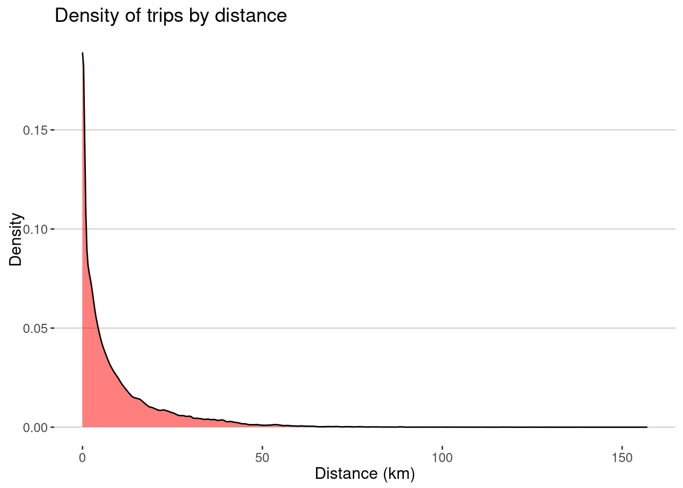
As expected most of the visits happen at small distances, but there are also some long distance trips.
Here is the median distance by user
visits |> group_by(USER) |>
  summarize(median_distance = median(distance)) |>
  ggplot(aes(x=median_distance)) + geom_density(fill="red",alpha=0.5) +
  labs(x="Median distance (km)",y="Density",title="Density of median distance by user")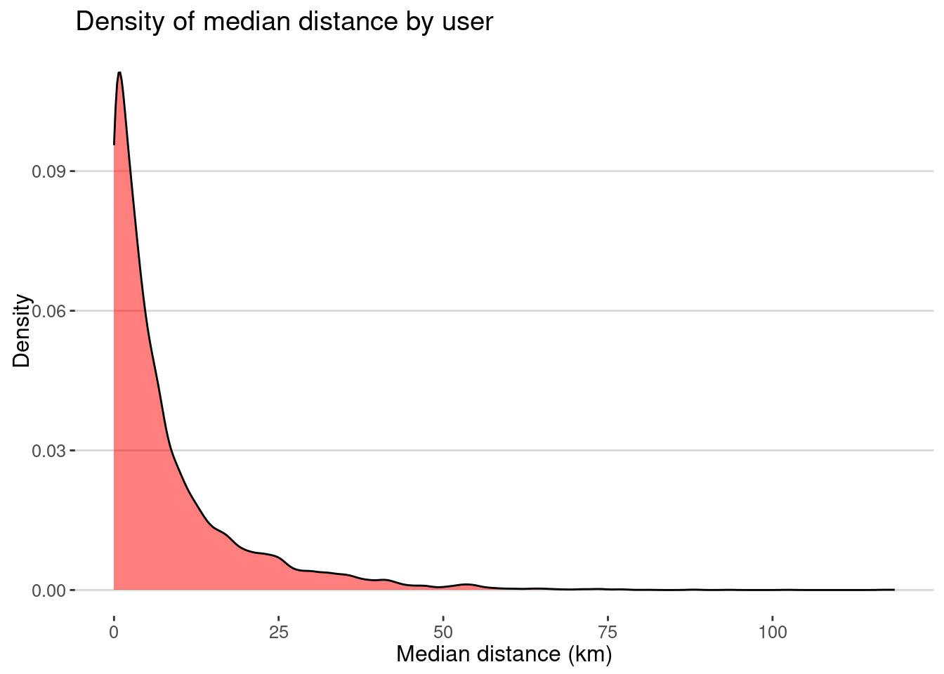
and the distance travelled by category
visits |> group_by(ACTIVITY) |>
  summarize(mean_distance = mean(distance)) |>
  ggplot(aes(x=reorder(ACTIVITY,mean_distance),y=mean_distance)) + geom_col(fill="gray") +
  labs(title = "Mean distance by category",x="Category",y="Mean distance") +
  coord_flip()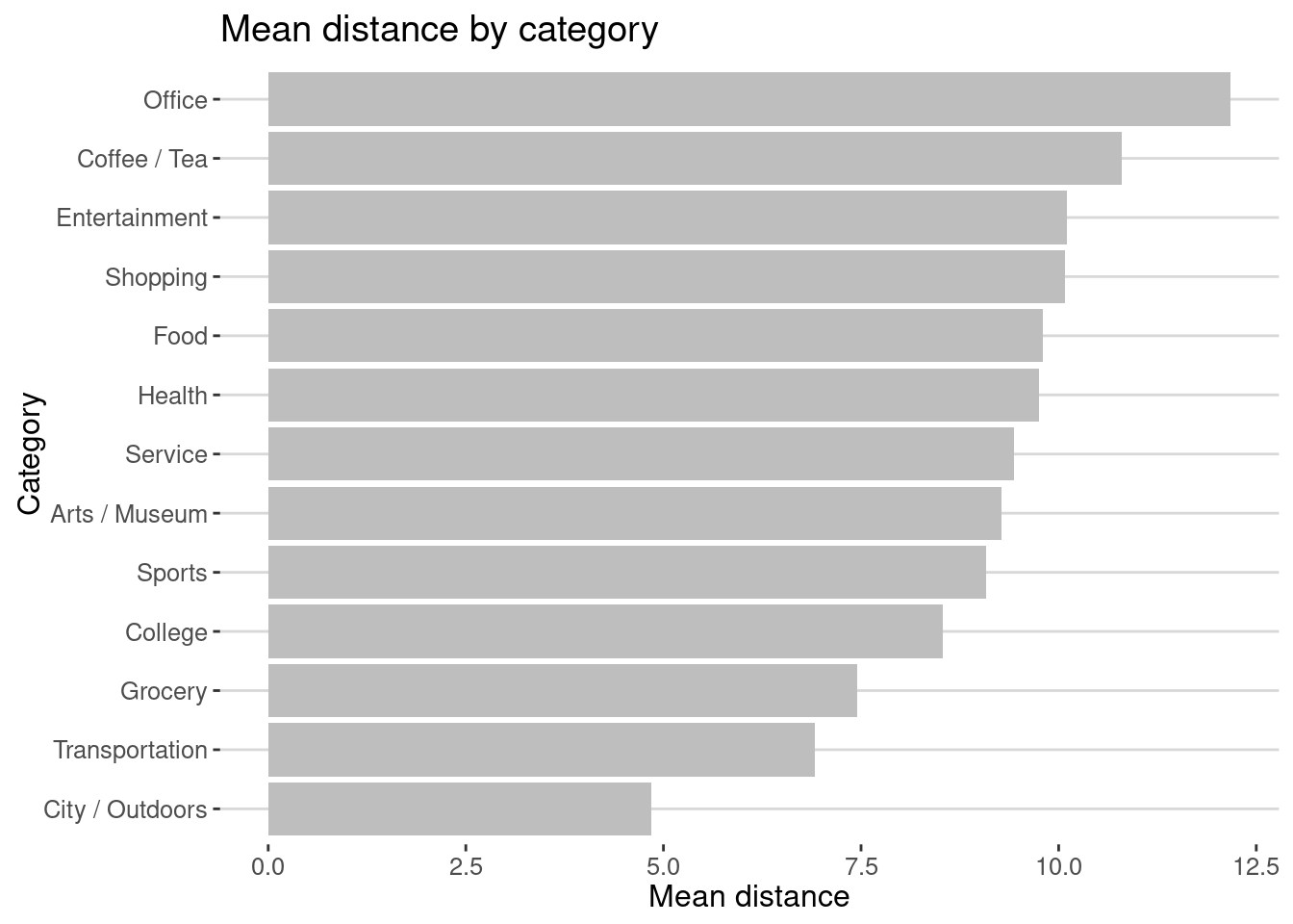
As we can see the average distance travel to parks or transportation is small compared to commuting to office or going shopping/enterntainment.
Modeling the data using the EPR model
Let’s calculate the exploration ration for each user. Since we don’t have information about the actual place, we are going to use the combination of VISIT_CBG and ACTIVITY as the place ID.
visits <- visits |>
  mutate(placeID = paste0(VISIT_CBG,ACTIVITY))
exploration <- visits |>
  group_by(USER,HOME_CBG) |>
  summarize(N = n(), ST = n_distinct(placeID)) |>
  mutate(exploration = ST/N)
here is the distribution
exploration |>
  ggplot(aes(x=exploration)) + geom_density(fill="red",alpha=0.5) +
  labs(title="Density of exploration by user",
       x="Exploration rate", y="Density")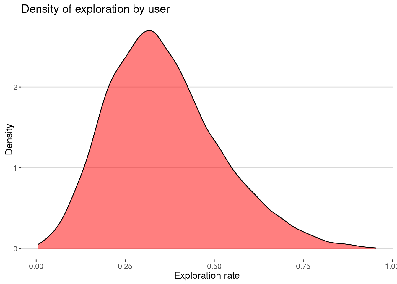
As we can see most of the users have very small exploration rates.
Your turn
Model the exploration rate for each user using the demographic variables for each of the CBGs where they live. Do you see any bias?
data_model <- exploration |>
  left_join(cbgs, by = c("HOME_CBG" = "GEOID")) |>
  mutate(fyoung = age.u1825/age.total,
         fblack = race.black/race.total,
         fbachelor = education.bachelor/total.education,
         median_income=median_income,)
Regression
fit <- lm(exploration ~ fyoung + fblack + fbachelor +
            median_income, data = data_model)
summary(fit)
Call:
lm(formula = exploration ~ fyoung + fblack + fbachelor + median_income,
    data = data_model)

Residuals:
     Min       1Q   Median       3Q      Max
-0.37936 -0.11022 -0.01716  0.09232  0.59520

Coefficients:
                Estimate Std. Error t value Pr(>|t|)
(Intercept)    3.381e-01  4.927e-03  68.629  < 2e-16 ***
fyoung        -1.032e-01  1.620e-02  -6.369 1.99e-10 ***
fblack         8.839e-02  8.529e-03  10.364  < 2e-16 ***
fbachelor     -2.538e-02  9.776e-03  -2.596  0.00944 **
median_income  4.389e-07  6.176e-08   7.106 1.28e-12 ***
---
Signif. codes:  0 '***' 0.001 '**' 0.01 '*' 0.05 '.' 0.1 ' ' 1

Residual standard error: 0.1546 on 9592 degrees of freedom
  (403 observations deleted due to missingness)
Multiple R-squared:  0.02117,   Adjusted R-squared:  0.02076
F-statistic: 51.87 on 4 and 9592 DF,  p-value: < 2.2e-16
Your turn
How do exploration events happen? Get the times, areas in the city and distance from home where most exploration happens
visits <- visits |>
  group_by(USER,placeID) |>
  mutate(is.exploration = ifelse(TIME==min(TIME),1,0))
Conclusion
The EPR model is a simple model that can explain the mobility patterns of individuals and groups. It can be used to understand the exploration and preferential return behavior of individuals and groups. The model can be modified to account for different factors regarding the type of place explored, the distance to new exploration events, etc.
References
[1]
H. Barbosa et al., “Human mobility: Models and applications,” Physics Reports, vol. 734, pp. 1–74, Mar. 2018, doi: 10.1016/j.physrep.2018.01.001.
[2]
C. Song, T. Koren, P. Wang, and A.-L. Barabási, “Modelling the scaling properties of human mobility,” Nature Physics, vol. 6, no. 10, pp. 818–823, Oct. 2010, doi: 10.1038/nphys1760.
[3]
E. Moro, D. Calacci, X. Dong, and A. Pentland, “Mobility patterns are associated with experienced income segregation in large US cities,” Nature Communications, vol. 12, no. 1, pp. 1–10, Jul. 2021, doi: 10.1038/s41467-021-24899-8.